


Professional typesetter Amie McCracken explains the technical terms used in formatting books
When typesetting is done very well, it becomes one of those hidden arts that most people don’t even realize they're consuming on a daily basis. But when it's done badly, it jumps out a mile.
Bad typesetting can set up a barrier between your book and your target readers – and may even deter them from picking up your book at all.
To help you get the typesetting right in your self-published books, whether you're doing your own formatting or subcontracting to a specialist, professional typesetter and editor Amie McCracken, an ALLi Partner member, explains the technical typesetting terms that every indie author needs to know, whether they format their own self-published books or subcontract to a formatting service.
Typesetting is the practice of laying out text for a document. Typography is the art and design of the individual letters and symbols. Typesetting was originally practiced by placing letters and spacing materials into a form and then printing with a press. It was (and is) a tedious process that reaches perfection through plain old hard work. Even today, digitally, typesetting requires an eye for creating readable text and laying the type in an organized manner. Take a look at these eleven typesetting terms and their definitions to understand more of what a typesetter does and how complex the project can actually be.
- Font/Typeface
Font and typeface have become interchangeable words in the computer age. However, font refers to the size and weight—the specifics—and typeface refers to the design. So in the case of standard book chapter text, the typeface would be Perpetua and the font would be a mixture of regular and italic, 11 point. - Serif/Sans Serif
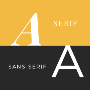 Typefaces fall into one of two major categories: serif or sans serif. The serifs are the strokes on the open ends of letters. Sans-serif is the literal translation for a typeface being “without” serifs. Good typography comes with choosing typefaces that contrast and also blend well together. Typical design of a poster or book cover will use a mixture of serif and sans-serif. The interior of a book will use sans-serif for headers, footers, and chapter headings. Serif is easier on the eyes in large blocks of text, so some common typefaces for the main text of a book are Times, Perpetua, or Garamond.
 - Widow
A widow is a lonely line at the end of a paragraph that has been separated from the others. It lies at the top of a page and should be reunited with its paragraph to strengthen the continuity of the reading experience. This is fixed by adjusting the leading (see below) between the lines. - Orphan
As might be obvious by the name, the orphan is the smaller version of a widow. Sources differ on what it might mean. The Chicago Manual of Style calls an orphan the first line of a paragraph that begins by itself at the bottom of a page. The more commonly known definition is that it is a lone word or short line at the end of a paragraph. Especially at the bottom of a page, this should be remedied. Typically a typesetter can easily fix an orphan by changing the tracking (see below) on the paragraph. - Tracking
Tracking is one of those simple ones. It is the consistent degree of space between letters. It can be increased or decreased, but of course this is a fairly touchy tool. If over-spaced, text can quickly look off to the common reader’s eye. - Kerning
Kerning is similar to tracking in that it is the space between letters, but it is the individual space. This would be used on a cover to make certain letters look closer together because they naturally look farther apart compared to their neighbors. For instance, an A and V both lean the same way, so the space between, especially on a larger font, can seem drastically larger than between a V and E. - Leading
Leading is the space between lines. When printing presses were used, this was literally lines of lead strips placed to space the text properly. It can be used to help with widows and is also a setting applied to the entire text to give enough space for readability. - Recto/Verso
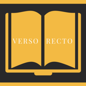 These refer to the front and back of a sheet of a paper, or in the case of a book, the right-hand and left-hand pages. Have you ever received a typeset of your book and found empty pages? Those are there on purpose to force the content to fall on the proper side of the page. You wouldn’t want to open a book and find the title on the back of the first page. This also brings up the subject of those blank pages in the back of the book. Those are there because printing requires one large sheet folded into a multiple of four. If you don’t include the blank pages at the end to make a multiple of four, you risk blank pages showing up somewhere in the middle.
All of these terms lead to a step a typesetter must take to compile your text into a readable book. This goes beyond trim sizes, margins, font size, and page count. There is so much more involved.
As you can see from the many different steps needed to create a coherent text, typesetting is a complicated dance built of trial and error, jumping backward and forward to create a flawless reading experience where one can get lost in the story instead of in the confusion of badly laid text.
OVER TO YOU Do you have any other terms to add to Amie's great list? Join the conversation via the comments box!
11 #typesetting terms that #indieauthors need to know - how many have you got nailed? by professional typesetter @AmieMcCracken, ALLi partner member Share on XOTHER USEFUL POSTS ABOUT FORMATTING
From the ALLi Author Advice Center Archive

I’ve been testing out my second chapter book on an advance reading team (see more at tinyletter.com/FABART) and I’m so glad one of them is a designer. She has also stressed the importance of whether to indent or not, depending where you are in the page, or chapter.