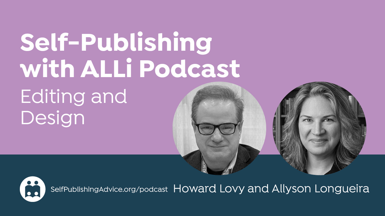
On the Self-Publishing with ALLi podcast, host Howard Lovy talks to Allyson Longueira, associate director of publishing at the graduate program in creative writing at Western Colorado University, about what authors need to understand about book design, from typography and interior layout to covers and branding. They discuss how design choices signal genre, how authors can better communicate with designers, and where to draw the line between creative control and trusting the experts. Longueira also explains how thoughtful design supports readability and market positioning, giving authors practical ways to approach the visual side of publishing with more confidence.
Listen to the Podcast: How Authors Can Work Effectively with Book Designers
Show Notes
About the Host
Howard Lovy is an author, developmental editor, and writing coach with a long career in journalism and publishing. He works with writers at many stages of their careers, with a focus on helping them develop their ideas and strengthen their work while preserving their unique voices. He lives in Northern Michigan.
About the Guest
An award-winning writer, editor, and designer, Allyson Longueira has worked in fiction and nonfiction across multiple media, including newspapers, magazines, and books, for more than twenty years. She now works as a developmental editor, line editor, copyeditor, proofreader, cover and interior designer, and publishing consultant for authors of fiction and nonfiction through her company, Long Alley Press. As associate director of the publishing concentration at Western Colorado University’s graduate program in creative writing, she teaches and mentors the next generation of publishers, writers, editors, and designers. Longueira is a strong advocate for preserving author voice in the editing process and trains editors to approach their work with the same focus through craft talks, conference lectures, and graduate-level classes. She has designed hundreds of book covers and interiors and has a deep interest in typography, including a willingness to discuss favorite and least favorite fonts at length. To learn more about Western’s publishing MA program, contact her at [email protected]. You can also find her on LinkedIn and Facebook.
Thoughts or further questions on this post or any self-publishing issue?
 If you’re an ALLi member, head over to the SelfPubConnect forum for support from our experienced community of indie authors, advisors, and team. Simply create an account (if you haven’t already) to request to join the forum and get going.
Non-members looking for more information can search our extensive archive of blog posts and podcast episodes packed with tips and advice at ALLi's Self-Publishing Advice Center. And if you haven’t already, we invite you to join our organization and become a self-publishing ally.
Read the Transcript
Howard Lovy: Hi, I'm Howard Lovy and this is the Self-Publishing with ALLi podcast. First, a bit about me. I'm an author and a developmental editor at howardlovy.com. I work with words for a living, but when it comes to design, I know where my expertise ends. At a certain point you have to hand things off to specialists who understand how books look, not just how they read. Still, authors can't step away completely. You don't need to be a designer, but you need to work with one and know how to communicate what you want. You need to understand what makes a book cover work in your genre, how typography affects both the look and readability of your book, and how to collaborate with a designer so you end up with a book that feels professional from the cover to the final page. That's what we're talking about today.
My guest is Allyson Longueira, associate director of publishing in Western Colorado University's graduate program in creative writing. She works closely with authors and teaches the principles of book design with a focus on typography, genre branding, and helping authors understand the language of design so they can work more effectively with designers. Allyson, thank you for joining me.
Allyson Longueira: Thank you so much, Howard.
Background in Publishing and Design
Howard Lovy: Tell me a bit about yourself, your background in publishing and design, and how you came to specialize in typography.
Allyson Longueira: I started out as a journalist. My master's degree is in newspaper and magazine editing and design, and that was an excellent way to start because when you're working for newspapers and magazines, you're very reader-focused in your design. It's all about the audience and making sure the information is portrayed clearly and that you're effectively communicating. That was a wonderful foundation. I moved into book publishing about 15 years ago. I was the publisher and chief designer and editor and marketer — all the hats — for a small press. In that role I designed more than a thousand book covers, so I got a lot of experience across a wide variety of genres. It was an independently owned publishing house and we started right at the advent of the indie revolution, around 2010. I joined them in 2012, and watching everything evolve over time has been fantastic.
Howard Lovy: I was a newspaper designer for a little while myself — I worked for the Detroit News as a page designer, and I learned all about presenting layered information, how some readers are scanners and some read every word. I worked for Gannett and they were big on info boxes and things like that. It's great training for learning how information is processed.
Allyson Longueira: Absolutely. And one of the biggest things emphasized in newspaper design in particular is hierarchy. The biggest headline goes to the most important story. You're using the design to guide the reader's eye where you want it to go. For scanners especially, you want to make sure you're effectively communicating: this is the most important story, start here. That translates directly into book design.
I started with Western Colorado University in 2020. Kevin J. Anderson had created the publishing concentration within their graduate program in creative writing. The program had been around for a number of years with concentrations in genre writing, nature writing, poetry, and screenwriting, but publishing was new. Kevin created that program and then brought me in to co-teach it, filling in the skills he wasn't as strong in — the design and the editing side. It's a low-residency program, so I get to work from my home on the Oregon coast and then go spend a week in lovely Colorado in July.
Howard Lovy: Both beautiful places. Do you focus on students who are going to be designers, or also on authors who are going to work with designers?
Allyson Longueira: Primarily it's authors who are going to work with designers. In the publishing program we teach both traditional and independent publishing. We have independent authors who want to learn how to publish their own books, aspiring publishers who want to create a small press, editors who want to understand how the whole thing works, and occasionally a designer who wants to understand the full picture. That holistic view is really important — you can't effectively design if you don't understand the rest of the process. One of our most accomplished alumni is Mark Leslie Lefebvre. I talked to him about it because I've known Mark for a long time and I said: what exactly are we going to teach you? At the end of the program he said, oh my God, I learned so much. We bring things from a different perspective and delve into areas that people who've learned as they went may not have experienced — the design side in particular.
I make all of my students design their own book covers. For their solo projects, where they reprint a public domain work, they have to get into InDesign. I have a full tutorial walking them through how to use it. I teach them the fundamentals and principles of design, and then they go from there.
Howard Lovy: These are people who want to be authors, not designers — but they have to know the basics of how design works.
Allyson Longueira: Exactly. Doing it, I've found, is the best way. I want them to really understand how this process works. And the majority of them get through and say: yeah, I am never going to do this on my own again. But they understand why.
Why Not Just Use AI for Your Cover?
Howard Lovy: Why would anybody want to hire a designer and go through all that when they can ask an AI chatbot to create a cover?
Allyson Longueira: AI is developing all the time, but here's the thing AI can't do — and this translates to what you and I do as editors, and what authors do as writers. There's a human element that AI can't understand. What I'm seeing from people who try to use AI to do covers is that it gets close, but it has more of an advertising focus than a genuine understanding of the book industry specifically. The AI doesn't necessarily understand that the majority of people purchasing books online are looking at the cover as a thumbnail. If your cover isn't effectively communicating what it needs to communicate at thumbnail size, the right readers aren't going to click on your book.
Howard Lovy: I find the same thing when I look at AI-produced writing. It's not writing — it's an advertisement for writing. It's like ‘insert actual writing here.'
Allyson Longueira: Yes, absolutely. I'm not anti-AI in general. I think AI can be a useful tool for some things, but more for research than for actual application. You can use it to source ideas, but you need that human element and you need to understand the industry we're working in. AI is never going to do that — it's going to base everything on numbers and be very traditional-publishing-heavy, because that's what it's trained on.
Teaching Authors the Language of Design
Howard Lovy: You talk about teaching authors the language of design. What does that mean in practice?
Allyson Longueira: When you're talking to designers, designers are very visual people. As an author, when you say ‘I want the cover to show the scene where my main character is running through the forest,' you've given a very specific image to the designer — but that's not necessarily the scene that's going to sell the book. And when you get the design back, what the designer comes up with might not match what you envisioned, because you've lived inside that scene and know it intimately. The designer, even if they've read the book, doesn't have the same visual. So when you give that direction, you haven't conveyed the mood, you haven't properly conveyed the genre, and you've tied your designer's hands creatively. If they're focused on a person running through a forest, they're ignoring every other possible design element.
It's also about understanding typography. When you get the cover back, you need to understand whether the designer is using the correct hierarchy, whether the type is balanced, whether the fonts are right. Fonts have character. They convey mood and tone. There's a reason the font you'd use for science fiction is going to be very different from the font you'd use for mystery.
Howard Lovy: That's something that's just beyond me as a writer. I worked with a designer on a novel I wrote, and when she asked for suggestions, I was very literal — let's depict this character and that character doing this action. What she finally gave me was more of a mood. At first I scratched my head, and then I thought: this is the book. It wasn't a literal scene from the book, but it caught the mood through image and typography.
Allyson Longueira: That's exactly what I mean. The biggest mistake I see authors make when working with a designer is being so wedded to a specific idea of what should be on the cover that they hamstring the designer. In your case, you had a specific idea, the designer took it as inspiration and designed the cover that would actually work best for that book, gave it to you, and you stepped back and realized it was the perfect cover. Kudos to you for doing that, because a lot of authors don't. If you keep insisting it needs to be this way or use this color, the designer is eventually going to give you what you want — not because it's right, but because at a certain point as a designer you just want to finish the job and get paid. And then the problem is what you wanted wasn't the right cover for the book, and eventually you'll have to pay for a new one.
What Information Does a Designer Actually Need?
Howard Lovy: If designers don't necessarily need a play-by-play of what each chapter looks like, what do they actually need?
Allyson Longueira: They could really use good promo copy — a strong back-cover blurb. The author needs to clearly convey the genre and sub-genre of the book, because that makes a huge difference. They need to convey the mood and tone. I would highly advise all authors to research what covers in your genre are looking like right now, especially in your sub-genre. Mystery covers can vary wildly depending on sub-genre. The Book of the Month Club is a great place to look at cover trends across genres — they curate very specifically, and you don't have to join to browse their catalog. Use it as a cheat sheet for marketing trends in your genre.
A Carl Hiaasen-style mystery is going to have a very different look than a cozy mystery. You have to understand where your book is placed. Is it dark? Is it light? Is there a humorous element? Your cover has to say as specifically as possible what kind of book it is. Eighty percent of people buy books online — they're scrolling through thumbnails. So the political thriller cover needs to be dynamic, full of movement and tension. The cozy mystery needs to convey warmth and, if it's a cooking cozy, food. Lighter colors, more illustrative style, probably a serif font with more playful characteristics. All authors should understand the difference between a serif and a sans-serif font as a basic starting point.
Genre Blending and the Cover Challenge
Howard Lovy: Our audience is particularly indie authors and we're a stubborn bunch. One of the reasons we're indie is because we don't necessarily fit neatly into genre categories. What about an author who says it's sort of sci-fi and sort of not — how do you define a cover for a genre-blended book?
Allyson Longueira: Genre blending is huge in indie publishing, and I love that indie publishing has allowed it. But when you're genre blending, you need to step back and understand what your primary genre is — because there always is one. Authors will argue with me on this and they always lose, because there is always one primary genre. The primary genre is the thing the book can't lose without falling apart. Most books have a mystery and most books have a romance, but if there's no happy ending it's not a romance. If the mystery isn't the key element driving the story, it's not a mystery. If a futuristic or alternate-history timeline isn't the primary element, it's not true science fiction.
So ask yourself: what is the thing that stands alone? Once you've identified that, you pick one — and then the mood and tone help you incorporate the secondary elements. If there's a supernatural element or a touch of humor, you find a way to incorporate that through typography, through the lightness or darkness of the art, through the color palette. That's what sets the mood. If you've got a primarily mystery book with a magical element, you have to make sure that magical element is visible on the cover — because straight mystery readers are going to be very upset if they're reading what they thought was a mystery and suddenly there's a supernatural element. You have to let the reader know what they're getting.
Howard Lovy: So in other words, pick one.
Allyson Longueira: Yes. And if you're working with a developmental editor, talk to your editor about it — because your editor, I guarantee you, knows which is the primary genre.
The Typography-Only Cover Trend
Howard Lovy: I've seen a lot of books lately that have no images at all — it's all typography. Is that a recent trend, and why?
Allyson Longueira: It is a more recent trend. My speculation for why: traditional publishers are really trying to differentiate themselves from indie publishing. Both trad and indie have been relying on stock art for a long time, and the problem with stock art is that the same image can show up on dozens of covers. As a traditional publisher, you never want the same piece of art as another dozen covers — it dilutes you. So my suspicion is they've moved toward typography-only covers to avoid that. And it's less expensive — you're not paying for custom art, just the designer you'd be paying anyway.
But make no mistake: typography is an art. Getting it right, choosing the right font — I will sometimes spend hours going through the Adobe Typekit looking for exactly the right font to convey the genre, mood, and tone of a book I'm designing, and then finding the appropriate coordinating font. A cover can use all one font family or two font families, but should never use more than that. If somebody is using three different fonts on a cover, they've gone wrong in most cases. When you choose your primary font — whether it's serif, sans-serif, or a decorative or script font — you need a coordinating font that matches that same character. If it's a serif, you want a sans-serif for the secondary, and vice versa. They should also have similar x-heights — that's how tall the main body of the letter is — and similar overall character. A tall, skinny font paired with a short, fat font is going to create visual conflict. Everything should flow smoothly together.
Interior Design: Readability and What to Avoid
Howard Lovy: This has all been about the cover. Do you also work with interior fonts and design? As a developmental editor I require Times New Roman, 12 point, double-spaced, indented paragraphs. Sometimes authors give me all kinds of fancy fonts and italics, and I tell them that's all for the book designer. But authors do have very specific ideas about what the interior should look like. Are there standards where you just have to say no?
Allyson Longueira: Readability is key when talking about the interior. There's a reason serif fonts have been used in book printing for as long as we've been printing books. The whole point of the serif is to guide your eye from one letter to the next. If you try to read sans-serif body copy, your eye has to work harder to get from letter to letter, and that's going to fatigue you. You won't want to read for as long as you would with a serif font. That's just how our brains work. Now, if you're dyslexic, that doesn't necessarily hold true — there are accessible font options for different readers — but for the majority, you want a serif font for the body.
Howard Lovy: Maybe it's just me, but italics also drives me nuts. Authors like to use italics when communicating a letter being written, or thoughts.
Allyson Longueira: Going back to our newspaper days — we were very specific there: you never use vertical punctuation because it stops the eye. You want to keep things moving. Same thing with italics. We didn't use them in the newspaper because you jar the reader when you switch from roman to italics. You don't want to do that unless there's a very specific reason. Italics, in my view, should be used for emphasis — when you want to make sure someone reads a sentence with the proper stress. They're not for letters, thoughts, or large blocks of alternate text. There are much better ways to handle those in interior design.
For letters, you can set them apart visually in InDesign or Vellum — different indentation, different margins, something that makes it look like a letter without requiring italics. For thoughts, if you've written ‘he thought' before the passage, you've already told the reader what's happening. You don't need italics to signal it. The whole point of interior typography is that it should disappear — it should be invisible, subconscious. You're not supposed to see it. It's supposed to carry the reader without them noticing it.
Howard Lovy: What about all caps? Some authors use all caps for emphasis, which looks amateurish to me.
Allyson Longueira: All caps is for shouting. That is the only reason to use it, and even then very sparingly. And here's the thing — if you have to rely on all caps to tell people a character is shouting, you might not have properly written that scene. Your developmental editor can help you convey shouting through body language, description, the way the prose leads up to the moment. You don't need all caps. Same with exclamation points — you don't need them. And please, no parentheses in fiction.
Howard Lovy: Here's a tip to save authors money: if you give a really complicated book to a designer, they're going to charge you more for the interior. And if you're doing it yourself in Vellum, which is a fantastic tool —
Allyson Longueira: Vellum is excellent. It offers a lot of creative options. When you go into the settings, you can choose different styles for letters, different indentation — there are ways to convey ‘you're now reading something different' without resorting to italics or all caps. But don't use every design option Vellum offers. When you throw too many different design elements onto a page, you distract the reader. And you never, ever want to do that.
Should Authors Design Their Own Books?
Howard Lovy: Authors should not be editing their own books — should they also not be designing their own books? Is it a different part of the brain, or can you combine the two?
Allyson Longueira: Some people can combine the two — those who have an aptitude for design as well as writing, or a training background in design. But are you the best person to design your book? Generally not. It's the same reason you need someone else to edit your book: you cannot step back far enough from your own work to be objective. Everyone needs an editor and everyone needs a designer. You need someone who can execute things to a level you can't, because you're not a professional designer. You could scroll through Adobe Fonts and say ‘oh, that looks cool' — but you don't really know if that font conveys fantasy, or mystery, or the specific tone you need. That takes training.
The reason I make my students go through the design exercise is not to turn them into designers. At the end they say: now I get it. Now I understand why I need to hire somebody. The stakes are high. If you put a bad cover on your book, no one is going to pick it up — it doesn't matter how well it's written. And if the interior is poorly laid out, if there are no page headers, the reader won't be able to articulate what's wrong, they'll just know something feels off. And if something feels off, they're not going to click on that listing.
Hiring a Designer: Red Flags and What to Ask For
Allyson Longueira: Anybody can hang up a designer's shingle. That doesn't mean they're good at it. So when you get a cover back and it's using three fonts, or has different colors on parts of the text that don't make sense, or has a very heavy-handed drop shadow because they didn't know they could adjust those settings — those are all red flags. When you're hiring a designer, ask for a portfolio. Specifically, ask for examples of books they've done in your genre. You need to see whether they understand how to design for that genre. And the designer and the author need to be genuine partners in the project — which is another reason why understanding the language of design matters, so you can communicate effectively without either tying their hands or ignoring their expertise.
Key Principles Before Starting on Your Cover
Howard Lovy: What are a few key principles authors should think about before they start working on their cover or hiring a designer?
Allyson Longueira: Research cover design in your genre. The best thing you can possibly do is have comps — other books, specifically bestselling books, in your genre and sub-genre with similar mood and tone. If they're not selling, the cover isn't doing its job, so look at what is selling well. Pull those comps and either use them to guide yourself or give them to your designer and say: here are books that are doing well in this space, I'd like to emulate this style. It should look different — they shouldn't just replicate what you gave them — but it should have a similar tone and character.
Readers are sometimes surprised to hear this, but they're looking for familiarity. You want your cover to look similar to other bestselling books in your genre. That's the whole point. If you don't hit those targets, you're sending the wrong message. Color means things — there's no naturally occurring blue food, which is why you'll never see blue in cookbooks. It suppresses appetite. The wrong design choices send the wrong message without the reader even knowing why.
And don't get wedded to specific images from your book. It doesn't matter if the woman on the cover has slightly different hair than you envisioned, or never wears a red dress in the story. Nobody cares. The sole job of the cover is to get the reader to click on it and read the blurb. That is it. Get them to the marketing copy that convinces them to buy the book. Keep that in mind, give your designer the genre, the sub-genre, the mood and tone, some comp covers, your back-cover blurb, and any series information or pull quotes — and then trust the process.
Howard Lovy: I wish we could keep going — this has been fascinating. And I also learned: no blue in the kitchen.
Allyson Longueira: No blue in the kitchen — unless you're trying to lose weight, in which case maybe you do want it.
Howard Lovy: This has been really helpful and I think a lot of authors will come away with a much clearer sense of how to approach cover and interior design, and especially how to work with designers more effectively. Thank you so much for joining me.
Allyson Longueira: Thank you so much. It was a pleasure.
Howard Lovy: Thank you, Allyson. Bye.