Whether selling books from your website, or offering free content for mailing list signups, marketing psychology can be a useful tool in the indie author's toolbox.
During the redesign of a friend's website, we pondered how to lay out the books on her sales page for maximum sales. She also wanted to offer a choice of novellas on the landing page for her mailing list, and we wondered what the optimum number of choices would be.
Fortunately, marketers and behavioral psychologists have been mulling over these concepts for decades, and we found a wealth of information to guide our website development. The following are the theories and studies we found helpful in guiding our decisions. I'll follow up later this year with the results of our efforts. In the meantime, I hope these studies provide inspiration for your website marketing efforts.
Too many choices leads to analysis paralysis
Researchers Sheena Iyengar and Mark Lepper found that the higher the number of options, the greater the likelihood that people will walk away without selecting any option.
Known as the “Jam Experiment,” Iyengar and Lepper's famous study described a display table offering 24 varieties of gourmet jam, and a second table offering only 6 varieties. The larger display attracted more shoppers, but the smaller display resulted in nearly ten times as many sales.
Psychologist Barry Schwarz calls this the paradox of choice. Offering too many choices can paralyze consumers. By simplifying that choice and reducing the number of decisions that must be made, we should be able to increase conversion rates.
Based on this, we scrapped a plan to list every book on a single page, and opted to display only three titles at a time.
A single option makes consumers more willing to walk away
Author Daniel Mochon found that narrowing a consumer's options to one choice may make them less likely to buy that option, a phenomenon he calls “single option aversion”.
In his study, one group of consumers was offered the chance to purchase a Phillips DVD player. A second group was offered the chance to purchase a Sony DVD player. The third group was given both options.
The study found that consumers were more likely to make a selection when both models were presented to them.
Consumers like options…just not too many.
This theory reinforced our desire to offer multiple options as an incentive for mailing list signups rather than a single novella.
Three is a magic number
If a single choice stifles conversions, and too many choices will overwhelm the consumer, how about two choices?
That's a possibility, but studies show that when given a choice between two options, consumers overwhelmingly select the cheaper option (or the greater perceived value). This may not always be the option we would like them to pick. Worse, if the items are equivalent, indecision can set in, and the potential customer may abandon the sale.
The Rule of Three is ingrained in the consumer's psyche. Small, medium, large. Basic, premium, deluxe. Hot, warm, cold. Bronze, silver, gold. It abounds in all fields, but especially in marketing, where a three-option layout leverages other psychological principles to drive conversions.
You'll see four, five, or more options in some cases, but three is the most common.
On the site we designed, three books are prominently laid out in the top third of the page. Other titles are available through a menu, and are grouped by categories, with the primary selections at the top of the page. In each triptych, the one we most want to promote is in the middle of the three.
Consumers favor the middle option in space
In an interesting study out of the University of Chester, UK, researchers Paul Rodway, Astrid Schepman, and Jordana Lambert tested our preference for positioning. Test subjects repeatedly picked the middle items in a series, whether those items were varied paintings or identical pairs of socks.
Termed the “Center-Stage Effect,” numerous studies have since affirmed that we favor the middle item in a series, whether presented horizontally or vertically. Marketers have taken this strategy to heart, with the center option emphasized on a majority of sales and pricing pages.
To take advantage of the Center-Stage Effect, we will position the book we most want to promote—e.g., a new release, or the first novel in a series—in the center of a lineup rather than the end.
Consumers favor the middle option in price
The “Goldilocks Effect” echoes the “Center-Stage Effect”, but with regards to value rather than positioning. When a low-priced, budget option and a high-priced, premium option are placed alongside a standard option, most consumers will pick the standard pricing rather than the cheapest option available.

Virgin Airlines' offers three pricing tiers: an economy class, a standard option, and a premium class. The standard option (Main Cabin Select) is their most popular offering.
Airlines frequently offer budget and premium tiers (with a lower number of seats), encouraging more flyers to take the medium-priced tier.
While this principle didn't factor into the site design, it's nonetheless a useful strategy for your marketing toolbox. This could be used to promote a box set, where a single novel is offered at the “cheap” price, a multi-series omnibus is offered at the “premium” price, and the preferred box set positioned comfortably in the middle.
An inferior version of an item shifts the focus to the better version
To me, this is one of the most surprising and interesting phenomena in pricing psychology.
Behavioral economist Dan Ariely noticed an ad for The Economist which offered three subscription options: digital, for $59; print, for $125; and both digital and print for $125.
Few people would purchase the print version only when they could get the online version at no additional cost. The print-only option seems useless, so why not get rid of it?
Ariely posed that choice to 100 graduate students at MIT. He found that a small number chose the cheaper online subscription, nobody chose the print-only subscription, and the majority chose the combined subscription.
But when the print-only option was removed, the majority of students chose the cheaper option, and only a third chose the combined option. The choice between an inferior option and its better sibling overshadowed the choice between those two options and the third, potentially less-profitable option.

The LA Times uses the Decoy Effect — the left panel — to steer subscribers towards the middle option.
Ariely extended this concept to human faces as well. When he asked respondents to identify who they would want to go out with, Tom or Jerry (both average, computer-generated faces), responses were evenly split.
When a distorted version of Jerry was added to the options, respondents overwhelmingly picked “normal” Jerry. When a distorted version of Tom was added, respondents overwhelmingly picked “normal” Tom.
The Decoy Effect is proving useful for mailing list incentives. We wanted to encourage readers to download a particular novella, but didn't want to limit them to that single option. The solution was to offer Novella A, Novella B (the one we wanted to promote), and an option that bundled Novella B and a short story together. Early results have strongly favored the bundled option, whereas the previous layout was split between A and B.
Highlighting one choice makes the decision easier
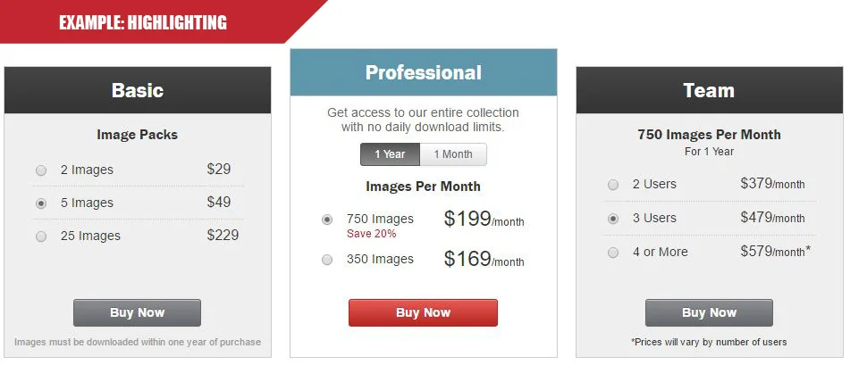
Setting one option apart from the others adds a strong push in that direction. You'll see this done in a variety of ways: changing the color of a Buy button on the promoted option; adding a “Most Popular” or “Recommended” or “Best Seller” tag; or fading the colors of the other options, to name a few.
The key to employing this technique is to highlight only one option. If you tag multiple options, the consumer still faces a difficult choice that may lead them to abandon the sale.
Using psychology of choice to sell more books on your #indieauthor website - by @JohnDoppler Share on XWe chose to tag the newest release with a brightly-colored “Hot Read!” tag to attract clicks. We will experiment further with A/B testing to find which wording, color, and style has the greatest impact.
OVER TO YOU
What marketing psychology do you use in your author website or mailing list signups? Have they been successful? Share your tips in the comments below!
Other Posts You Might Like

[…] When you’re selling more than just books for your income, clinching the sale is vital. There’s a psychology behind getting the sale and John is here to break down how you can employ a raft of techniques to improve your sales conversion rate. […]
[…] The Psychology of Choice by John Doppler […]
Reading this article I related to it as a consumer. I’ll have to look at my website to see what I can use to help with growing my audience.
Thank you for sharing!
Excellent article, thanks for the clear analysis.
What a super post! Yes, the number three seems to be magical in many contexts. Thanks for sharing this information and your experience.
Thanks for the info. This is something I can use with future websites.
I think I need to grit my teeth, and put up the short story prequel to my novel, and the totallly unrelated novelette, to have three things!
That way I can funnel – just have to do two covers, and some editing, and …
Thanks for the science and analytics.
Very informative article. Thanks for sharing. 🙂
🙂 Aren’t ‘consumers’ just such funny Lego people? But useful to know how the majority work when given some options! Thanks for this … Hopefully can ‘make’ more ‘consumers’ consume my books …
Terrific details, John. Thanks!