


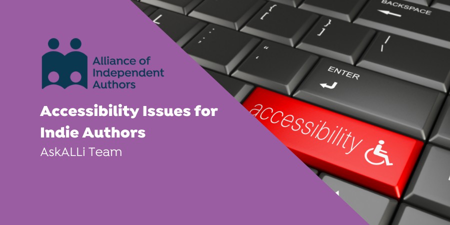
With the rise in advancing technologies, making our self-published books accessible to everyone is becoming easier and easier. In today's post from the Alliance of Independent Author's AskALLi team, we dive into accessibility issues for indie authors and how you can make your books more accessible. With thanks to ALLi Partner member Jens Troeger from Bookalope for his contributions to this post.
Accessibility Issues for Indie Authors: What's it all About?

Jens Troeger, Bookalope
Jens is a software veteran with an MS and PhD in computer science, who’s been building software for over thirty years. He is also a passionate typophile and book lover. Jens started Bookalope several years ago out of his personal need for efficient and intelligent tools that help him design print books and digital books. What started out as a pet project has now grown into a powerful yet easy to use commercial product. When Jens isn’t glued to his laptop, he often travels to remote places to dive and photograph underwater.You can find Jens Troeger on Twitter.
What is an accessible ebook, exactly? That’s the question I’ve never stopped asking. Over the years, I’ve helped numerous authors and publishers transform their book manuscripts into well-designed print books and accessible ebooks. They usually have a good idea of how the printed book should look, but haven’t thought much about its digital equivalent. And while many authors and publishers assume that a digital book is much the same as its printed counterpart, it is, in fact, an entirely different design incarnation.
Accessibility Issues for Indie Authors: The Difference Between Print and Digital
The best way to get you thinking about print books and digital books is by looking at them as two different presentations of the same content. Let’s refresh what we know about book content so far; it’s its text, images, and tables. The main narrative text is usually structured into chapters and sections. It may contain other elements like footnotes, endnotes, quotations, poems, and so forth. Traditionally, we express the text’s structure and elements visually; by changing the text size, fonts, and using white spaces. This visual expression is then printed onto paper — once printed, the book’s design doesn’t change anymore.
When I talk with authors about the digital incarnation of their books, I often ask them, “How would your book look on a small phone? Or on that big thirty-inch computer screen? What if I change the font and make it tiny or really large?” I’m trying to get authors to understand that the digital book obeys different visual design rules and so needs to be reconsidered entirely — the book has to be redesigned for the digital medium, as a digital product. It has to interact and compete with the wider range of print and digital books available; and this all starts with how you approach the designs of your book. Richard Hendel, a well-known book designer and author himself, summarized this duality of the book in the essay The conundrum of the Ebook, published in his book Aspects of Contemporary Book Design. It’s worth a read, if you’re curious about this topic! I think that if we can grasp this duality, we can begin to understand what designing accessible ebooks is all about.
Accessibility Issues for Indie Authors: Why Bother?
Like all serious authors and publishers, you care about your books and your readers. You’d like more people to buy your books and appreciate your work; that’s your objective. But I think that in addition to expanding the market reach of your books, you still want to be inclusive and respectful by making your books accessible to all readers, whether they live with an impairment or not. Overall, prioritising accessibility is crucial for your image as an author, and for your branding as a publisher.
In technical terms, then, we’d like to build accessible ebooks. Last year, Booknet Canada published a lengthy blog titled Accessible Ebook Publishing in Canada: The Business Case which details the many aspects of accessible ebooks and their relevance for business, illustrated with some interesting numbers that all emphasize the importance of accessible ebooks. In short, there’s no avoiding the necessity of building accessible ebooks in our current climate, and that’s why I think we need to up our design game.
Accessibility Issues for Indie Authors: Working with Rich Content
So, what can you do as an author to make sure that your book — print or digital — looks great for everyone, including impaired readers?
To answer that question, let’s take a look at how some people use assistive technologies to read digital content, websites, and ebooks. For example, your web-browser and most modern reading apps and devices have a “text to speech” feature which allows a book to be read out loud. You can try it out for yourself, and listen to a synthesized voice read back to you the content of a web page or an ebook. Chances are that what you hear is confusing; a stream of words stringed together in a seemingly random order — perhaps even without intonations, pauses, or changes in speech. This content is not accessible, and you’d have a similar experience with an electronic Braille reader presenting such content to a visually impaired or blind reader.
This is why it’s important to structure your book’s content; you don’t want the message to be lost in the medium. I’ve mentioned above that text structure is independent of presenting that structure visually — because with read-aloud or with a Braille reader there is no visual presentation of the book’s structure. And while ebooks have a well-defined way of implementing structured text, as an author you want to have an intimate understanding of your book’s structural elements: you need to know which paragraphs are chapter or section headings, which ones are narrative text, and which ones are poems or quotations. This shows you’re committed to creating the best version possible of your book, where all the different parts work together.
The same holds true for inline formatting. Traditional book design uses italics to emphasize text or for a phrase in another language, or to denote a book or article title, whereas bold text is occasionally used to visualize a strong emphasis. Notice how we differentiate between visual presentation (e.g. “italic” or “bold”) and its intended meaning (e.g. “emphasized”) — it is the meaning that you, as the author, want to be clear about, and that your book designer and ebook implementer must express in some visual way or another.
And then we come to images and illustrations; that’s where accessibility and ebooks get interesting. In print, we use images to support a narrative visually or perhaps to illustrate data correlations as graphs. For accessible ebooks, text is always preferred over an image, but often we can’t do that. To make images accessible, think about explaining and describing the image meaningfully in the context of the narrative. If you were to replace the image with a text box, what would a visually impaired or blind reader (or listener) of your book get in place of the image? This is called an “alternative text” for your images, and such alternative text needs to be meaningful and attached to every image and illustration in your book. Remember, it all comes back providing information to make your content accessible, and then presenting that content for different media.
When we work with images, we must also consider their color and contrast. There are different kinds of color blindness, which means that some readers won’t be able to see your pictures the way you do. One solution would be to change the picture itself — e.g. working with black-and-white or avoiding certain colors. In any case, we must constantly ensure to supply a meaningful alternative text for our images. In addition, it is good practice to avoid inlining images into the text flow. Large drop caps, foreign language letters, or mathematical formulas must be made part of the content as text to ensure that they are accessible and meaningful to the reader.
Dyslexia is another important aspect to keep in mind. It is a reading disorder that can manifest in different ways, and you can get a sense of how a dyslexic reader may perceive text on this website. Modern ereader apps now ship with typefaces that are especially designed for dyslexic readers; their letters are purposefully irregular in order to break the symmetrical and monotonous design of common text faces.
While less common, tables also need to be considered carefully when we rethink our content for an accessible ebook. We often spend a lot of time formatting a table for a printed page; yet, for an ebook, we’d need to reconsider whether a table would work at all! Here, too, it helps to imagine how a table would look like on a phone display; both in portrait and landscape mode. Maybe for an ebook a table isn’t a good choice at all, and we’d want to explore alternative ways to present the content, such as a bullet list or as plain text. Whatever we choose, the goal is to consistently strive towards an intelligent and inclusive book design which will resonate with all types of readers independently of the type of reading medium.
Accessibility Issues for Indie Authors: Piecing it Together
By now you’ve probably noticed that authoring content which works well for both print and accessible ebooks requires some more work than most people realise. But I believe it’s worth the effort, and not only for the sake of your readers. It challenges you, the author, to understand your text and its intended structural presentation from the inside out; with no page left unturned.
Now that we’ve edited our manuscript, understood the intended structure of our content, and come up with helpful alternative text for all images, one question remains… How exactly do we create a functional, valid, and accessible ebook? Well, in the same way we go about creating a well-designed print book; we find a good designer, or we find a good tool that does the work efficiently and reliably for us.
Bookalope is a tool that publishing houses, book designers, and self-publishing authors alike use to create fully accessible ebooks with just a few clicks. Being a software veteran by trade, I’ve built the Bookalope toolset over years of working with digital and print books. My mission is to make the process as easy and comfortable as possible for myself and other professional users. I want to put the creativity back into the book design; minimising effort but maximising quality. So, here is a brief introduction to creating accessible, beautiful books using these tools.
After uploading your manuscript, the Bookalope AI gets to work; it analyses the visual styling of the text to extract the intended structure — exactly what we’ll need for making the ebook accessible. Sometimes, the original visual styling is a little ambiguous, or it’s something Bookalope hasn’t encountered yet. But we can still review and adjust the extracted rich content. And that’s almost all there is to do, before you can download your accessible ebook.
While Bookalope takes care of almost everything for you, you may still be curious about some ebook technicalities, and might want to ensure that your ebook is indeed valid and accessible. Here’s what you’d need to do next…
The easiest way is to open the ebook yourself on your phone, tablet, or laptop and see how it looks; then, have it read back to you. On your laptop, resize the window of your reading app or browser, change the font size, and invert the color theme. Make sure that the table of contents is linked into the book, and that the glossary and index are linked throughout. Traditionally, both reference the page numbers of the printed book, so make sure that those print page numbers are also built into your ebook.
If you’d like to get even more technical, you can have the ebook checked by EPUBCheck to make sure it’s implemented properly, and by the Ace tool to check if the built-in accessibility information (if any) is valid. If you’d like to take your tests to the next level, check out Flightdeck!
Bookalope does all of that for you, though, so you don’t need to worry. If you’re having your ebook built by a vendor, you should always ask them to provide you with these validation results.
Accessibility Issues for Indie Authors: Summary
At first, this all may seem like a daunting process. Granted, it takes some additional effort to prepare and enrich your book’s content, but building an accessible ebook is its own reward. And, with the right tools like Bookalope, it’s not that difficult to do.
In the end, you’ll have a good chance of increasing your book’s market reach. Your readers will be thankful for your efforts, and will be able to enjoy your writing no matter how they consume your book. To me, that’s the answer to what makes an ebook accessible and inclusive; designing a one-of-a-kind book product that touches the hears and minds of all readers. And isn’t that why you wrote your book in the first place?
Accessibility Issues for Indie Authors: 4 Quick Tips
Vellum – Large Print
Large print books are books that are formatted and printed with much larger typeface than usual. Vellum is a formatting software designed to make formatting your books easier, quicker and more intuitive. And it really does do just that. One of the benefits of Vellum though, is that it has presets that can help you turn your book into a large print edition in just the click of a button.
When you create a large print edition, make sure you increase your trim size and font size. It also helps to create some kind of stamp, sticker or indicator that goes on the front of the cover to promote the fact its large print. Once your large print book is loaded, you'll need to connect it to the sales page of your other book editions and don't forget that because it's a new format, you will need a separate ISBN
Closed Captions
According to Wikipedia,
“Closed captioning and subtitling are both processes of displaying text on a television, video screen, or other visual display to provide additional or interpretive information.”
You might not realize, but there is actually a difference between the two. Subtitles assume that the viewer can hear the audio. Whereas closed captioning assumes the viewer cannot. So as well as providing dialogue information, it will convey information like background noises, phones ringing and other auditory clues.
YouTube provides the opportunity for close captions on all your videos. Go to the creator studio, click edit video and then subtitles/CC to edit. You also have the option to upload your own subtitle files.
Rev.com is often cited as one of the best closed captioning softwares on the market. If you use transcription software then you can use that to load up your captions.
Audio Books
Are your books in audio yet? The audiobook market is booming. You only need to read our weekly International Insights to know that in some parts of the world…
“Sweden reaches the tipping point where digital books, and especially audiobooks, are on the brink of outselling print.”
And the audiobook market is still comparably young compared to print and digital. But for those who are either visually impaired and therefore listen to audio, or those that prefer audio anyway, you're missing an entire market and section of your potential audience. If you don't want to record and narrate your own audiobooks, consider searching for a narrator through places like Findaway Voices.
Digital Devices
Technology has advanced considerably in the last few years, and reading has become infinitely more accessible since the advent of the Kindle and other digital reading devices. These devices have the ability to produce high contrast reading displays, different colored backgrounds, font changes like using OpenDyslexic—a purpose created font—for those people with dyslexia that prefer it. If your books are only in print, then it's time to turn them into digital ebooks.
Accessibility Issues for Indie Authors: A Final Word
If you'd like to read or download guidelines on creating accessible books, Dave Gunn has written a guide that was published by the Accessible Books Consortium, in conjunction with the International Authors Forum. To download click here.
Excellent points…thank you for making them.