Last year ALLi was pleased to support the International Authors' Forum‘s guidelines to help indie authors make ebooks more accessible to the print-disabled, i.e. those who cannot easily access conventional print books, whether due to visual impairment, dyslexia or other reasons. (See Related Posts below.)
We were therefore very interested to hear of a similar initiative by one of our author members, A A Abbott, to produce special editions of her own paperback books for dyslexic readers. Here she shares with us why and how she did this, and appeals to fellow indie authors to blaze a trail in this field.
As a young child, I learned to read and write in what seemed like the blink of an eye. The world of books unfolded, bringing knowledge and adventure.
Not all of my relatives have been so lucky. Parallel threads run through my family: each of the last three generations has included at least one writer, one engineer and one dyslexic. My grandfather, a dyslexic engineer, achieved great things in his profession but wouldn’t pick up a book for pleasure.
It's a common story.
10% of the British population is estimated to have dyslexia, including celebrities like Richard Branson, Jamie Oliver and Keira Knightley.
In many ways, life is easier for them than in my grandfather’s day. The condition is better understood. There are digital aids for reading and form-filling. E-books and talking books make fiction accessible.
It would also be a simple matter to format books so they’re easy for dyslexic adults to read. Surprisingly, no one has done this in the UK – until now.
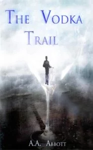
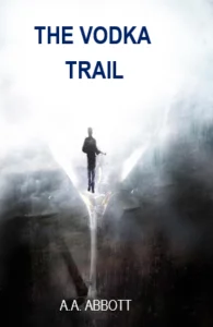
I decided to issue new, dyslexia-friendly editions of my last two crime thrillers, The Bride’s Trail and The Vodka Trail, once I realised how simple it was. The impetus was a conversation with an independent bookseller, Alistair Sims.
Meet the Dyslexic Bookseller
Alistair Sims, who owns the bricks-and-mortar bookstore Books On The Hill in the gracious Somerset seaside town of Clevedon, is himself dyslexic. He makes sure to stock an excellent range of books for dyslexic children and young adults, attracting customers from miles around.
It’s a source of frustration to him that mainstream publishers ignore dyslexic adults completely, choosing only to service younger age groups.
We both agreed that indie authors were uniquely placed to fill that gap.
To borrow from corporate-speak, indies are focused on solutions.
We’re not afraid to try something new, and we can get books published quickly. Within two months of meeting Alistair, he was stocking my dyslexia-friendly paperbacks in his shop.
What is a Dyslexic-friendly Print Book?
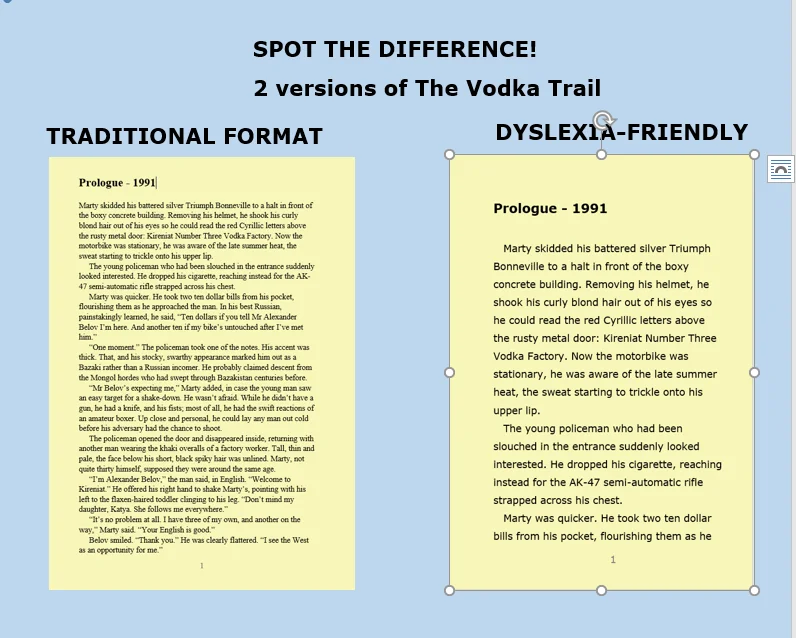
So what makes a paperback dyslexia-friendly? Alistair suggested I read the British Dyslexia Association Style Guide, which recommends:
- a large sans serif font
- wide line spacing
- black text on a cream background
I also investigated specialised fonts, such as Dyslexie, road-testing them on dyslexic relatives. However, they found conventional sans serif fonts just as easy to read provided the text was made large enough. It seemed the special fonts didn’t perform any better than Verdana, which came out well in comparison tests by the BDA New Technologies Committee. I therefore chose 14 point Verdana with 1.5 line spacing, and, of course, cream paper.
This makes the books nearly three times as thick as my traditional editions, and I sell them at a higher price to cover costs, but they’re still affordable.
The format also works well for readers who suffer from visual stress or sight defects.
Writing style is also important. I’ve deliberately written my thrillers in an easy reading style: they’re fast-paced and fun, with bite-sized chapters.
The new editions are available to the book trade through IngramSpark and online via CreateSpace at RRP £16.99 for a very thick paperback!
What I Learned
There have been teething troubles, too. As I used different ISBNs, my existing reviews didn’t show up on Amazon’s listings for the new editions.
Even though they’re linked now, you have to know what you’re looking for to find the dyslexia-friendly paperback versions. It’s early days, and there’s still a lot to do to spread the word.
The Net Result
Of course, the real proof is how readers react. I handed the new edition of The Bride’s Trail to my dyslexic brother-in-law. “I usually like stories about space battles,” he said, “but I read half your book in a morning. You’ve provoked my curiosity – I’m definitely finishing it.”
“I want more indie writers to do this,” I told him. “As soon as there’s a dyslexia-friendly book about spaceships, you’ll be the first to know.”
How about it, indie authors? Why not try a dyslexia-friendly format, and give the forgotten 10% some great new books to read?
OVER TO YOU Have you ever published dyslexic-friendly print books? Have you advice to share? We'd love to hear about your experience.
How to #selfpublish books for #dyslexic adults - and why - by @AAAbbottStories #dyslexia Share on XOTHER POSTS ABOUT BOOKS FOR PRINT-DISABLED READERS
https://selfpublishingadvice.org/reaching-all-our-readers-making-books-that-everyone-can-read-katie-webb-maribel-steel/



[…] How to Print Dyslexia-Friendly Books – and Why by AA Abbott […]
[…] How to Print Dyslexia-Friendly Books – and Why by AA Abbott […]
[…] How to Print Dyslexia-Friendly Books – and Why by AA Abbott […]
[…] How to Print Dyslexia-Friendly Books – and Why by AA Abbott […]
[…] How to Print Dyslexia Friendly Books – and Why […]
[…] doing some research and finding this article, I decided to publish my books with dyslexia friendly font. I agree with the articles author, that […]
[…] How to print dyslexia friendly books – and why […]
[…] How to Print Dyslexia Friendly Books – and Why (Selfpublishing Advice) […]
After a head injury in my teens, I have issues reading, too, that developed much later in life. When I published my books, I used an 11 pt Century Gothic sans serif with 13.2 pts leading. I read in a blog somewhere (sorry I can’t find it to credit), to adjust the justification to help make it easier to read–so in InDesign I modified the Normal style as follows: Word Spacing to minimum 80% – maximum 133%; Letter Spacing min -3%, and max to 3%; and Glyph Scaling min -97% and max to 103%. Auto Leading set to 120%. Ultimately, I think it “tightens” up the words and leaves more white space between words. I chose not to create a different version with a “standard” font — because it’s easier for everyone to read. I had compliments from readers often, which confirmed my choice. My only negative comment was from a writers’ group lead–who was snarky about everything anyways. After he berated me as a rookie (among other negative comments), I politely explained my research and reasoning. He had no grounds for argument and became rather humble (for a moment, anyways).
I’m just preparing a run of my children’s books in dyslexia-friendly format, black text on cream paper wide-spaced with a large Comic Sans MS font, and as they are for children I’m using the largest trim size routinely available.
Also, being for children, I have British-English and American-English editions, as this is a concern of teachers and school librarians.
I also have standard large-print font editions for the visually impaired, again in US and UK English versions.
For my adult titles dyslexic-friendly editions in a comfortable 6×9 trim and an appropriate adult font are on the To Do list.
This is where CreateSpace really comes into its own as we can put these niche market titles out with no upfront costs, offering consumers what they want.
It’s also great for discovery.
For example, my seven part children’s series gives me seven UK-English regular font, large print and dyslexic paperback editions, and the same again in US English, giving me 42 “titles” for the seven books.
For ebooks US and UK English versions, so another fourteen discovery points there, and then audio-books, of course, and then translations with the ebook edition and then regular, large -print and dyslexic editions for each title (and working on the first audio-translations too.
That’s a lot of discovery points and lots of trickle revenue streams that collectively mount up, all with no “new” writing involved.
[…] to the rest at the Alliance of Independent Authors and thanks to Felix for the […]
I actually did this by accident. The first batch of books I sent to the printers had a bigger font and quite a bit more space between the lines than I had intended, but it wasn’t like there was really anything wrong with them, so I took them with me to conventions and sold them anyway.
Since then I have had several people come up to me at later conventions, telling me they really appreciated how easy my books were to read, even though they had dyslexia.
Since then, I’ve just kept formatting my books that way.
I’m seriously considering doing this, especially since I write Young Adult. I
would really like to know if we should or should not justify the book. The paragraph in my regular books are all justified but for a dyslexic person, does it make a difference?
I worked to raise some money for Dyslexia Action and my books are now large font, cream paper and short chapters. Would be great to see more adult books too. http://hyperurl.co/hhb23u
A great post! Many thanks. Interestingly when my chapter book for 7-10 year-olds, Eeek! The Runaway Alien, came out I was asked by LoveReading4Kids if I had aimed to make it dyslexia friendly. I hadn’t, but I had thought carefully about the type size, line spacing and font — as well as breaking up the text with images — because my aim was to encourage reluctant readers. The typeface is Georgia, not Verdana, but it’s still reasonably easy on the eye. While this isn’t one recommended to help dyslexic readers, I’m glad to say that the feedback I’ve had from parents, teachers and a reading charity is that it has encouraged many children to read who otherwise might have shied away from a book.
I’m writing a series of HiLo books for my dyslexic 11-yr-old son. I’d been thinking I needed to be rethinking my novels for adults. Timely post, thank you!
What a shame the article was not printed in the way suitable for dyslexics.