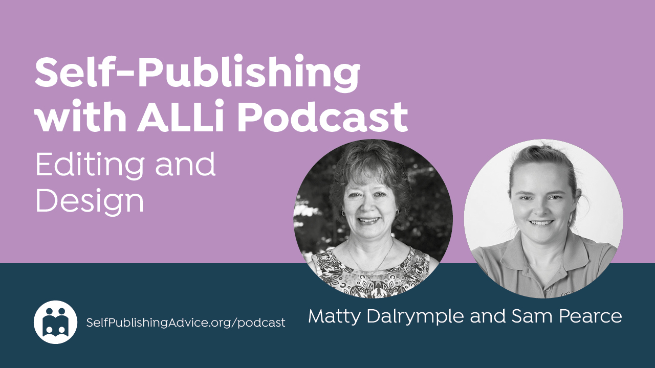
In this episode of the Self-Publishing with ALLi Podcast, Matty Dalrymple talks with publishing strategist and book designer Sam Pearce about the invisible design rules that shape a reader’s experience. They explore how readability, typography, layout choices, and genre conventions can make—or break—a book. Learn about how to create professional, reader-friendly interiors that strengthen your brand and boost your success as an indie author.
Listen to the Podcast: Design Rules That Make or Break a Book
Thoughts or further questions on this post or any self-publishing issue?
 If you’re an ALLi member, head over to the SelfPubConnect forum for support from our experienced community of indie authors, advisors, and team. Simply create an account (if you haven’t already) to request to join the forum and get going.
Non-members looking for more information can search our extensive archive of blog posts and podcast episodes packed with tips and advice at ALLi's Self-Publishing Advice Center. And if you haven’t already, we invite you to join our organization and become a self-publishing ally.
About the Host
Matty Dalrymple podcasts, writes, speaks, and consults on the writing craft and the publishing voyage as The Indy Author. She has written books on the business of short fiction and podcasting for authors, and her articles have appeared in Writer’s Digest magazine. She serves as the campaigns manager for the Alliance of Independent Authors. Matty is also the author of the Lizzy Ballard Thrillers, beginning with Rock Paper Scissors; the Ann Kinnear Suspense Novels, beginning with The Sense of Death; and the Ann Kinnear Suspense Shorts, including Close These Eyes. She is a member of International Thriller Writers and Sisters in Crime.
About the Guest
Sam Pearce is a publishing strategist, award-winning book designer, and founder of SWATT Books. With more than twenty years of experience in design and more than 250 books published across fiction, nonfiction, memoir, and business genres, she is known for making the publishing process clear, professional, and author-empowering. A four-time author, she specializes in helping writers turn manuscripts into credible, well-crafted books that stand out in the marketplace, and she is a forthright advocate for authors who believes every strong story deserves to be published well. Pearce can be found on her website, LinkedIn, Facebook, Instagram, and YouTube.
Show Highlights
This blog post was produced using ChatGPT based on the interview transcript.
Matty Dalrymple talks with publishing strategist and book designer Sam Pearce about the interior aspects of book design, including typography, readability, layout choices, and how these elements shape the reader experience. They explore the invisible rules that influence how readers engage with both fiction and nonfiction books, especially in the context of indie publishing.
SAM’S PATH INTO BOOK DESIGN
Sam describes beginning her career in corporate graphic design before shifting into book design during the 2009 economic downturn. After being made redundant, she founded her own agency. One of her early clients—a book printer—began sending her authors who needed design help. She discovered she loved book design and typesetting, noting that it fit her “weird hybrid creative slash analytical brain.” Eventually, a client asked whether she could also manage the publishing process, which became the catalyst for her company, SWATT Books. Fifteen years later, she has designed and published more than 250 titles.
THE EMOTIONAL EXPERIENCE OF READABILITY
A core theme of the conversation is Sam’s assertion that “readability is an emotional experience.” Readers may not know typography terminology, but they instinctively know when something feels easy or difficult to read. Poor design increases cognitive load, pulls a reader out of the story, causes fatigue or headaches, and diminishes engagement—even when the writing itself is strong. Sam explains that “good book design is supposed to be invisible.” When design is done well, readers don't think about it. When it's done poorly, readers can’t stop noticing that “little itch of something not sitting right.”
Matty offers an example: she finds that mass market paperbacks often feel “claustrophobic” due to narrow line spacing. Sam confirms that this discomfort is rooted in design choices, not content.
CHOOSING FONTS AND WHAT E-READERS REVEAL
Matty asks how authors can better understand reader preferences, especially given the customizable options on e-readers. Sam explains that publishers typically cannot see reader-level data, but the limited approved fonts on platforms like Kindle suggest that certain typefaces have been proven to enhance readability. She notes that Amazon has chosen a small set of fonts for good reasons, including one designed for dyslexic readers. For authors on a tight budget, reviewing these pre-approved fonts can help guide thoughtful choices for print interiors.
FORMATTING FOR DIGITAL AND PRINT
Matty raises the topic of formatting elements like text messages or faux newspaper clippings. Sam agrees these can enhance immersion when used with restraint and consistency. She stresses that authors should first list all formatting needs for their manuscript—chapter headings, body text, special elements—and create a small set of styles that accommodate those needs. Consistency matters, especially in nonfiction, where hierarchy plays a crucial role in helping readers follow complex ideas.
Matty shares a challenge she encountered with one formatting tool that had insufficient subheading levels for nonfiction. Sam notes that fiction and nonfiction have different demands but the process is the same: identify needed design styles, then apply them consistently. Using Word styles or similar tools helps prevent drift in formatting over time.
GENRE NORMS AND READER EXPECTATIONS
Sam emphasizes that genre conventions extend to interior design. Romance often uses softer, more flowing fonts, whereas science fiction might use bolder or more futuristic ones. Adhering to these norms helps readers quickly identify a book’s category and keeps online algorithms from becoming confused. Breaking genre expectations can harm discoverability, especially on Amazon.
Matty asks how authors can decode genre norms if they’re not designers. Sam recommends researching bestselling books in one's niche. With modern tools, authors can screenshot pages and run them through image-recognition software to identify fonts or find equivalents available in programs like Word or Canva. She also notes that authors can search online for recommended font pairings—for example, body text fonts that match well with certain header fonts.
CREATIVE DESIGN ELEMENTS
They discuss how imaginative elements—such as using symbols for scene breaks or illustrated chapter headings—can add personality without harming readability. Sam advises authors to think laterally about symbols or themes in their stories, selecting simple visual representations rather than overly literal or complex ones. Matty notes examples like using a horseshoe instead of a full horse illustration.
Sam reiterates that creative additions must serve the story and remain consistent. She highlights the importance of using beta readers to ensure that design choices don’t overwhelm or distract. Authors often become “blind to what's actually there” after long hours with a manuscript, so outside feedback is vital.
ALIGNING DESIGN WITH BRANDING
As the conversation shifts to marketing and author branding, Matty explains how she uses the distinctive title font from one of her series in promotional materials but limits its use to a few words because it becomes difficult to read in longer blocks. Sam agrees and expands on how interior and exterior design decisions influence author branding, series cohesion, and long-term reader engagement.
She notes that readers often encounter book visuals before reading the description, especially in social media or ads. Consistent visual branding—across covers, interiors, and marketing materials—helps readers immediately recognize an author’s work. This contributes to a book’s lifecycle: “Will they finish it? Will they leave a review? Will they recommend it to a friend? Will they then read the next book in the series?” Good design supports each of these steps.
THE ROLE OF DESIGN IN INDIE PUBLISHING SUCCESS
Sam returns repeatedly to the point that independent authors act as both writer and publisher, meaning they must weigh creative choices against reader expectations. Book design is not merely aesthetic; it impacts discoverability, readability, and perceived professionalism. She reminds authors that once a book enters the publishing stage, the focus should shift from the author’s preferences to the reader’s needs.
Matty appreciates the idea that interior design can serve as both a readability tool and a promotional tool, reinforcing author identity and enhancing the reader’s emotional connection to the book.
CONCLUSION
The discussion underscores that interior book design, typography, layout consistency, and genre-appropriate formatting are central to creating a smooth reading experience and maintaining reader engagement. Sam encourages authors to approach design strategically, think about the emotional impact of readability, and use research, templates, and beta reader feedback to guide decisions. The episode highlights that thoughtful interior design is one of the most effective yet often overlooked tools available to indie authors.


