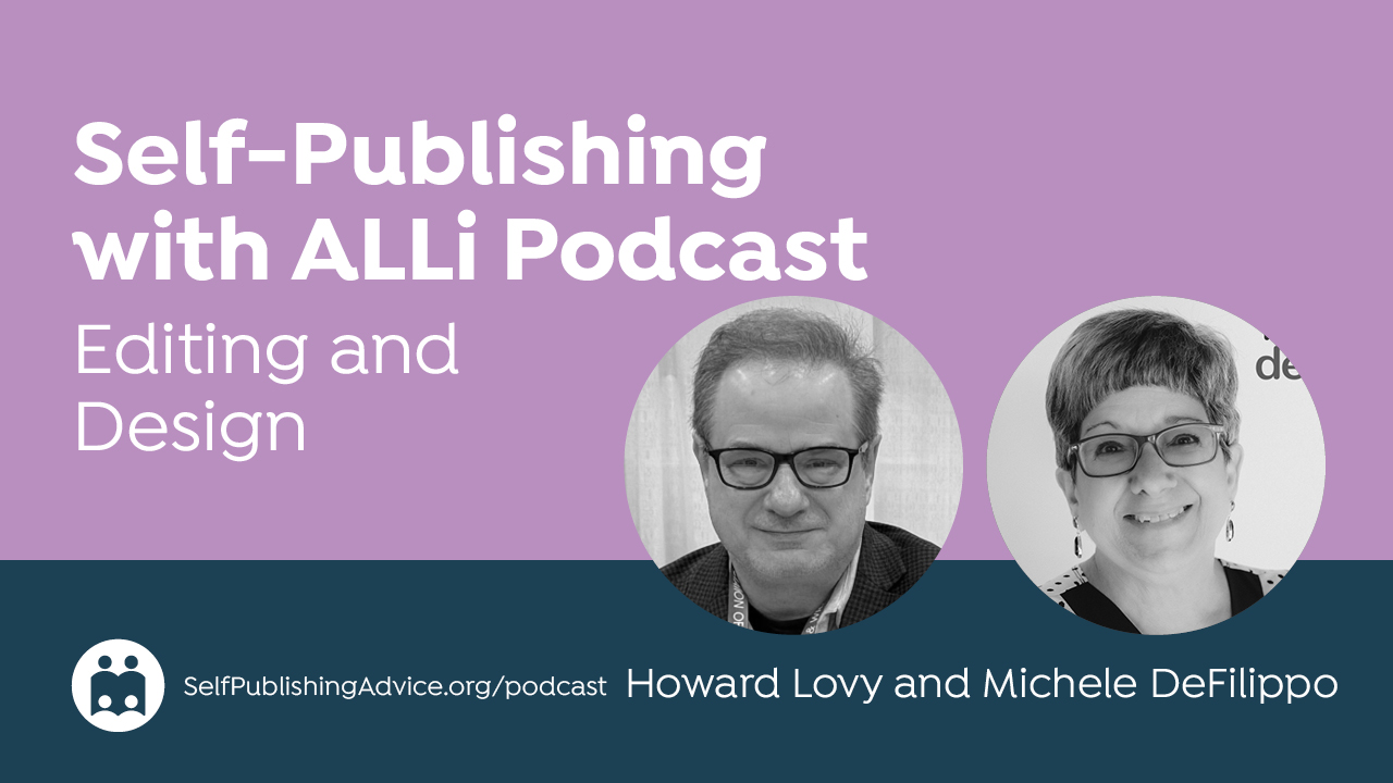
On the Self-Publishing with ALLi podcast, host Howard Lovy talks to Michele DeFilippo, founder of 1106 Design, about the role genre conventions play in professional book cover design. Michele explains the visual signals that help readers recognize a book’s category at a glance, from the authority expected in business books to the mood and atmosphere that drive fiction covers. She also discusses the thumbnail test, common amateur mistakes, the danger of cramming too much information onto a cover, and the importance of giving designers enough room to create a cover that serves both the author and the marketplace.
Listen to the Podcast: What Genre Conventions Teach Authors About Professional Book Cover Design
About the Host
Howard Lovy is an author, developmental editor, and writing coach with a long career in journalism and publishing. He works with writers at many stages of their careers, with a focus on helping them develop their ideas and strengthen their work while preserving their unique voices. He lives in Northern Michigan.
About the Guest
Michele DeFilippo has more than fifty years of experience in book publishing. Her company, 1106 Design, helps authors publish high-quality books, keep control of their work, and earn more from each copy sold. Michele is committed to helping authors ask the right questions, avoid scams, and make informed decisions when choosing publishing service providers. A PDF of her eighty-eight-page guide, “Publish Like the Pros: A Brief Guide to Quality Self-Publishing,” can be downloaded for free.
Thoughts or further questions on this post or any self-publishing issue?
 If you’re an ALLi member, head over to the SelfPubConnect forum for support from our experienced community of indie authors, advisors, and team. Simply create an account (if you haven’t already) to request to join the forum and get going.
Non-members looking for more information can search our extensive archive of blog posts and podcast episodes packed with tips and advice at ALLi's Self-Publishing Advice Center. And if you haven’t already, we invite you to join our organization and become a self-publishing ally.
Read the Transcript
Howard Lovy: Hi, I'm Howard Lovy and this is the Self-Publishing with ALLi podcast. I'm an author, developmental editor, and writing coach at howardlovy.com. I spend most of my time working with words, but today we're focusing on something just as important — what readers see before they read a single sentence. Last month we talked about how authors can communicate effectively with designers. Today we're narrowing the focus to genre design: how covers instantly tell readers whether a book is romance, fantasy, memoir, business, thriller, or something else entirely. My guest is Michele DeFilippo, founder of 1106 Design. Michele has more than 40 years of experience in publishing and is known for helping indie authors create books that meet professional publishing standards while still maintaining creative control. Michele, thanks for joining me.
Michele DeFilippo: Thank you for having me, Howard. I hope I can be useful to your listeners.
Background: From Typesetting to 1106 Design
Howard Lovy: Before we go into the topic, tell me a little more about you and 1106 Design.
Michele DeFilippo: I've been in the publishing industry since 1972 in various roles. For a lot of that time I owned a typesetting business, from 1980 to 1993. We did old-fashioned typesetting for books and all kinds of materials — annual reports, car ads, you name it. That ended when Steve Jobs invented the Macintosh. One by one, all my customers went out and bought Macs, and I basically had to follow them and close the typesetting business and work with the more modern tools.
Howard Lovy: But you managed to land on your feet. Same with me — I started at a newspaper on a manual typewriter, and then in the early '80s they brought in this funny little green screen and we didn't know what to do with it. So tell me how you founded 1106 Design.
Michele DeFilippo: 1106 was founded right around when Amazon came on the scene, maybe a few years after. After the typesetting business ended I went back to freelancing as an individual, but then I started hearing about self-publishing and thought, well, I can do that — we've actually done that for customers for many years. So it started small in 2001, just me, myself, and I. Over the years I started adding people, cover designers, and then authors started asking me whether I did editing. I said yes, if I can hire somebody to do that. Little by little the company has grown — now we have a team of 20 people who I bring in and out depending on the nature of the book and who would be the best fit. We've done 4,000 books since 2001.
Howard Lovy: Wow. But who's counting, right? So we're going to focus on design specifically — and not only that, but how to design for a genre. Indie authors are an independent bunch and sometimes we don't follow genre conventions, and sometimes there's a mix of genres. But tell me how genre conventions dictate the first draft of what you do.
The Big Picture: 80% Genre Conventions, 20% Creativity
Michele DeFilippo: The big-picture answer is that a book has to look like what it is. Cookbooks look different from business books. They look different from memoirs. Spiritual books have a certain look and feel. Test preparation books have a certain look and feel. It's really important to signal to the book browser — before they even read your title — what kind of book this is. You have to make that mental match with them before they learn more. I would say the most successful book covers are 80% genre conventions and 20% creativity. It's not cheating, and it's not a lack of creativity to stick to those conventions. It's basically shorthand that tells the buyer: yes, I'm in the right place, let me learn more.
Howard Lovy: I guess I haven't really thought much about what those conventions are, but I know them when I see them. I know a romance cover when I see it. Science fiction has a certain kind of font, maybe a few spaceships or aliens. Is there a lot of room to play around within those conventions?
Michele DeFilippo: Oh, sure — there's always room for creativity and for meeting the author's vision. But it's important to remember that the conventions aren't accidental. For nonfiction books, which are selling information, readers expect the cover to provide that information so they can make up their minds. That usually means the cover is primarily composed of typography — heads, subheads, maybe more than one subhead — with imagery somewhat downplayed. With fiction it's just the opposite. Fiction is selling an atmosphere, an emotion, an experience, entertainment. So imagery is far more important, and the fonts are a little fancier than they might be in a nonfiction business book.
Business Books: Authority Over Everything
Howard Lovy: Let's dive into business books, because I've been editing a lot of those lately. Some of the books I edit combine how-to with a little memoir mixed in with advice. The obvious instinct is to put a picture of the author on the cover. But unless the author is already famous, does that really work? Or are business books primarily typography because we don't know who this person is?
Michele DeFilippo: You're exactly right about the author photo question. Definitely yes if the author is already well-known. If they're not, the answer is maybe. We've worked on books where the author wants to become well-known, so they put their picture on the cover — that telegraphs to people that this author is important. But business books above all need to look authoritative. If you wanted to pick one word to describe a business book cover, that's it. You wouldn't want to get too fancy or decorative.
Howard Lovy: Now how much do designers actually — and I mean this seriously — listen to the author in terms of design? There are two different parts of the brain — the author brain and the designer brain — and they often don't mix.
Michele DeFilippo: The way I'd answer that is: the author and the designer should be on the same page about what they want the cover to accomplish. Some designers just ask the author what they want, and then do it. But the cover isn't really about the author — it's about what the buyer expects to see, and what's going to convert that book browser into a book buyer. That's where genre conventions come in, and that's where professional design comes in.
Howard Lovy: This is an audio podcast so it's hard to picture, but try your best — what does a business book need in terms of typography and imagery?
Michele DeFilippo: The font needs to be serious. It can be sans serif or serif — that's where some creativity comes in. But the cover text on a business book is really important. The title can be factual, explaining immediately what the book is about, or it can be a little quirky and creative, with the subtitle describing what the buyer is going to get. We all need to recognize that people look at a book cover for only a few seconds, which is terrifying — we have to communicate to them before they're even consciously thinking about it what this book is, and help them conclude that they want to learn more. The cover should make people stop and want to know more. After that, we can't know their subjective needs, but we want to make sure the cover tells them this is written by someone who knows what they're talking about and can solve their problem. That's why the design of a business book should be serious more than anything else.
Nonfiction Genre Conventions: Cookbooks, Self-Help, Memoirs, Spiritual Books
Howard Lovy: Let's go through some of the genre conventions and stick with nonfiction for now. Cookbooks, self-help books, memoirs, and spiritual books — what kind of look does each have?
Michele DeFilippo: When we start a cover design, you want to figure out first what emotion is involved. A cookbook is a blend — it's not as information-heavy as a business book, but it's a how-to book, so people want to see the results of what they might get if they buy it. The covers tend to have a lot of photography: deliciously plated food, much better-looking than we can usually manage at home. We want to elicit that emotion — that looks mouthwatering, I'm bound to find something in here I'll love. So it's full-color photography, bright colors — food colors, green, yellow, red. Never blue, because there is no blue food. And I know the first thing people say is ‘blueberries are blue' — well, they're not. They're purple.
Howard Lovy: So I'm going to spend the rest of the show trying to think of a blue food. Go on.
Michele DeFilippo: Maybe blue popsicles. But that's the color palette for a cookbook. For a spiritual book we're going for a different emotion entirely — the buyer is looking for comfort, inspiration, something much more ethereal. So the colors would more than likely be pastels, white, violet. The imagery might be clouds, sky, flowers. A very different look.
AI and Book Cover Discovery
Howard Lovy: This wouldn't be a podcast in 2026 if I didn't ask about AI. Both of us have been in this business a long time — I've been a journalist, writer, and editor for 40 years, and I'm dealing with AI now. What is the proper place you think AI has in terms of coming up with ideas for book covers?
Michele DeFilippo: AI has certainly changed everything. Book cover design has always been about the shelf — whether it's an online shelf or a bookstore shelf — and always about visual conventions, how we're visually going to attract that reader and turn them into a buyer. AI is good at that, but what it's doing is taking those visuals that the designer and author create together and generating data from them. So we want to make sure the visual hook is there, just as it would be on a physical shelf. We also want to make sure the right keywords are there so AI tags the book correctly, so that when somebody goes to ChatGPT and says ‘can you recommend a book about…' whatever they're asking about, AI will see that structured signal and recommend your book. It's basically what we've always been doing, but automated and somewhat hidden. That's a little concerning. We just have to think about it when we're designing.
Howard Lovy: Do you use AI in any design work at your company?
Michele DeFilippo: No. We're entirely human. We talk to the author, we find out what they want, we research what's being done in cover design right now — because what the author is asking for might be something that would make the book look self-published when Amazon displays it next to the bestsellers. We never want that to happen. So it's always a back and forth, a collaboration. Sometimes we get into trouble, but we will always push back and say, ‘we really don't think you should do that, and here's why,' and we give examples and try to explain our reasoning.
Howard Lovy: Do you have a team of designers working with you, in-house or freelance?
Michele DeFilippo: I have several designers who work with us, and as I said, some are better with fiction and others with nonfiction business books. I always assign the cover to the designer who's right for the job.
Fiction Genre Conventions: Fantasy, Sci-Fi, Thriller, Romance, Children's Books
Howard Lovy: Let's talk about fiction now. Like you said, fiction is more about emotion than information. My own experience: I came out with a novel a year ago, worked with a designer, and I was telling her all these scenes in the book, what the characters looked like, what happens. She politely took it all in and then gave me a cover that had none of that in it — but it was pure emotion, and it worked. I'm incredibly happy that she didn't take me so literally.
Michele DeFilippo: What happened there is very common. The author is very close to everything they've written and very attached to the scenes, but that's almost the kiss of death for cover design. We call it the kitchen sink syndrome — the author wants to put every scene, everything in the book on the cover. And that confuses readers. It also confuses AI, because human viewers can only absorb so much information at once. What you want to go for on the cover is the emotion. You don't want to tell every aspect of the story. And AI thinks just like humans in that regard — don't confuse humans, and don't confuse AI if you can help it.
Howard Lovy: By confusing AI, you mean the algorithm that sells it on Amazon and similar?
Michele DeFilippo: Not only Amazon anymore — through ChatGPT and other apps as well. AI is looking for structured data. If you give it ten things to think about, it's going to get confused and won't know who to recommend your book to. If you keep that cover simple and focused, AI will see that and recommend it to the people who are looking for exactly your kind of book.
Howard Lovy: Tell me about the conventions in the different kinds of fiction — fantasy, science fiction, thriller, children's books. What are the different conventions?
Michele DeFilippo: Fantasy books are unique. What we're looking for is an epic story — maybe dragons and swords and maps of strange places, things we can only imagine. But not all of those at once — maybe just one of those elements. The colors are usually very deep: purple, silver, something like that. The fonts are usually decorative. A fantasy book is typically old-world, creating a place and characters and a time that doesn't exist. That's very different from sci-fi. Sci-fi is all about the future, so the look might be more futuristic and technical — space, spaceships, tech imagery, stars.
Howard Lovy: I'm glad to hear you differentiate between fantasy and sci-fi, because for some reason those two genres get lumped together, and they're so completely different.
Michele DeFilippo: They are. The readers of those genres are looking for different experiences, so we have to signal on the cover what this book is about so they immediately — before they even think — recognize ‘this is the kind of book I'm looking for.' In sci-fi the fonts might be geometric, sans serif. Not exclusively, but that's the direction you'd want to go. Then there's the thriller — all about danger and mystery. The design should be bold, with bold colors like red or black, and the type should be bold and blocky. We're looking to create energy on the cover. But again, we're not showing everything — you wouldn't put a figure and a gun and a restaurant all together. You don't want to confuse the reader.
Howard Lovy: Are there any trends right now in fiction covers? Last month we talked about how typography with no images is really big right now.
Michele DeFilippo: Fiction is more about imagery, with typography playing the secondary role, and nonfiction is more about information, so typography plays the major role and imagery is more downplayed. That's the distinction I'd stand by.
Howard Lovy: What about children's books? You're trying to appeal to children, but it's the parents who are actually buying the books.
Michele DeFilippo: Children's books are always a challenge in that regard, because the buyer is not typically the three-year-old who's going to enjoy the book. In children's picture books, we want to create a vibe that's joyful — animals, playgrounds, primary colors. The type might be a standard font, but it might also be hand-lettered by a creative illustrator who knows how to make a bubbly impression on the cover. Children's chapter books are a little different — more adventurous, more about the characters, with colors perhaps a little more muted than for a picture book. We always look at what the major publishers are doing and don't want to stray too far, but that doesn't mean the author can't get what they envision. It's always a blend.
The Most Important Rule: The Thumbnail Test
Howard Lovy: What's the most important rule that applies to every genre?
Michele DeFilippo: The thumbnail rule, without a doubt. You want to make sure your cover works when it's about an inch tall on Amazon. If you put too much on the cover, all you're going to see is a blur — it won't be legible. And sometimes people don't get past that first page to see the larger version, so you have to make sure that thumbnail image is readable and has the impact you're going for. That's another argument for keeping it simple.
Howard Lovy: By readable, do you mean the image or the title — or both?
Michele DeFilippo: Definitely the title. In fiction, you don't have to see every detail of the image, but the title in any book needs to be readable. Subtitle — maybe, maybe not. I'd argue that on a business book the subtitle has to be readable, especially if it explains what the book is about in more detail, because people buying business books are no-nonsense. They don't have time, and they want to know immediately: is this the book for me or not?
Howard Lovy: That's hard when you're 60 years old and reading on your phone — the subtitle often just escapes me.
Michele DeFilippo: If you know your audience is older, you'd definitely keep that in mind — not only in cover design but in the interior design as well. We always want the buyer and reader to have a great experience at whatever age they are.
Clichés to Avoid — and Why
Howard Lovy: Are there fonts or images or any technique that is completely forbidden — where you say, absolutely not?
Michele DeFilippo: There are clichés, and you should always avoid them because they don't have the power of a real creative image. People process the vibe of a cover in milliseconds, mostly subliminally. You want your cover to create a hook, but you don't want to immediately communicate — by using clichés — that this book is like every other book in the genre. For example, cozy mystery: a cat sitting on a windowsill. That's been done to death and people don't even see it anymore. In a business book, the handshake — also done to death. The lightbulb for ideas — done to death. Try to avoid those things. But at the same time, you have to make it clear this is the genre the reader is looking for, so there are some conventions that may feel like clichés but still do their job. Romance covers, for example — I imagine romance readers might send some angry letters, but a lot of those covers do look alike.
Michele DeFilippo: What you want to think about is not specific clichés but the metaphor, the emotion you're going for. If your book is about a messy divorce, you don't need to show a couple yelling at each other. Maybe something more subtle — a broken teacup on the floor — shows there's conflict without spelling it out. And except in romance, showing people is often discouraged, because whoever you show, you're automatically excluding everyone else. I'll give you a personal example: I once received a solicitation letter from an insurance agent who looked exactly like my ex-husband. He might have been the best insurance agent in the world, but there was no way I was ever going to call him. So you've got to be careful who you show. Sometimes it's better not to show people at all.
Special Editions, Kickstarter, and Final Advice
Howard Lovy: What about the special extras you see with Kickstarter books — special lamination, 3D covers? Are those important in selling a book or just extras?
Michele DeFilippo: Things like different kinds of lamination — a combination of gloss and matte on the same cover, for example — can create a handsome effect. You can also have embossing and foil. But none of those special treatments are available in print-on-demand, so we usually simulate those effects. If the author wanted to go to a traditional printer they could get them, but it would be costly, especially for small quantities. That said, it may well be worth it — if someone is donating $500 to your Kickstarter campaign, so what if you have to spend $80 to get that book printed and shipped? It's up to you to decide whether the math works.
Howard Lovy: To some authors this is a work of art in itself and they want it perfect. It depends on what you want to get out of the book. Any general advice for authors who have a specific idea and want to communicate it to a designer?
Michele DeFilippo: Trust your designer. Don't tie their hands. Make it a real collaboration where you're open to what the designer suggests, and the designer has to be open to what you have in mind. With open minds on both sides you can create a great cover that meets the needs of the marketplace and also meets your subjective needs. The one thing I would say is don't focus exclusively on your own subjective preferences, because that could lock out a significant portion of your audience. You want the cover to be objectively designed well and to also meet some of your subjective preferences — that's the right balance.
Howard Lovy: It's clear that there's a lot more to cover design than most of us realize. Where can our listeners find you?
Michele DeFilippo: My website is 1106design.com, where you'll find design samples, educational articles, and our prices. We're completely transparent — we don't believe in promising you a bestseller or finding out how much you earn before we quote our prices. I know what our services cost. I hire good people, we cover our costs with a fair profit, and we let you know what that is right up front so you can decide if it's right for you.
Howard Lovy: Well, I've been racking my brain and I still can't think of a blue food, so I guess you're right about that. Thank you, Michele — I appreciate you taking the time to talk to us.
Michele DeFilippo: Thank you, Howard. I hope this was useful to your listeners, and I would love to help them — and you.
Howard Lovy: Thank you, Michele. Bye.
Michele DeFilippo: Bye.