Diversifying formats enables indie authors to reach a wider audience – and large-print books helps us serve the significant number of print-disabled readers who find standard format paperbacks too difficult but still prefer print to audio. As Russell Phillips explains, drawing on his own research and experience, creating a large-print book is not just a matter of increasing point size. His useful post provides a complete how-to list for indie authors everywhere.
I've released large print versions of several of my books. Most indies only have an ebook, or an ebook and a standard paperback. Having extra formats such as large print looks professional and helps me to stand out.
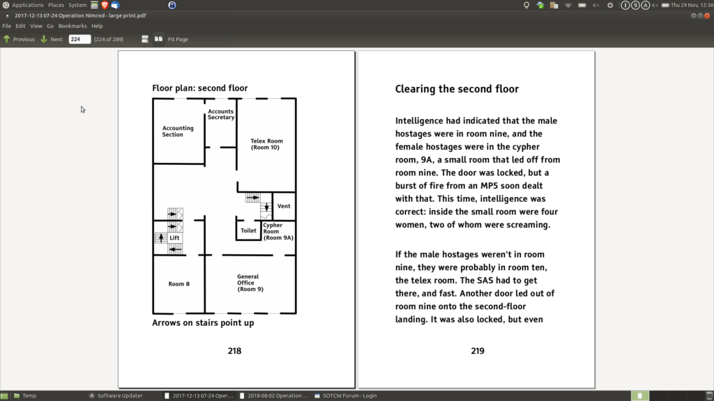
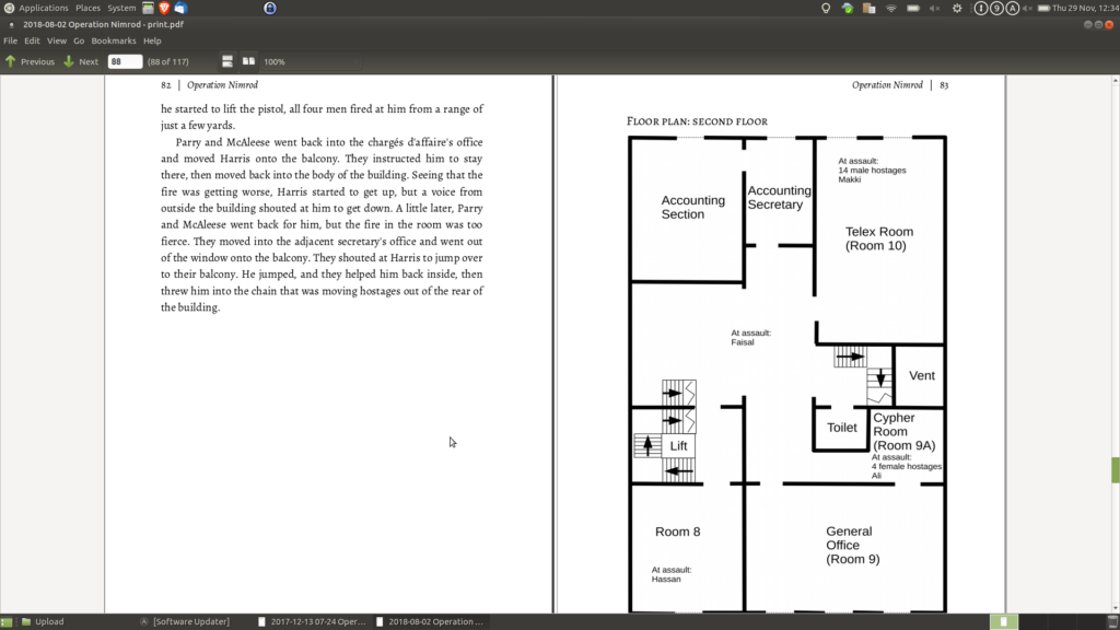
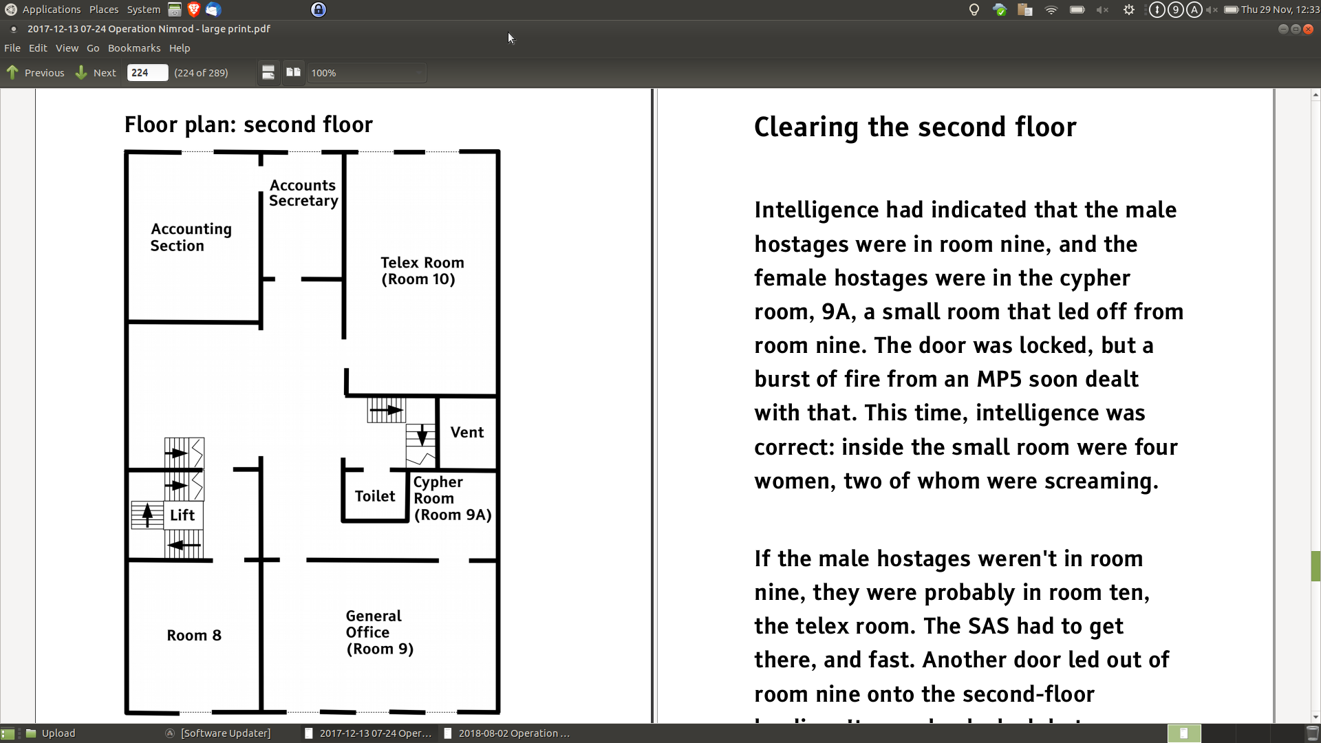
Spot the differences between large print edition (above) and standard formatting (below)
Font and Font Size
Obviously, large print books need a larger font size than normal. 16 point is generally considered a minimum, but 18 point is preferred if possible. There should be no text in a smaller size. Page numbers, copyright information, etc. should all be at least as large as the main body text. Headings should use a larger font size, as with normal print.
It is also important to consider the font face. Use a sans-serif font, and if at all possible, avoid using italics, underlining, or blocks of capital letters.
White Space
In general, plenty of white space makes a book easier to read for those with sight issues. Single spacing can make it difficult to find the start of the next line, so use 1.25 or 1.5 spacing instead.
Indentation makes it harder to find the start of a paragraph, so use block paragraphs instead.
Margins should be wider than usual, at least 25mm (1 inch) wide. Footnotes should be at the end of the chapter, or in a section at the end of the book, to avoid cluttering the page.
Left Align
Most print books use full-justified text, so that the right side of the text is lined up along the right margin. However, this leads to uneven gaps between words. Left-justified (or ragged-right) text should be used in large print books.
Headings should also be left-aligned rather than centre-aligned. This makes them easier to find.
Images should be aligned to the left for the same reason, but there should be no text to the right of the image. A partially-sighted reader may not realise that there is text next to the image. The image should be clear, and any text inside the image should obey the same rules as the rest of the text in the book. If possible, move the text out of the image. If this isn't possible, ensure that there is good contrast and that the text is on a plain background.
All text must be horizontal, including things like labels on diagrams and images.
Keep Things Together
It is important to keep related items connected, without large spaces. If your contents page doesn't already have a row of dots between the chapter name or number and the page number, add them. Tables should usually have lines around the cells. It is also important to avoid widows and orphans (single lines from a paragraph at the top or bottom of a page).
Don't use hyphens. If a word won't fit on a line, put the whole word on the next line rather than splitting it with a hyphen. Hyphenated words (e.g. self-publish) should be on one line, not split over two lines at the hyphen.
Use a Clear Layout
A consistent layout is particularly important when designing books for the partially sighted. Headings should be clearly different to the body text. Include chapter names on page headers if possible. This helps the reader determine where they are in the book.
Other Considerations (Book Size, Paper, etc)
Use cream paper rather than white, as it reduces paper glare. A very thick book can be difficult to hold, so you may need to increase the trim size to reduce the page count. I've used 6″x9″ and 8″x10″, but you could go up to 8.5″x11″ if you need to.
You may be able to sell your large print books to libraries, so consider a hardback version. Libraries prefer these as they are more durable.
Mark It as Large Print
Finally, make it clear that the book is a large print edition:
- In KDP Print, tick the “Large Print” box on the Paperback Details page.
- In IngramSpark, set the Edition Description to “Large Print Edition”.
This will set the metadata so that retailers can categorise it as a large print edition.
Add “(Large Print)” to the end of the title, and mark the cover to show that it is a large print edition. This can be as simple as a colored band with “Large Print Edition” printed in it.
Further Reading
This blog post covers the most important points. If you wish to find out more, the following should be useful:
- UK Association for Accessible Formats (UKAAF)
- Royal National Institute of Blind People (RNIB)
- American Foundation for the Blind
OVER TO YOU Do you have any tips to add to Russell Phillips' extensive list? Do you have any recommendations on how best to market large-print books? We'd love to hear them!
#Indieauthors - reach more readers & get greater market share by producing large print editions of your #selfpublished books using this handy guide by @Helping_Writers Share on XOTHER POSTS ABOUT REACHING PRINT-IMPAIRED READERS
From the ALLi Author Advice Center Archive
https://selfpublishingadvice.org/reaching-all-our-readers-making-books-that-everyone-can-read-katie-webb-maribel-steel/


I’m trying to publish the large print for my first in series, but I don’t see how to link it to the ebook or existing paperback. Do I have to publish a new series?
Can’t find any info on this.
Thanks.
Is this for Kindle? If so, there is a button on the first page to select a series.
Sorry Ken, I’ve only just seen this comment. If you contact KDP Support, they should be able to link it for you. Make sure you give them the ISBNs and/or ASINs of all the formats that are to be linked.
Thank you so much for this enlightening article. Books have been one of my favorite things for as long as I can remember. Once I learned to read, I rarely stopped, and then only to complete more mundane tasks. My vision has become very problematic in recent years, so I have attempted to read large print books. To my dismay, I have found the layout to be much as you describe herein. For me, this layout is quite difficult to read; the ragged right edge is particularly distracting, with longer lines sometimes disappearing into the binding. I prefer serif fonts to san serif, and I would much prefer more traditional placement of all page elements. I don’t know if my preferences are unique among persons with low sight, but I hope you find my input useful. Thank you again.
Thanks Russell. Very useful information.
Thanks Russell… It’s a very informative QA you have going here… Keep it up… I will be coming back here again
Very helpful. Thank you, Russell. Most writers I know create their large print using 16 font, but everything I have read from websites for those with impaired vision says what you do–that 18 font is necessary. However, that brings my 8.5 by 5.5, 270-page book to a 6.14 by 9.21 (Joanna Penn specs) 572-page book. I used left instead of justified and reduced margins from .75 to .65. But then, should I still format the book as having mirrored margins? Also, someone showed me a large print book of theirs where the company had made it 7 by 10, not by 6 by 9–is that common? Lastly, this expansion makes the book thicker and heavier, but my understanding is large print readers expect that–along with higher cost. I notice large print books from the Big Five use a Large Print sticker on the cover but not always, and not for their bestselling authors like John Grisham (though the platform page says it is Large Print), but I would like to use one. Is there a site that has such a sticker for sale I can give to my cover artist? Apologies for so many questions–I just feel a keen sense of wanting to do this right for people who need the larger print version. Assuming they find my books… :-)) Best regards, Regina
You should be able to create a ‘sticker’ in Canva that can be added to the existing cover.
Some good info there, Russell. Thanks for sharing. I do have one question, though.
The mechanics of setting out the page/font aside, do you know anything about creating the actual layout of the text, please? For example, when dealing with such a large font, can the issues of orphans and widows be ignored to help reduce page count, or must those be treated with exactly the same care as in a mass market book?
Thanks again.
I didn’t see anything in my research to indicate one way or the other, I’m afraid. My feeling is that you should pay the same attention to such details as you would with any other edition, because not doing so means that you’re giving the large print readers an inferior product. I’m not sure that ignoring widows and orphans would make a great deal of difference to page count, to be honest.
Thanks, Russell. I know what you mean about creating an inferior product, but as it would significantly increase the page count for my title, initially at least, I’m ignoring them in favor of giving readers a book at a lower price. If mainstream publishers don’t follow all the guidelines, I feel I’ve done enough with the layout for large print readers to be happy with what my book offers them.
I’m surprised it makes that much difference, but yes, there’s always a compromise with page count and therefore cost.
Hi Russell, thanks so much for this information!
I was wondering if you had any thoughts on how to format dialogue in large print? Normally, I would use a new line and indent for each new person speaking and their associated actions and thoughts. Do you treat each new character speaking as a new paragraph, and therefore leave a line between, or keep them together, just on new lines with no indent?
Thanks for your help.
I use new paragraphs for each new person speaking. Normally, that would be indicated by it being on a new, indented line. In large print, I’d still use a new paragraph for the new person speaking, but in this case, it would be a block paragraph, so no indentation, and a gap to mark the new paragraph.
That makes sense. Thanks so much for your help!
You’re very welcome 🙂
Hello Russell,
Many thanks for the information. Just what I’m looking for at the beginning of the Great Upsizing Project our our 6 books.
What size gap relative to line spacing (1.5?) between speeches would you recommend?
Our books are all 5.25 x 8 and around 300 pages. Once we boost the font size, it will increase the number of pages. You mention that a book can become too thick and so a larger trim size would be recommended. At what point would that be, please? How many pages would be too thick?
Thanks for this timely post. Some have recommended doing a large print edition for library sales, which begs the question can you manage OK sales-wise with just KDP or do you find you get library sales only through Ingram for your large print edition?
Neither KDP Print nor Ingram Spark report on exactly where books sell, so I can’t say for sure whether my large print books have sold into libraries, but I suspect you’re unlikely to sell to libraries via KDP Print.
I believe libraries prefer hardback, which can be done via Ingram Spark, but not via KDP Print.
I’ve seen a few traditional-house large print, and they ussally compensate for the larger text by reducing the page margins, which allows them to have an LP book that isn’t much bigger than its standard-print counterpart, yet you say “bigger margins,” which really doesn’t make sense. How is an 8-inch page with 1-inch margins more readable than a 7-inch page with 1/2-inch margins (Yes, I’m ignoring the fact that the gutter would be larger that the outside)?
And if they’re at the end of a chapter or the book, they’re “endnotes,” not “footnotes.” Pet peeve of mine, because I use both: endnotes for works cited and footnotes for author commentary. I never read commentaries as endnotes because I get tired of flipping from where I’m reading to the end, only to discover it’s a citation rather than a commentary, and eventually assume they’re all citations.
The recommendation for larger margins, as with everything else in the article, comes from various groups that advocate for people with limited sight. As to why they’re useful, the UK Association for Accessible Formats (UKAAF) says that they help to separate the document from its surroundings. The American Printing House for the Blind (APH) say that they provide contrast to the print and luminance around the text.
When I first researched large print books, I borrowed several large print books from the local library, all from big publishers. It was notable that none of them followed all the guidance I’d found, and some of them appeared to do nothing more than increase the font size. Indie authors are often told to try to match the quality of traditional publishers, but I think in this case, we have the opportunity to do better.
You’re right about endnotes and footnotes, of course. My mistake.
This post came at the right time! Thank you for the super info – Bridgitte
Thank you, Bridgitte.
Very interesting, Russell. Thank you.
Can you tell me more about the cover? Are there any specifics for that, for instance the blurb text on the back etc?
The advice I found didn’t mention covers at all. I looked at some traditionally published books in large print, and the only difference there seemed to be to add a “Large Print” banner.
Ideally, I’d say that any text on the cover should follow the same guidelines – sans serif font, at least 16 point, etc, but I suspect it’s less important for the cover than the interior.
I’d think that enlarging the cover for a bigger book would automatically result in larger text on the cover. I certainly wouldn’t consider making a large-print book to the same trim size as the ‘normal’ book.
Fantastic information Russell.
Very useful and I’m now excited about creating Large Print editions.
Thank you
Thanks Lisa, and good luck with your large print editions 🙂