


Jane Dixon-Smith, author and graphic designer
Jane Dixon-Smith, author of The Importance of Book Cover Design, is always being asked about what makes the perfect cover. Here she talks about what works and what doesn’t.
I’ve been in the book design industry for some years now, and before that I worked for a branding agency. I have hundreds of books on my shelves I’ve not had the chance to read, because I have an addiction to buying beautiful books with stunning covers.
For me book covers are about selling books. I’m a sentimentalist but also a realist. Most authors and publishers put books out into the world to either be found, or to be found and make money. If we publish books just to gather dust on one of Amazon’s virtual shelves, we might as well have left them on our hard drives. And from a personal perspective, I feel we writers owe it to our books to make them the best they can possibly be.
So what should you bear in mind when creating a book cover that sells?
1) Appeal to the right market
If you want to sell books and for people to think your book is good, then it must be targeting very specifically at a market that will enjoy your book. Time and again I hear people say ‘but there are no other books out there like mine!’ There are always books out there like yours, and if you as an author don’t know what they are you are about to make your job marketing your book really tricky.
Check out the bestselling lists in your genre, whether that’s crime fiction, women’s fiction, young adult etc. Whose books do you read that you enjoy? Will the readers of those books enjoy yours? Are the tone, style and characters similar to your own?
This is really important. I cannot stress that enough. This is the basic key to creating a cover that will sell in your genre to the right market. Do you write like Mark Billingham? Then you want to attract his fans. Do you write like Philippa Gregory? Then you want to attract her fans. That’s not to say you want to copy their covers, but you need to have a similar feel, and to present your book with visual clues that scream ‘if you enjoyed their book you’ll enjoy mine.’
2) It’s all in the detail
Good cover design doesn’t just refer to the amount of time or money spent on it. A cover I’ve designed isn’t better because I’ve spent twice as many hours on it as another book, or twice as many images. A cover can be simple and equally as effective. It can be the first design I’ve done for a specific book rather than the third. It’s all about hitting the right balance between images, text, colour and so on. There are many elements within a cover that make it work.
Let’s use Linzé Brandon’s book, Keeper of the Dragon Sword, as an example.
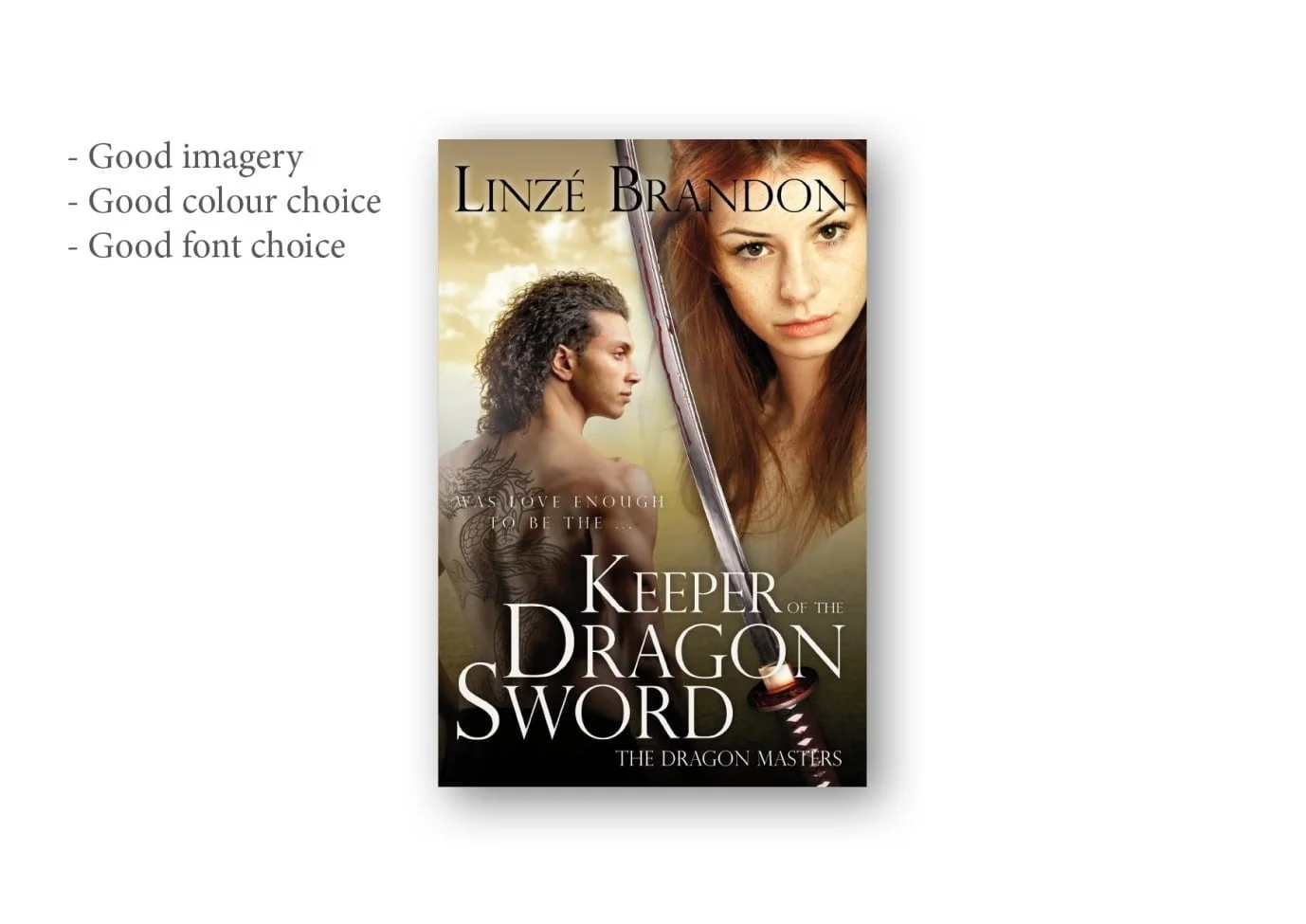
Good Imagery:
Imagery should be suitable to the period in which the book is set. Here, in a dark-ages style fantasy epic, the images chosen are relevant – the hair on the man isn’t a modern cut, neither character wears modern clothes, the sword is ancient, and the woman isn’t wearing make-up or appears as if posing for Vogue.
The other important key here is that the overall cover is made up of multiple images. A common mistake is to blend images into one another, but not correct the colours in the images so they match. Here a yellow filter has been placed on the image of the woman so she fits with the overall yellow-ish tint of the rest of the cover.
In addition, the background behind the text is darker so that the text is visible and doesn’t blur into the background, making it hard to read.
Good Colour Choice:
It’s vital to use colours which stand out; white and black here. When using a colour, it should be a hue picked out of the imagery used, or a direct complement. It shouldn’t just be a random colour, which clashes with everything else.
Good Contrast:
Contrast will make a cover really stand out. Here we’ve got a stark contrast between the male figure and the background behind him, together with the paleness of her face, which makes the cover jump. This can be achieved in other ways, such as using strong colours, light on dark and dark on light.
Good Font Choice:
The font needs to be something in keeping with the style of the book. If you look at covers in your genre, you’ll notice a trend: Chick-Lit using curly, girly fonts; Historical Romance script fonts; Action solid, impact style typefaces; Literary Fiction often uses classic serifs or light sans-serifs and so on. It’s not strict, but chosen right the font will say as much about the contents of the book as the image. Get it wrong and it’ll either look bad or will appeal to the wrong audience.
Good Typography:
The composition of the title and author name are really important in creating a professional feel. Here you’ll notice that the title is stacked. Note that the left hand edge of the ‘K’ of ‘Keeper’ is aligned with the left hand edge of the ‘R’ of ‘Dragon’ and so on, whilst at the same time ‘Of The’ is right aligned with the last letter of ‘Dragon’. It fits in a grid which, when locked tightly together, is therefore attractive to the eye.
Good Composition:
Composition is very much a grid. Look at your subject and set up your shot to a grid. Below you’ll notice that the title takes up approximately a third of the lower half of the page, whilst the characters two thirds. Whereas the horizontal composition is constructed of the man on one half and the woman on the other half, with the sword running through the middle. That’s a little general as it doesn’t always work quite like that, but there’s always a balance to be reached.
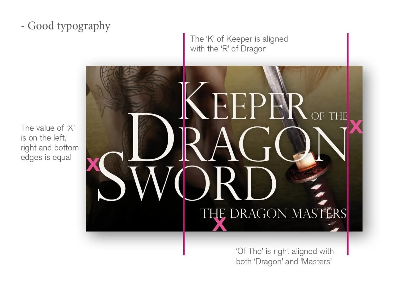
Another trick is to line the text up so that it’s of equal distance from, say, the top edge of the page to the right and left hand sides. If it’s not going to be equal, it needs to be deliberately unequal, otherwise it just looks poorly positioned. These are just examples, not global rules, of subtle things designers do subconsciously to make sure the cover is balanced.
3) Trust your instincts
One mistake I see authors make time and again is designing by committee.
Friends and family are great, they are supportive and keen and want you to be happy and fulfilled in your writing career. They are even excited that you’re publishing a new book. But they aren’t the right people to ask for an opinion unless they are your target market. You need to ask people who read the kind of books that you write. What appeals to one fan base, won’t appeal to another.
Other writers are also a natural source of opinion, however there are a lot of ‘experts’ out there. People who have ‘been in the industry for so many years’, etc. That’s great, and sometimes those people will have very valid opinions, but other times they’ll just regurgitate general industry opinion, such as ‘the title must be as large as possible, until it’s filled the entire cover and you can’t see anything but the title’ – an exaggeration, but you get the idea. The principles behind what they are saying are usually sound, but don’t necessarily apply to every genre, or trend, or what will actually work and sell your book. They just want to sound like they know what they’re talking about.
Trust your own opinion.
4) Straplines, quotes and thumbnails
But they won’t be seen in thumbnail, I hear people chorus. No, probably not. So why have them? ‘It needs to work in thumbnail’ is one of the most overused phrases in publishing these days. It’s also one of the least understood.
Not everything on the cover has to be visible when your book is postage stamp size. This actually depends on your genre and market. Not all markets lean toward the title and author name as being important, for example.
So what’s the point of having a quote or strapline? Well for starters, it will be visible if not legible, so a reader will know it’s there. Lots of traditional books have one or the other or both, and so your book can appear more professional. It also gives a subtle indicator that you’ve been endorsed by a big name author, or that the strapline might state that you are a NY Times Bestseller.
5) Think to the future and your brand
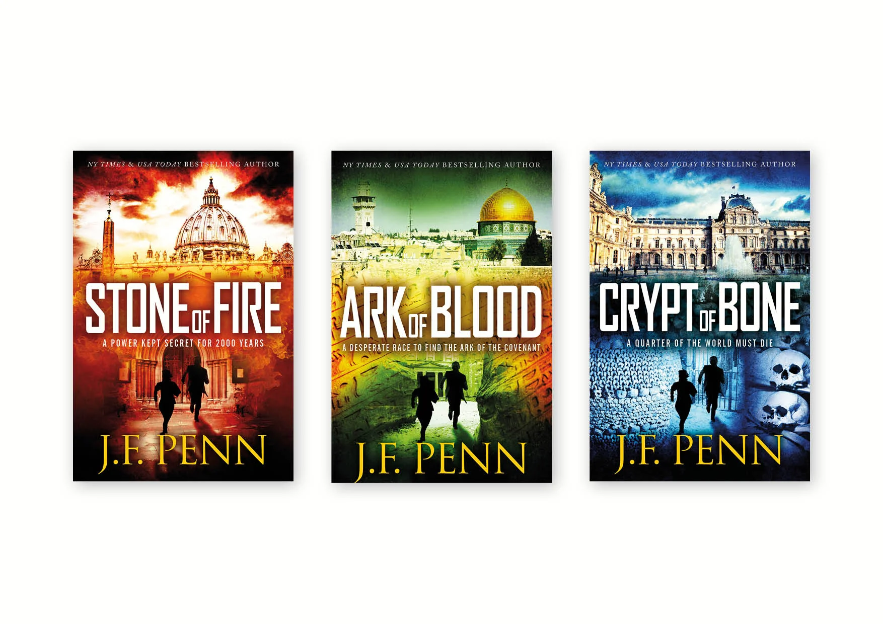
Once you have established a readership you need to keep that readership. Make it easy for readers to find your books when browsing. Ensure the style of each cover in a series is similar, so that readers easily identify with the next release. You as an author can be recognised not just by your name on a cover, but by the way it’s typeset and the overall look and feel of your covers. Make sure marketing materials tie in well and are sympathetic to your cover design so that everything works as one to build your brand.
Only when a reader has picked up the book do they actually read anything, and that includes the back cover blurb that you will have spent hours and hours honing. If the blurb was worth all that effort, then the cover is equally if not more deserving.
#IAF16 5 Tips to Create a Book Cover that Sells @JDSmith_Design bit.ly/IAF172885 #selfpub Share on XClick here to find out more about JD Smith
GIVEAWAY
Jane is giving away a paperback copy of her recently released book “The Importance of Book Cover Design and Formatting for self-published authors”.
This book includes all the tricks of the trade from an experienced cover design professional. You’ve worked hard on the content. Now give the book the image it deserves. Not only a professional cover that sells, but one you love.
SESSION SPONSOR

Visit our Session Sponsor Damonza


[…] LINK: https://selfpublishingadvice.org/5-top-tips-to-create-a-book-cover-that-sells-jd-smith/ […]
[…] 5 Top Tips to Create a Book Cover that Sells : JD Smith […]
[…] 5 Top Tips to Create a Book Cover that Sells : JD Smith […]
[…] 5 Top Tips to Create a Book Cover that Sells : JD Smith […]
[…] 5 Top Tips to Create a Book Cover that Sells : JD Smith […]
[…] 5 Top Tips to Create a Book Cover that Sells : JD Smith | Self-Publishing Author Advice from The All… […]