Getting a look at your first book cover is one of the most exciting parts of the publishing journey. It’s often the first time your book ‘feels’ real because you get to see it in a tangible way. But it’s also scary because everyone knows first impressions count. What if the cover is off genre, what if it doesn't resonate? We all want the perfect book cover for our book. ALLi prides itself on its approved partner directory and services vetted by our Watchdog Desk, if you want to search for trusted cover designers, start there. Today's post is all about finding the perfect book cover. With special thanks to Anastasiya from ALLi Partner members MiblArt, Jane Dixon-Smith ALLi partner member from JD Smith Design, and ALLi partner member and author, Helen Baggott.
The Perfect Book Cover: How to Write a Book Cover Design Brief

Anastasiya, MiblArt
With thanks to ALLi partner members MiblArt for their contributions to this section of the post, all about creating the perfect design brief. Anastasiya is a Content Writer at MiblArt — a book cover design company for self-published authors. They believe that book cover design is the most important marketing tool and help authors make the most out of it.
Communicating with a book cover designer can be stressful and intimidating, to say the least.
Well, it doesn't have to be this way.
Sometimes, all you need is a well-written book cover design brief. Understanding how to create one helps you check many boxes to end up with the book cover design of your dreams.
We're here to help. Keep reading this comprehensive guide and learn:
- what is a book cover design brief and why you should have it;
- what every author should know before writing a brief;
- main design brief elements;
- most common design brief mistakes;
- best examples and templates that will help you craft the best brief;
Let's get started.
The Perfect Book Cover: What is a Design Brief?
To put it simply, it's a significant part of any design process since the brief serves as a communication medium between the client and the designer. This piece of writing is essential to establish an excellent author-artist collaboration. Thus, if you want to avoid misunderstandings, save time, money, and energy, pay a lot of attention to what you include in your brief. In an ideal world, the designer would need to read your book before crafting the book cover, but unfortunately, time is money, so only high-end designers (read: very expensive) still do it. Enter the book cover design brief. The tables have turned, and now it's up to you to track down and pinpoint your book's key ideas. Think of all the necessary information the designer should know about your book. To give you an idea, take a look at the examples below. Can you spot the difference?
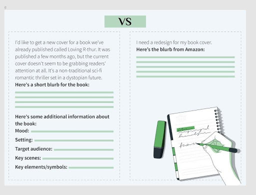
Now, we are going to let some daylight in. Take a look at the crucial cover design brief tips for authors. Let’s get cracking.
The Perfect Book Cover: Before the Brief
Let's take a look at a few tips on how to write a brief for a book cover designer.
Tip 1: Determine and identify your target audience
That's the first rule in marketing, business, and self-publishing. Before you even start hiring designers and working on your book cover, do proper research on your target market. A good idea is to create an audience persona, and analyze their needs and expectations based on demographic and psychographic factors. Let us spell it out for you.
To figure out your target audience's demographics, make sure you answer all these questions:
- What gender would be reading a book?
- What age are your potential readers?
- What's their income level?
- What education has your readership received?
- What's their family status?
- How about their occupation?
- What's their social status?
Now, let's dig into the psychographics. We'll be dealing with your readers' interests, activities, and opinions. Let's take a look at the list of questions:
- What values are my potential readers looking for in the book?
- What life challenges might they be dealing with?
- What's their cultural background?
- How about their desires, fears, and needs?
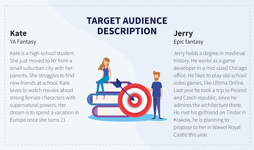
Now, you might be thinking this means you should include all of this information in your book cover design brief. Not really. Once again, compress all the information you have collected about your audience into the key ideas, and it'll do. Take a look at the example.
Tip 2: Share your tastes and ideas
You should be clear and precise with the designer regarding your needs and expectations.
Start the discussion by deciding on the following aspects:
- What is the message you are trying to deliver to potential readers?
- What is the spirit of your book?
- What are the plot elements that you would like to use on a book cover?
- How can I describe my book in a blurb to give the designer the essence without overwhelming him with too many details?
- Do you have an idea for the setting?
- Would you like the protagonist to be on the cover?
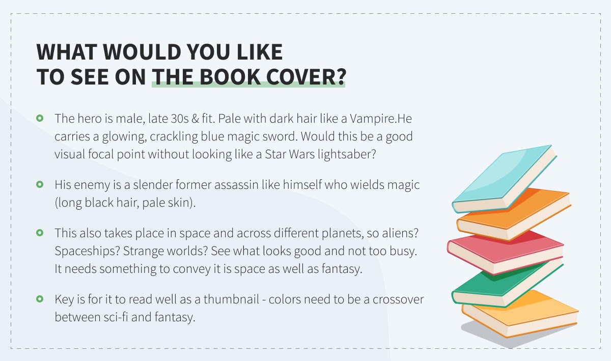
You can't imagine how much this helps. Pay attention to all the things you'd like to see on the cover and make sure you describe them right.
Tip 3: Discuss the constraints
We strongly suggest describing all the don'ts when it comes to some specific design elements. Explain to the book cover designer which colors, fonts, and images you'd rather avoid. Trust us: it's so much easier to list the things you don't want to see, rather than the ones you'd actually like to see. Just think on it for a bit, and provide the designer with the elements that you don't want to appear on your book cover.
Tip 4: Provide the designer with references and graphic examples
Provide a designer with an approximate idea of the book cover style you would like. To do this, you need to examine what is being done around you. Use Pinterest, Instagram, or Google, and see what catches your attention. Make a few screenshots, and notes, and attach them for the designer to look at. There's nothing wrong with saying that you like, let's say the Star Wars style, or Marvel Universe ideas. Remember: a picture is worth a thousand words. That's why you should always look for sources of inspiration.
Tip 5: Stay in touch
Start talking to your designer in advance, not to put too much pressure on yourself first of all. And don't forget to communicate regularly. The designer might have some additional questions when they start working on your cover, so check your email box (or whatever platform you use), and reply on time.
Tip 6: Give constructive feedback
Don't be afraid to say if you don't like something. Designers are professionals and understand there will be changes needed to their initial concepts. Also, many authors want to do A/B testing for their covers on social media. That's an excellent idea. The readers can tell you what they think about the cover and give some suggestions. If that's not an option, show the book cover version to your family and friends and see if they have some valuable tips. It's ok to ask for revisions until you are completely satisfied with the final result.
Now, let's also go through the most common book cover design brief elements. Bring it on.
The Perfect Book Cover: Main Design Brief Elements
Take a look at the checklist of book cover design elements. Make sure you mention all of them in your creative brief.
- Book title & Author name (#duh)
- Tagline (if applicable). It's a short, catchy sentence you might want to use to pique the readers' interest. The tagline will help a designer catch the soul and spirit of your book.
- Book size & number of pages. Depending on the contract, sometimes you don't have to worry about the final number of pages, book size, spine length, and blurb text. The designer can add this information later without extra charge. However, keep this information in mind. Otherwise, you are risking to end up with an unfinished book cover design project.
- Platform or publishing house. Different platforms have different technical requirements. The professional designer knows how to adjust, let's say, your image pixel dimensions so that it'll not get rejected.
- Genre. You absolutely must mention the book genre, so that a designer will conduct their creative research. Frankly speaking, representing the genre well is one of the primary responsibilities of a great book cover. If you are writing in a not so common (niche) genre, please include a description of the main characteristics. If this particular book is a combination of a few genres, explain what's going on.
- Audience (scroll up). The good idea is to squeeze your target audience description into a few sentences and pinpoint just the important factors that might directly influence the book cover design.
- Description of your book. To make your life simpler, you can insert your blurb here. Toss in the author commentary to better explain the plot, setting, historical timeframe, and characters (appearance, outfit, gender, behaviour patterns). Let us tell you a secret. A good book cover should intrigue potential readers, so it's best if the designer also doesn't know how the story ends.
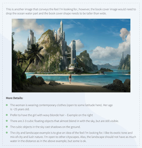
- What would you like to see on the cover? We've been through this already. If you have any ideas about your book cover design, spell them out. And if you rely entirely on a designer's creative mind, you can still help them out by providing some extra details.
- Back cover information. We're talking about the tagline, blurb, author bio, and testimonials.
- Author brand details. Working on establishing your author brand? Great. You might want a designer to include an author logo, let's say on the spine or back flaps of your dust jacket. If you are using a color palette or a specific graphic element that links your books together, don't forget to mention it.
- Paperback/hardback or dust jacket. It doesn't affect the front cover much, but this information is vital for the overall book cover design.
Why don't we discuss the most common book design brief mistakes as well? Buckle up.
The Perfect Book Cover: Most Common Design Brief Mistakes
We have put together a list of mistakes authors often make when creating a book cover design brief.
- Overcomplicating the design
Disclaimer: Good design is as little design as possible. – Dieter Rams
Easier said than done, huh? It's a common practice for the author to include everything on their book cover. Requests like “just one more image in the right corner” or “this one more graphic element over here” are quite common. They more often harm rather than help the design perception. We get it, it's easy to get caught in the process and ask for more, but know where to stop before you get carried away.
- Not clear and specific enough
Contrary to over-complicated design with too much information, some authors provide barely any information. Well, it's not enough to copy-paste the blurb, and after receiving the first draft complain that it’s not what you had in mind. See what happened here?
- Multiple conflicting priorities
It can get hard to decide what should be the centerpiece of your book cover. Shall we make a typography-oriented design? Will the colors be the element that will leave the readers speechless? Or shall we go with the stunning illustration? Just pick one idea and stick to it.
- Seeking too much control
Don't forget to leave some space for the designer's creativity. Just saying.
Finally, we'd like to present to you a book cover design brief template.
The Perfect Book Cover: Design Brief Template
Take a look at this template. Feel free to come back to it every time you are not sure what to write in your book cover design brief.
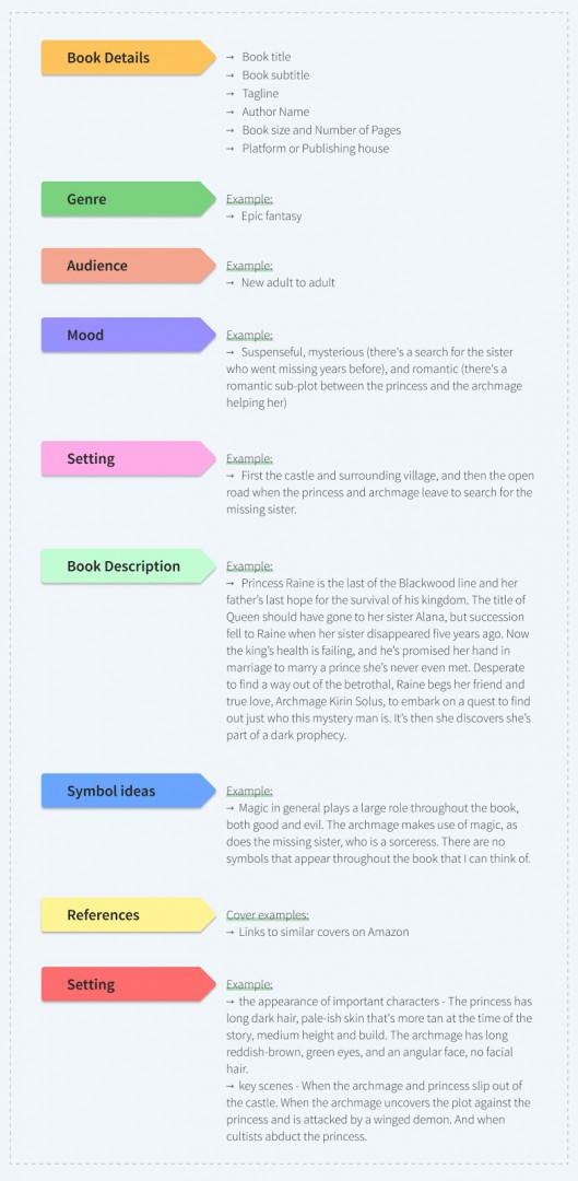
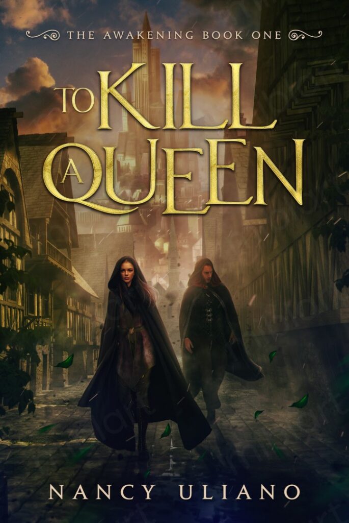
Are you curious to see what book cover design emerged from this creative brief?
We gladly present you “To Kill a Queen” by Nancy Uliano.
Wrapping up
Now, you know how to write a killer book cover design brief.
Got any other questions? Drop them in the comments section below, and we’ll be right there with an answer.
The Perfect Book Cover: What to Look for from Your Cover Design

Jane Dixon-Smith, author and graphic designer
With thanks to JD Dixon, ALLi partner member from JD Smith Design for her contributions to this section. Here, Jane describes the elements of a good book cover. While you might not be a designer yourself, it's important you know what good cover design looks like. Here are some things to look for:
Good cover design doesn’t just refer to the amount of time or money spent on it. A cover I’ve designed isn’t better because I’ve spent twice as many hours on it as another book, or twice as many images. A cover can be simple and equally as effective. It can be the first design I’ve done for a specific book rather than the third. It’s all about hitting the right balance between images, text, colour and so on. There are many elements within a cover that make it work.
Let’s use Linzé Brandon’s book, Keeper of the Dragon Sword, as an example.
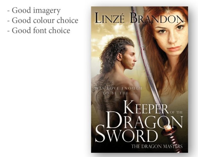
Image Credit: JD Smith Design
Good Imagery:
Imagery should be suitable to the period in which the book is set. Here, in a dark-ages style fantasy epic, the images chosen are relevant – the hair on the man isn’t a modern cut, neither character wears modern clothes, the sword is ancient, and the woman isn’t wearing make-up or appears as if posing for Vogue.
The other important key here is that the overall cover is made up of multiple images. A common mistake is to blend images into one another, but not correct the colours in the images so they match. Here a yellow filter has been placed on the image of the woman so she fits with the overall yellow-ish tint of the rest of the cover.
In addition, the background behind the text is darker so that the text is visible and doesn’t blur into the background, making it hard to read.
Good Colour Choice:
It’s vital to use colours which stand out; white and black here. When using a colour, it should be a hue picked out of the imagery used, or a direct complement. It shouldn’t just be a random colour, which clashes with everything else.
Good Contrast:
Contrast will make a cover really stand out. Here we’ve got a stark contrast between the male figure and the background behind him, together with the paleness of her face, which makes the cover jump. This can be achieved in other ways, such as using strong colours, light on dark and dark on light.
Good Font Choice:
The font needs to be something in keeping with the style of the book. If you look at covers in your genre, you’ll notice a trend: Chick-Lit using curly, girly fonts; Historical Romance script fonts; Action solid, impact style typefaces; Literary Fiction often uses classic serifs or light sans-serifs and so on. It’s not strict, but chosen right the font will say as much about the contents of the book as the image. Get it wrong and it’ll either look bad or will appeal to the wrong audience.
Good Typography:
The composition of the title and author name are really important in creating a professional feel. Here you’ll notice that the title is stacked. Note that the left hand edge of the ‘K’ of ‘Keeper’ is aligned with the left hand edge of the ‘R’ of ‘Dragon’ and so on, whilst at the same time ‘Of The’ is right aligned with the last letter of ‘Dragon’. It fits in a grid which, when locked tightly together, is therefore attractive to the eye.
Good Composition:
Composition is very much a grid. Look at your subject and set up your shot to a grid. Below you’ll notice that the title takes up approximately a third of the lower half of the page, whilst the characters two thirds. Whereas the horizontal composition is constructed of the man on one half and the woman on the other half, with the sword running through the middle. That’s a little general as it doesn’t always work quite like that, but there’s always a balance to be reached.
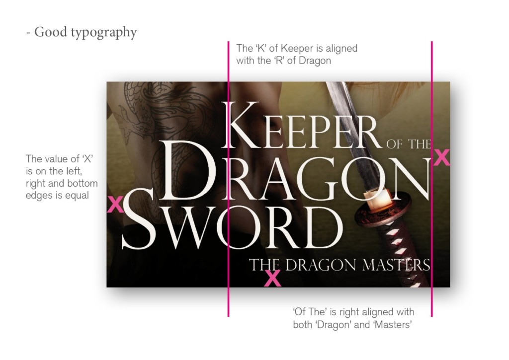
Image Credit: JD Smith Design
Another trick is to line the text up so that it’s of equal distance from, say, the top edge of the page to the right and left hand sides. If it’s not going to be equal, it needs to be deliberately unequal, otherwise it just looks poorly positioned. These are just examples, not global rules, of subtle things designers do subconsciously to make sure the cover is balanced.
The Perfect Book Cover: Online Thumbnails
With thanks to Simon Avery from idobookcovers.com for his contribution on why you need to consider thumbnails in your design briefing:
“The first rule of online publishing success is this: never underestimate the power of the thumbnail. It’s how readers buy books online, so your cover should be designed to look great at thumbnail size.
Designing solely for print means lost sales. A beautifully detailed cover which draws bookshop readers won’t look the same online. Not only will tactile design elements like foiling and embossing be lost, but design that looks incredible at 9” x 6” will be crunched and squashed down to a measly few centimetres.
To add insult to injury, if you buy into the option of Amazon’s sampling facility, it will add a ‘look inside’ banner, which further squishes the cover, and draws the eye away from the design. For many books that look wonderful in print, you can’t even read the title online, let alone the all-important ‘bestselling’ text, which has been proven to make readers buy.”
JD Dixon, ALLi partner member from JD Smith Design thinks there's a myth around thumbnails:
“‘Straplines, quotes and thumbnails' But they won’t be seen in thumbnail, I hear people chorus. No, probably not. So why have them? ‘It needs to work in thumbnail’ is one of the most overused phrases in publishing these days. It’s also one of the least understood.
Not everything on the cover has to be visible when your book is postage stamp size. This actually depends on your genre and market. Not all markets lean toward the title and author name as being important, for example.
So what’s the point of having a quote or strapline? Well for starters, it will be visible if not legible, so a reader will know it’s there. Lots of traditional books have one or the other or both, and so your book can appear more professional. It also gives a subtle indicator that you’ve been endorsed by a big name author, or that the strapline might state that you are a NY Times Bestseller.”
The Perfect Book Cover: Things to consider with Book Series Covers
Since 2014, Ebook Launch has been an Alli partner and they assist our author members with their book cover design service. In this section of the guide, they're going to outline the ways to tie a series of book covers together as well as ways to distinguish the covers within the series.
One of the most important things about approaching a series of book cover designs is to plan ahead. You need to make sure you can deliver a cohesive aesthetic that will tie each book in the series together. Let’s explore the key visual features and strategies that can tie a series together with some book series covers that we've designed for our clients in the past.
1. Ways to tie a book series together
Fonts:
This is the number one thing that will give your series a cohesive appearance. Even if the images, colours and layout are different, using the same title font and treatment will immediately show a relationship between covers. In the Four Feasts till Darkness series, each cover has a different colour and totally different subjects, but the bold white fonts and blurred treatment show clear cohesion between covers. Apart from the editing style on the images, the fonts are the only thing common to all 4 covers. One thing to be aware of: some authors use the same fonts to establish an author brand even if their books are not part of the same series. If you want to ensure your series looks like a series and not just an author brand, you can also incorporate one or two of the other visual features we’ll discuss below.


Subject:
It could be a model, silhouette, landscape or object: choosing a theme for your cover subject is an effective way to tie a series together. For even stronger cohesion, you can have each subject at the the same scale and position. For example, in The Bruce Trilogy, each model is the same size, wearing armour, with a blurred landscape in the distant background.
In this Choose the Ending Novel series, each cover features two symbolic objects that are important to that story: one man-made object and one botanical object. If you want more variety, you can mix up the layout. If you feature a stock model on your cover (particularly a main character whom you intend to be the subject for all your covers), make sure you also search for photos that will work for future covers before committing to a particular model for the first cover.


Decorative Features:
Decorative features like frames do an excellent job of creating an immediately recognizable series. Examples: the elaborate gold embroidery in the Dragon Archives series, the triangle motif and glowing circle in The Undermountain Saga or the frame in the Great American Magic Hunt.


Illustration style:
Custom illustration is a fantastic way to ensure your series is cohesive and unique. It is recommended that you hire a reliable illustrator/designer whom you are confident will be available as your series progresses. Examples: Dark Court series, Scott Baron series, Starfell series


Background or Foreground element:
You can create a unique aesthetic for your series by adding a distinct background or foreground image to your scene. For example, in the Sisters of Rosefield series, the blurry rose bush strongly contributes to the series brand and helps you immediately recognize that the covers are a set. The colours of the roses change for each season to enhance the distinction between each book. The Arnaka Saga utilizes an iris as a common image between covers.


Pop of colour:
Another fun way to show series cohesion is by using a pop of colour that is symbolic and common to all of your covers. In the Resistance Girl novels, the colour red symbolizes rebellion and is worn by each heroine featured on the cover. Even though each cover has a different model, the colour red hints they are all connected. The Joanna Hayworth series also utilizes splashes of red, in this case indicating the method of murder in this cozy mystery series.





Editing:
Sometimes the series brand is established with the particular way multiple photos are edited together. Double exposure (i.e. using a silhouette as the frame for another image) is one such editing technique that works well for action and thriller covers You can see this treatment in practice in The Detective Harlan Ulrichseries.


2. Ways to distinguish each book in a series:
Now that we’ve explored ways to make your covers look like a cohesive series, let’s discuss how you can make sure your books aren’t so similar that they are confused for one another.
Overall background colour:
This is the easiest and most common way to distinguish your series from cover to cover. Your colour palette can be a subtle transition that fits with the subject of each cover like The Black Douglas Trilogy, or they can be bright and distinct like The Max Series.


Subject:
As discussed, choice of subject will tie your books together, but it’s also a great strategy to set them apart. It could be as simple as having the same model in different positions like the Clockwork Chimera series or an entirely different scene for each cover, but the editing and fonts are all the same like the Faderville novels.


Font colour:
Your covers could have the same background tone and even similar subjects but having a different title colour for each will keep them distinct. For example in the Isabel Fielding Series, the backgrounds are almost identical and very neutral in colour, as are the flying magpies, but these design decisions serve to make the colourful titles pop even more.


Layout/positioning:
If you prefer to mix it up even further, you can shift the positions of the text elements from cover to cover. You may want to think ahead and alternate top and bottom (e.g. cover 1 in the series has the title at the top, cover 2 at the bottom, cover 3 at the top) or make them completely random. Examples: Dreamshifters series, Playing at Love series.


Book Cover Design Case Study: Helen Baggott
Author member Helen Baggott tells us about her experience of finding the right designer for her cover. www.helenbaggot.co.uk

Helen Baggott, Author
Although I know the work of several designers, I chose ALLi partner member Jessica Bell Design. A cover designer can only work from the information provided by a client. I completed a questionnaire and included examples of covers I liked and disliked, and explained why. I supplied Jessica with several postcards to choose from for the cover. My only stipulation was that any images used were my own.
The central image of a pier draws the eye into the scene and suggests a Victorian/Edwardian theme. The cards chosen for their handwriting all tell different stories – romance, travel, tragedy, and childhood games. That isn’t apparent from the cover, but is revealed inside – and is a great talking point that takes a conversation beyond ‘I’ve written a book’.
Although Jessica had other images to choose from, that particular pier is in my home county and has helped with local publicity. That was a lucky coincidence and something I will be bearing in mind for the next in the series.
The back of the cover is of equal importance and as much as people tell me they love the cover, my blurb seals the deal. The barcode area with my image and contact details is the final professional touch. I have witnessed cover envy when other authors have handled the book and seen that small but essential section so expertly and professionally produced.
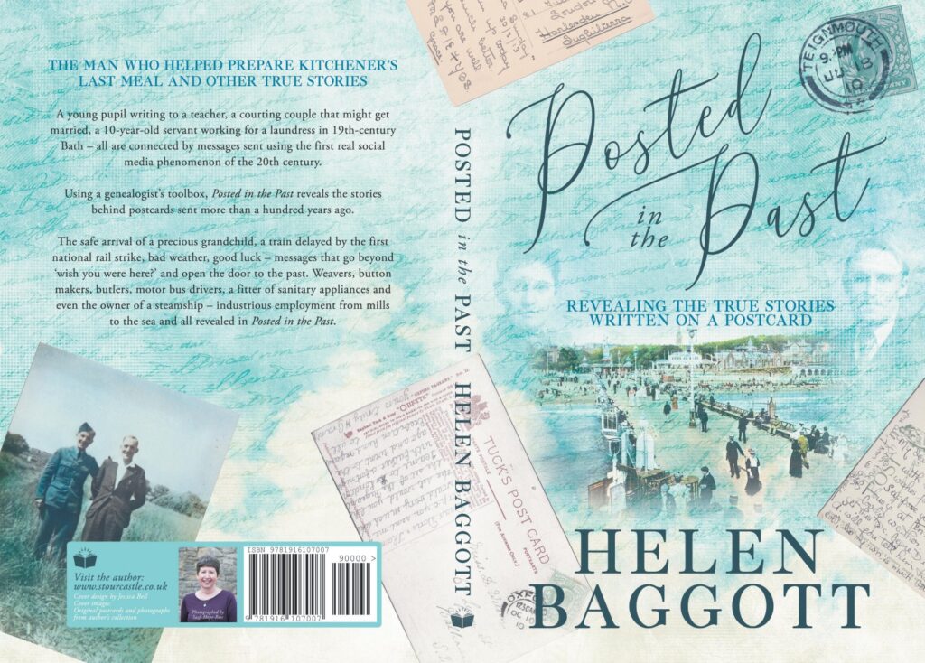 The colour palette was Jessica’s idea. I would never have suggested it. Yet again, it’s another piece of careful design. I write in a very conversational style, but it would be easy to consider that a book about social history – that’s really what it is – could be dry and, dare I suggest, even boring. Jessica’s style complements my own and, I believe, has produced the perfect cover for my book. When I show it to potential stockists, they all comment on the style and images. Then I reveal the stories behind each element on the cover and they’re sold. Literally.
Finding a professional to work with isn’t always easy. However, it was important that I worked with someone I knew wouldn’t hesitate to bring my focus back to a professional level. I needed them to take control of this stage – and then allow me to bask in the glory of their creativity. The cover has been the most expensive element in the production of my book – but what a good investment.
Find out more about Posted in the Past here.


