


The book is done. Hurrah. You've finished a draft, even had it edited. Now you need to format it and get the thing printed. But how? The Alliance of Independent Authors is pleased to welcome Dave Chesson, creator of Kindlepreneur and Atticus to explain how you can format your book for print. This is the ultimate guide to formatting your print book.

Dave Chesson, creator of Kindlepreneur and Atticus
Dave Chesson is the creator of Kindlepreneur.com, a website devoted to teaching advanced book Marketing which even Amazon KDP acknowledged as one of the best by telling users to “Gain insight from Kindlepreneur on how you can optimize marketing for your books.” Having worked with such authors as Orson Scott Card, Ted Dekker and more, his tactics help both Fiction and Nonfiction authors of all levels get their books discovered by the right readers.
Book formatting is one of those areas that doesn’t feel like it should be so complicated, but can be a major stumbling block for many authors. This is especially true of print formatting.
Ebook formatting is relatively simple, you don't have to worry about things like margins, fonts, etc. because these are all taken care of automatically by the ereader. Print formatting, on the other hand, requires far more from the formatter, and it can be tricky to get it right, especially if you don't have the right tools.
This article will outline some of my favorite tools that you can use to format your print books, as well as all of the different elements and best practices that you want for print books.
So, let's get started.
The Tools I Recommend
As the developer of Atticus, a tool I created as the ultimate formatting solution for all authors, I am naturally going to recommend it as your primary formatting software.
It is cheaper than the leading alternative, and works on virtually all platforms, including Mac, Windows, Chromebook, and Linux.
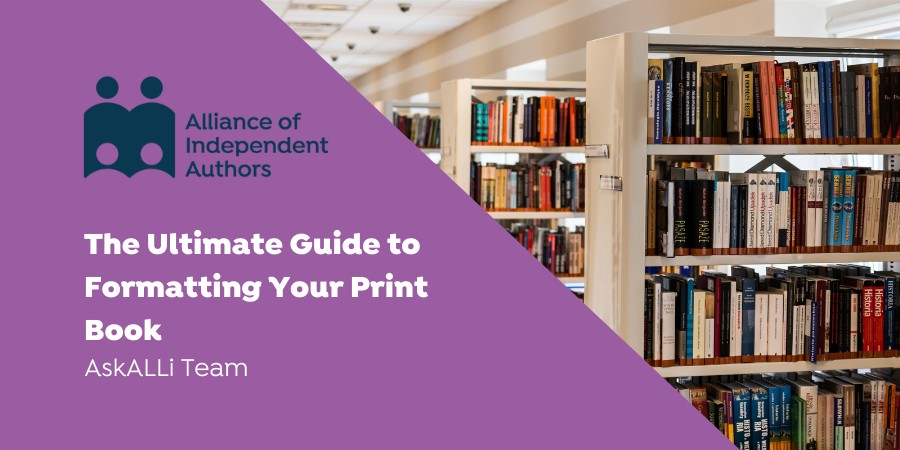
Most of the screenshots I use in this article are also taken from Atticus.
That said, if you use Microsoft Word, or an open source alternative such as LibreOffice, then much of this information will be valuable to you as well. And if you're looking for templates to get you started, we just rolled out a free tool to give you Word-compatible templates in a variety of trim sizes, perfect for formatting your book if you are on a budget.
Now on to the recommendations for formatting your paperback book.
Best Practices for Paperback Formatting
Here is a list of all the best practices to get right when formatting your print book.
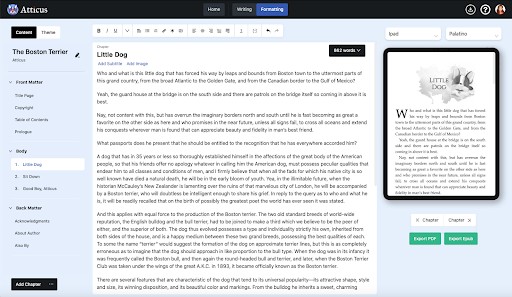
1. Trim Sizes
Available print trim sizes in Atticus
Some of the many trim sizes available in Atticus.
The first decision that you'll need to make when formatting your print book is the trim size.
The trim size is the height and width of your book. There are various sizes for various situations, and the one you use will depend on your needs. Here are some general rules of thumb:
- 4.25 x 6.87”: Mass market paperbacks (like the ones you see in the grocery store or airport)
- 5 x 8” or 5.25 x 8”: Best for common trade paperbacks.
- 6 x 9” or 6.25 x 9.5”: Best for hardcover books and graphic novels
- 8 x 8 or 8 x 10: Best for children’s picture books
- 8 x 10 or 8.5 x 11: Best for coffee table books, picture books, activity books, etc.
2. Margins and Paragraph Layout
Margins are another important element to consider in formatting your paperback book. Amazon has a minimum requirement of a 0.25 inch margin around the outside of your book.
However, don't forget about your gutter margin. The gutter margin is the portion of your book that will face on the inside, and it needs to be slightly larger than the outside margin. This can be set up in Word, or is generated automatically in Atticus.
Additionally, you want to configure your paragraph layout. This will depend on the genre. Fiction, for example, uses a simple indent for all of its paragraphs (not too large), whereas nonfiction often separates its paragraphs with a small space, much as you would see in a web article.
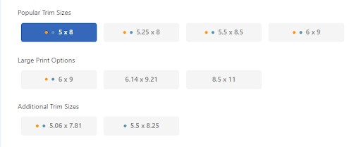
3. Fonts
Available font options in Atticus
You also want to consider the font that you use in your book, choosing something that matches the genre, but is not too overpowering.
Also you want to make sure that you have the rights to use that font commercially. Atticus makes this easy, by only offering fonts that you can legally use. If you are using Microsoft Word, you will need to do your research.
See my comprehensive article on font copyright here.
4. Page Numbers, Headers and Footers
Page numbers, headers, and footers can all be configured in Microsoft Word, or added automatically in Atticus.
The only thing you need to pay attention to here is that the headers and footers do not overpower the layout and stay within the margins that you have specified.
The headers are a good place to add your book title, your author name, or even the chapter title if needed.
5. Widows and Orphans
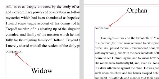 Widows and orphans are single words at the end of the paragraph that can sometimes become isolated from the rest. You can make slight adjustments to your formatting of those specific paragraphs to help them look cleaner and professional.
If you are using Microsoft Word, this will have to be done manually. If you are using Atticus, it is done automatically.
6. Page Breaks
At the end of every chapter, you need to make sure you are using page breaks instead of simple paragraph breaks. This will allow the next chapter to always begin on the following page. As with many of these instructions, this feature is handled automatically in Atticus.
7. Chapter Header Images
A chapter header design is one way to really stand out above the competition in your formatting.
You can add images, distinct fonts, and more, but this level of formatting is advanced if you're using Microsoft Word. That is why I recommend my free formatting templates if you are using Word, at least as a place to start.
If you're using Atticus, your options are greatly expanded. With Atticus, you can even create full-bleed backgrounds that take up the entire two-page spread of your chapter theme.
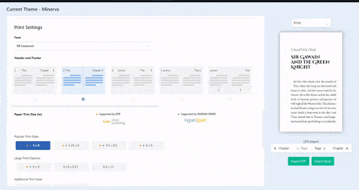
8. File Formats for Print
Without question, the only file format that you need to worry about when formatting for print is a PDF. This is the format accepted by KDP Print, as well as IngramSpark. While you can absolutely use Microsoft Word to create your files, they will ultimately need to be converted into an Adobe PDF.
A Word of Advice
The biggest pitfall that I see when authors format their own books is that they don't spend enough time to proof it.
There are a lot of little things to watch out for, such as the widows and orphans, that take a careful eye. You literally need to go through every single page (preferably in the finished PDF format) to check for errors like these. Because of this complexity, a lot of authors will choose to hire out the formatting, but there is an easier solution.
A program like Atticus will take care of 99% of these formatting issues for you, and it does so with the click of a few buttons. With Atticus you can easily take care of your trim size, your font, your page numbers, and design elaborate chapter themes without spending much time at all.
This is why I recommend Atticus for most authors. But if, for whatever reason, Atticus is not right for you, then check out the formatting templates that we've built, all of which are available for free.
Happy writing!
Print Formatting Options: ALLi Says
There are a range of common tools in use by ALLi members, including Vellum, templates from Dave above, from Draft2Digital and Reedsy. In addition, ALLi MEMBERS have access to our annual partner directory as well as the approved partner list. ALLi's watchdog vets all partner members before they're accepted onto our trusted provider listing. So if you would like to find and use a trusted formatting partner, then you can do so by becoming a member, logging into the member website and navigating to APPROVED SERVICES > SEARCH FOR A SERVICE.
How Do ALLi Members Format for Print?
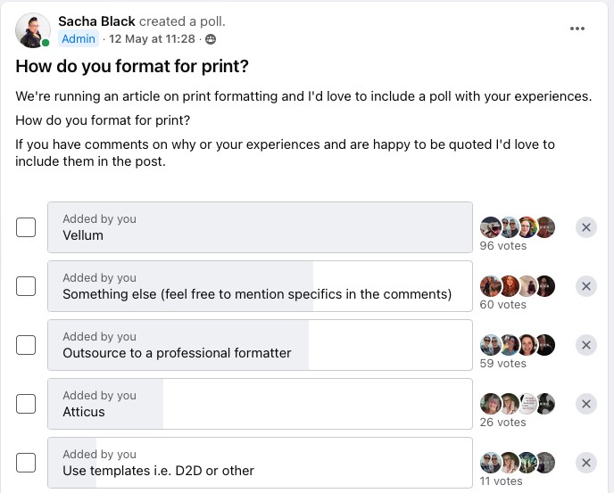
Currently, the most common way to format by ALLi members is via Vellum. The second most popular poll result was “something else”. Of that something else, the two most popular softwares mentioned in the comments were Microsoft Word and InDesign.
But other options not mentioned include:
- Affinity Publisher
- LibreOffice
- Scrivener
- Createspace templates
- Reedsy templates
- Jutoh
- Scribus
- Serif PagePlus
“I use InDesign, and like Matt Be, also create ePubs using the typeset pages as a starting point. The reason is because I have 100% control over how my books are presented and designed, both in print and in eBook. I can include custom design elements, and by using HTML to create my ePubs, I can also use styles to force eReaders to present certain elements in a certain way, for example, using different fonts to differentiate between parts of text.”
Berenice Smith
“I typeset books in Indesign (commenting as a professional designer but also when I was part of an anthology and now as I start the editorial process of a book of my own OMG..!). It's simply the right fit for anyone who values good typography and superior handing of design. I also use Affinity Publisher sometimes and rate that too as a cost-effective alternative, the only reason I haven't made the full switch is that my publisher clients like me to work and archive in Indesign. I've look at Atticus and Vellum as its good to see other options and I can be informed for my business but it's still Indesign for me! I also format eBooks in Indesign too.”
Mark Leslie Lefebvre
“I start with a WORD template I purchased from Joel Friedlander and then modified over the years. That generates a master for eBook and Print. I then convert it to PDF and do the final touches in Adobe Acrobat. (I also had experience using Adobe InDesign when running a Print/POD business, so I'm familiar and comfortable with those tools)”
Blaine D. Arden
“I've always used Libre Office to format for print, and it's served me well. But I've bought Affinity Publisher last year and have already started formatting for my digital pdf versions, and I really enjoy learning to work with it. So, next step will be creating my paperbacks with it, too.”
Phillipa Clark
“I love Vellum, particularly now with the newer features such as decorative pages.”
Angela Nurse
“I format in word – I have a Mac but I found it fairly straightforward and if you don't have the extra cash for programs I think it's a great option.”
Karl Drinkwater
“I used to use LibreOffice writer (I made my own templates and was going to start selling them along with a guidebook!) but shifted to Atticus. It's still rather buggy but I like the idea of one master copy, with ebook and print coming from the same source, rather than having to maintain two files.”

I’ve tried out Atticus after getting great things and like it well enough for KDP, but I can’t publish to IngramSpark with the PDF it generates. The print proof is completely messed up, all random symbols instead of text. After going in circles with both Atticus and IngramSpark, providing files to both support teams, etc, I haven’t managed to find a solution and kind of wish I’d stuck to my Word template. Anyone else have this problem?
I have been having the same issues with Atticus as Karl discusses above and I share his frustration. I was on target to publish a new novel on May 24. I uploaded the pdf to KDP. Upon reviewing the output I realized the quotes were messed up, along with widow and orphan issues and a word split between pages without a hyphen. I have sent five sets of screenprints (complete with highlights, arrows, and observations) to Support. I feel like I am doing the testing for them. They have been responsive and apologetic, and have admitted they are having problems. Several times they have asked me to log off, then back in, then do a hard refresh to get their attempts at fixes. Most have not worked, except for the manual workaround for the backward quotes,(using ALT coding for each incorrect quote). With a novel of 375 pages, it has been extremely labor-intensive. As of today May 31, it has not been fixed.
I believe Atticus will be a fantastic application once the bugs are identified and fixed. The rollout of the application and its updates need to be more professional. At a minimum, there should be alerts and a centralized log of issues, a target date for a fix, and workarounds as they are discovered. It should be provided to all purchasers of Atticus as soon as possible.
I think it’s vital that authors never underestimate the importance of professional formatting. While it’s great to try and save a few dollars, never undervalue your work as an author by putting out a product that doesn’t look 100% perfect! Great guide on formatting!
I’ve been using Atticus since the start, and it has lots of promise, but I think it’s absolutely vital that a service doesn’t roll out changes that will affect user’s books without consulting with them first. A few weeks ago Atticus made a change that replaces all single and double quotation marks with curly quotes. However, because it is done via a set of rules, if gets a lot of them wrong. All my books had been proofread and perfectly formatted, and every title now has errors in it with quotation marks the wrong way round, or open quotes and apostrophes mixed up. Just in a quick skim of one of my books the other day I found five examples of errors introduced by the script. There’s no way to reverse this (or even turn it off, at present). It doesn’t matter if you prefer straight quotes; doesn’t matter if your book was already perfect; doesn’t matter if you want to fix ones Atticus has broken. It’s a universal change, and even retyping the sentence sees the quotation marks flip around the wrong way. Even if they introduce a toggle to turn it off (support said that might take weeks, meaning any books exported in that time will probably have punctuation errors) I’ll either have to manually go through every quotation mark in all my books again, checking for which ones have been broken (perhaps a week’s work) or pay someone else to do that (a thousand pounds I don’t have). So this kind of thing can be infuriating.
What’s worse, if they had discussed this with users before making a change, any user with editorial experience (e.g. me) would have pointed out that there is no set of rules that can do this without making mistakes.
In the following examples, a human would know the first was a set of three apostrophes; the second was an apostrophe, open quote, close quote; and the third was open quote, apostrophe, close quote; but no automated set of rules would make that distinction because it requires analysis of context. Even if someone tried to also build in word lists of examples it would still fail because there’s no way it could incorporate alien names, strange speech patterns, every dialect and so on.
She kept firin’ ’til he stopped runnin’ away.
Dang, the girl jest kept repeatin’ ‘iPads are rubbish’ again and again.
The sign said ‘never NEVER trust the ‘pharni race’ in green lettering.
And that’s just a single group of examples from one style. The punctuation rules vary by country, time period a work is set in, style guide used, choices within the guide, stylistic issues, what is being quoted and so on. Those choices mean the same sentence can be written multiple ways, and that’s before anyone does anything inventive with the language (I’m still narked that Atticus blocks useful punctuation such as and forced me to repunctuate sections of a number of my books where alien/AI psychic dialogue was indicated that way – a further example of how the software shouldn’t try and change what the author has input unless the author specifically ticks for it to do so – this one makes it impossible to format a book about programming! D2D coped fine with ).
That’s why I’m still shocked no one at Atticus pointed this out before all our books were altered – any decent editor would have flagged this up as a huge no no. I’d have happily gone through all this, examined the proposed rules, pointed out cases where the text would be incorrectly punctuated by Atticus, and said the change can’t be rolled out automatically across every user’s books, changing their content, but must be some kind of toggle so they can apply it to one book or chapter then disable it (but keep most changes and manually tweak the ones it got wrong).
It’s absolutely right that formatting professionally is super important, both for our reputations, and for the benefit of our readers. It’s also true that in fiction and poetry there could be all sorts of uses which mean software rules completely break down. The idea that formatting software will not only change your book without notice or option, AND introduce irreversible errors into a book that had finished the paid proofreading stage boggles my mind. It shows why programmers should never be allowed to make roll out changes when they don’t understand the context fully (because they are programmers, not fiction editors). So, if you use Atticus, be aware of this (still unannounced) change, and go back and check the quotation marks in your books. Hopefully you won’t find them riddled with as many software-created errors as mine.
An update! Atticus just told me: “Our team has been working around the clock and we just released an update that allows you to choose whether or not to run the smart/curly quote algorithm in Atticus.”
Yep, tested now, and works. It’s also the best approach: a one-off process, run on a single chapter. So if we upload a book already formatted, we need never use it. But it offers something useful for people who upload with straight quotes (or write directly into Atticus).
I ran it over some of the ones I had flagged up. The latest version fixed about half of them. It still has trouble with this construction, and flips the final ” the wrong way around:
1999. Alex was still living at home. Shania said, “That Don’t Impress Me Much“. Alex had to agree.
She clicked on “I know the risks, I accept all responsibility for playing“. Just to see.
I’ll include some of my follow up email to Atticus, but don’t bother reading on unless: a) you are interested in (Atticus) UI, and b) you can put up with a long-winded pedant (me).
—
I’m sorry that this has no doubt been stressful for Atticus staff as well. I’m sure Atticus has a number of precepts it follows and probably shares internally as goal commandments. 🙂 If I was running a service like this it would include things like:
– having excellent customer service (which isn’t cheap, but really boosts perceptions of a product);
– focussing on stability and bug fixes over new features (since I’ve seen things I don’t use but maybe others do – PWA and Bookbrush integration, for example – being added when there are still stability issues such as [list of issues I won’t repeat here].
But one of my top five – maybe the top one – would be “Do not change the content of someone’s project”. From the reactions in my writing networks, that’s been the biggest issue with this. If we’ve finished the proofreading and formatting stages, we don’t want a single character in our book changing without us initiating it! That’s why, if Atticus had followed that precept, then smartquotes would have been dealt with like this before launching. There would have been no issue at all, just happy customers. (This precept affects other things too – I think sometimes themes get updated, maybe changing how they appear, and this can then mess up existing books, or mean later books in a series using that theme no longer look identical.)
But stability, reliability and knowledge that a book is safe and won’t be secretly altered is always important, and even moreso in web-based tools (since locally installed software like LibreOffice Writer already provides that security, which is why I write in that, share docxs with editors and proofreaders, then upload the finished thing with perfect punctuation). Online services have to work extra hard to reassure customers (and potential customers!)
“You can also use keyboard shortcuts to adjust any incorrect quotes, similar to how you would in other word processing programs.”
Great, I can manually fix any now. Related to your sentence above, is there a web page with all of these codes for Atticus? They can vary by operating system and word processor – all the ones I used in Windows and Word are different in Linux and LO Writer. Though my Linux ones seem to work for me in Atticus:
“” AltGr+v or b
‘’ AltGr+Shift+v or b
But for users who have no idea of shortcuts, the ? icon in Atticus should go to options that include a useful summary.
“I know that at least one, if not all, of your books was affected by this update so please let me know if you would like for us to try to restore (as new versions) any of your books to the point before the smart quote update. I know you have worked hard to get them looking exactly the way you want and I’d like to do what I can to help get them back that way.”
Thanks for the offer, but unfortunately that won’t help. I have made a number of tweaks to books over the last few weeks, but I don’t have a record of them – normally as I skimmed the documents I might have decided to change formatting (e.g. using small caps for signage, or sans serif for a handwritten note). Some were small language tweaks in my older books, when I spotted a sentence different from how I’d write it nowadays. So if older versions were restored all I’d end up with is one version with smartquote errors but recent tweaks and formatting; or one with perfect punctuation, but losing the tweaks and small changes. So I’d have an even bigger task trying to compare the two. As far as I can tell, my only option is to go chapter by chapter through every book (fifteen titles!). I’ll maybe apply the new version of the Atticus smartquotes to each, since that should fix about half of them (but not the ones I mention above, or some of the more complex single quote structures). Then I’ll have to go line by line checking every apostrophe, single quote and double quote. I don’t look forward to it – the process is a bit headache inducing, because it involves staring at tiny punctuation for thousands of pages, looking at which way an apostrophe is flipped! – and it may take a week, but it’s the only way I can see at present (I’m not paying a proofreader to go over the books again!) I’m really fussy about perfection in my books. Obviously this has been a big setback for me, which would have been avoided by not rolling out a change that affected existing books which had already been proofread. But I think Atticus is aware of that now, and that it should have been aware of it at the start. And I’m grateful I can start going through my books doing the checks this weekend, rather than having to wait a few weeks. I’d rather spend a weekend getting something out of the way than put it off! Ditto with DIY. 🙂
It’s a tricky time for Atticus as you are new and trying to establish a reputation as well as a strong product. You really need satisfied customers, and 100% reliability. As you know, to many authors their books are both their babies and their livelihood. They need 100% surety that their books are safe from unwanted changes, and fully secure. Hence no more changes to existing projects! Anything new which might change them must be optional. And any bugs to do with losing work, or sentences going missing, must be priorities. [Bit cut, since no point giving excamples here.]
I guess also communication could be better. I haven’t had an email for a long time about changes/updates to Atticus, but they used to come at the start. I didn’t get an email announcing the smartquotes script rollout. If I had I’d have immediately replied and shouted “Whoa, stop! How does that work? Surely it will break things?” I’d at least have had a chance not to open my books until after resolving it, so it wouldn’t have affected them all. As it was, I had no idea the change had taken place, because my books had been formatted with curly quotes before upload to Atticus. So at first glance nothing was obvious. It was only after a couple of weeks when I started to notice quotation marks flipped the wrong way that I began to suspect Atticus had done something to my books, and then I had to investigate/report, and by then it was too late. So the original issue of rolling something out that changed books was made ten times worse by us not being told of it the same day it happened. And if Atticus had told us all _in advance_ of the rollout, with a chance to know what it would actually do, my “Whoa whoa, how does that work, surely it will break x and y?” would have been in time to prevent punctuation being broken in books. So I guess that’s three things which created this problem and then exacerbated it. [Continued …]
—
[… Continued] I won’t say any more on that topic. Everyone’s perspective is different, and whereas to me this was a huge issue, to someone else it may not have seemed so bad. I’ll resign myself to spending afternoons checking punctuation until I get through them all. 🙂 I saw you updated the 20books post with this news, I’ll add similar to the other groups where we’ve been discussing it. There have been lots of issues raised, and they often come down to concern at books being altered after upload, so hopefully that won’t happen again.
One thing which is unrelated, but has been interesting in some discussions in Facebook groups – a slight tension between different intentions for Atticus. On the one hand you have some people who do all the creation outside of it, working in documents and then getting them proofread and only using Atticus at the end as a single master document (with templates for automated end matter) which can easily be exported as epub and pdf. So, really, just formatting and exporting. People who use it like this have no interest in it as a writing tool – no need for timers, PWA integrations etc. Our mindset is often based around a kind of horror of creating work online where backups are a bit more faff, the tools are more limited, there are worries about data loss, we already have established practices etc. For us, we don’t mind if some people actually write into it, as long as those features don’t clutter up the interface or take too much dev time away from the core thing we care about. Being in that group, it’s why I have never had an interest in Scrivener, since so much of it is based on the writing stage (reorganisation, research notes etc). It’s packed with stuff I’d never use, that would just get in the way of simple format and export, click click boom. But, of course, there is a second group who loves the idea of one tool to rule them all (the ones you aim at with timers, integrations etc). I have no idea how many of the Atticus users fall into each camp, and I’m not suggesting one is more important – your own staff may also be split between the two – I’m just pointing out that there is a slight potential tension between the different goals of Atticus, and it’s always worth being aware of this, so that changes are implemented in ways that benefit one camp of users without causing any problems for the others. Since Atticus has Writing and Formatting tabs, it’s obvious you’re aware of this. (My stages are Plotting, Writing, Editing, Formatting, Distribution, Promotion.)
So the last thing I’d want would be complex toolbars and menus of options I never use, with the ones I do need to use split up amongst them like minestrone soup. Whereas if all the writing stuff was grouped together under one menu/layout that didn’t invade my GUI, I’d barely notice it, but it would still be there for those that used it.
Which has just led me to think about how the current interface is slightly clunky. (I am using Atticus as I type this, so I can test things.) At the top we can switch between Writing and Formatting. But if you click Formatting then you have to go to the left to another toggle between Content and Theme and choose Content in order to format the text itself chapter by chapter. And, even then, there are writing-related buttons still visible (e.g. Timer), so the UI is a bit mixed up. As a user/tester (something I did as part of my role when I worked for a university in Wales) I always focus on the UI. To my mind, clicking Writing at the top should provide all the Writing options. Timers, notes, text formatting etc. But if I click Formatting then I’d expect the purely writing buttons to disappear (e.g. Timer), and to be replaced with purely formatting stuff. Instead of Timer, that button might say Theme, and be a toggle to alter theme settings, completely doing away with a secondary toggle menu on the top left. Maybe that would be more logical.
Since exporting is often a final task, and currently Atticus is a bit weird in terms of UI (the Formatting previewer has two export options below it, but the project details screen has three – two places, with different options), I’d simplify it. A single Export button that appears next to where the Timer currently is, maybe only showing up in the Formatting option (or maybe in both Writing and Formatting if preferred, with only the Timer button switching to Theme when we go from Writing to Formatting). And that single export button has epub, pdf, docx, and ideally mobi (maybe others – I think Scrivener etc have things like plain text). I mention mobi because even though Amazon is changing their email to Kindle service to use epub, if you use direct file transfer (like me) you have to have a mobi file – my Kindle can’t even display an epub. Since Amazon is not updating the UI of older Kindle models like my Fire HD, that will never change. So I often need a mobi for myself, but equally, if I am selling ebooks direct (e.g. via Gumroad) I need to have both epub and mobi files. At present I either have to export from Atticus and convert to mobi in Calibre (quite a few steps every time I update the book), or I have to upload to D2D and download their mobi – again, a faff. If there were multiple Export options under that button, with lesser-used ones at the bottom (such as mobi) that would be best of both worlds for users. Even if mobi gradually fades away over the next decade as devices die, at least the format would not change – once Atticus implemented the export, it would never need touching again. [Continued …]
—
[… Continued, last part!] Sorry, I have the Atticus UI open, so am spotting all the things that have always felt slightly resistive rather than fluid to me! Ditto the inconsistencies such as some menu options you have to click on (such as add chapter ellipsis, or More tools) and others you hover over (such as the formatting down chevron, or word count) – so when I was a new user I kept forgetting, and clicking on one and hovering over the other to no effect, because two different menu principles have been used on the same screen. (FYI the click to reveal menu option is always prefereable to hover – hover obviously has issues with touchscreens; it can be triggered accidentally when the mouse pointer passes over it; the menu disappears if the pointer passes off it, which happens more than you’d think, meaning the process has to be repeated!) And since the toolbar has the behaviour of “hover = tooltip” for everything else, it’s weird to have a single screen element that behaves differently, has no tooltip, but instead has hover = submenu. So these kind of UI things might need rethinking so the UI is both consistent and simpler, without losing any options. The problem is always that when you get used to idiosyncrasies you notice them less, but that doesn’t mean there isn’t an unnecessary learning curve for new users. It’s always a shame when suboptimal or inconsistent design becomes set in stone over time (and then added to) rather than properly refined to be elegant. It’s one of the reasons I stopped using Photoshop. The tools are powerful, but so many of the UI elements are cluttered, inconsistent and ugly (but historical) that I found I was battling with it even on simple stuff with layers, masks and modes. You don’t want Atticus to agglomerate like that over time.
(Obviously changing anything at all always gets some people initially grumpy! People hate change, usually. But when the changes actually make processes more consistent/elegant/streamlined, in ways they hadn’t imagined, they quickly get used to it, plus new users get a better experience. As long as the books aren’t changed and no options are lost, just moved, people are soon won over. It’s something Draft2Digitaal get mostly right, whereas the IngramSpark UI is awful to the point where I’d pick another service if there was one with better reach.)
Oh, another one: in the left navigation bar, clicking the chevron next to Front Matter and Back Matter will expand or collapse them, but the chevron next to Body does nothing. Inconsistent! Likewise Body has an ellipsis menu to set Begin On for all chapters in that section (as well as being able to do it individually) but Front and Back Matter don’t have the ellipsis menu to do it for all, and only do it individually. I know the reasons why, but a new user may well get extra confused by things like that.
Oh, another, last one! You can always access Book Details from the top left. But it also appears as an option in some Front Matter types such as Title Page and ToC, but not others. So a new user sees extra buttons appearing and disappearing, and needs to work out the logic and the best way and note that it does the same as accessing it another way. Easily fixed by just sticking to the one way of accessing the screen (clicking on the pencil next to the book title). Consistency and simplicity, rather than (like export) multiple different places.
Sorry, I’ll close Atticus now! But software and UI is one of my interests (you wouldn’t believe the usability testing I did before moving to Linux, it took a year to make the final decision, as well as choosing the correct distro and examining underlying GUIs such as KDE versus Gnome versus Cinnamon; I regularly criticise moves towards aesthetics over functionality, such as impossibly thin scroll bars or ones that disappear).
Have a good weekend. If any of that might be useful as a user perspective, it’s fine to share it with Atticus staff.
Best wishes,
Karl
—
I have been a fan of Atticus since the start, and hope it continues to evolve into a really useful tool. I hope even more, that it is successful and also becomes a _vital_ tool for me, as part of my publishing processes. The customer support is good, the potential is wonderful. I hope this communication/rollout issue was a one off. If you are holding off on Atticus at present, do come back in a few months and see what the state of play is then. It may well be a better tool than ever, we’ll see. 🙂
Thank you so much @KarlDrinkwater for the time, thought and attention you’ve put into this feedback. We too are hopeful fans of Atticus at ALLi.