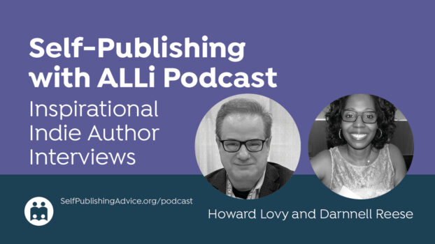
ALLi Campaigns Manager Matty Dalrymple talks with book cover designer Rachel Valliere about improving indie book design through a crucial but often overlooked tool: the creative brief. Rachel explains how a well-crafted brief helps authors communicate their vision clearly, including technical details like trim size, binding, and cover text. They discuss how understanding genre conventions, using design elements intentionally, and navigating image and font rights contribute to professional indie book design.
Listen to the Podcast: Elevating Indie Book Design
Sponsors
 This podcast is proudly sponsored by Bookvault. Sell high-quality, print-on-demand books directly to readers worldwide and earn maximum royalties selling directly. Automate fulfillment and create stunning special editions with BookvaultBespoke. Visit Bookvault.app today for an instant quote.
This podcast is also sponsored by Gatekeeper Press, the all-inclusive Gold Standard in Publishing, offering authors 100% rights, royalties, satisfaction and worldwide distribution. Gatekeeper Press, Where Authors are Family.
Thoughts or further questions on this post or any self-publishing issue?
 If you’re an ALLi member, head over to the SelfPubConnect forum for support from our experienced community of indie authors, advisors, and team. Simply create an account (if you haven’t already) to request to join the forum and get going.
Non-members looking for more information can search our extensive archive of blog posts and podcast episodes packed with tips and advice at ALLi's Self-Publishing Advice Center. And if you haven’t already, we invite you to join our organization and become a self-publishing ally.
About the Host
Matty Dalrymple podcasts, writes, speaks, and consults on the writing craft and the publishing voyage as The Indy Author. She has written books on the business of short fiction and podcasting for authors, and her articles have appeared in Writer’s Digest magazine. She serves as the campaigns manager for the Alliance of Independent Authors. Matty is also the author of the Lizzy Ballard Thrillers, beginning with Rock Paper Scissors; the Ann Kinnear Suspense Novels, beginning with The Sense of Death; and the Ann Kinnear Suspense Shorts, including Close These Eyes. She is a member of International Thriller Writers and Sisters in Crime.
About the Guest
Rachel Valliere is a book cover and interior designer and the founder of Printed Page Studios and The Book Designer Collective. While she currently specializes in nonfiction, she has worked across many genres throughout her career. Her mission is to provide high-quality services to purpose-driven independent authors—beginning with strategy before design—to create stunning books that amplify their impact while ensuring they maintain full rights and control over their work. You can find her on LinkedIn and YouTube.
Read the Transcripts
Matty Dalrymple: Hello everyone. I am Matty Dalrymple. I'm the campaigns manager for Ally and I am here today with Rachel Valliere. Hey Rachel, how are you doing?
Rachel Valliere: Hey Matty, I'm great. Thanks for having me on.
Matty Dalrymple: I am pleased to have you here and to give our listeners a little bit of background on you, Rachel Valliere is a book cover and interior designer and the founder of Printed Page Studios and the Book Designer Collective.
Her mission is to provide high quality services to purpose-driven independent authors, beginning with strategy before design, to create stunning books that amplify their impact while ensuring they maintain full rights and control over their work.
The Missing Piece in Self-Publishing Book Design
Matty Dalrymple: Today, we are going to be talking about what Rachel proposed is the missing piece in the self-publishing book design process, and we're going to be talking about how indie authors can better prepare their book designs so that they get the most high-quality marketable book design possible.
So, Rachel, what is the missing piece of the self-publishing book design process?
Rachel Valliere: It is the creative brief, which in regular terms just means the instructions that you're providing to your designer.
But the missing piece is that, in a traditional publishing house, it's publishing and design professionals who develop this brief and these instructions, and then they pass it along to the designer. So, when you're a self-publishing author and you're not an expert or a professional in the publishing or design industries, then there's a lot that might go inside, or the context and the shape of the information might not be as useful or effective as it could be for your designer.
So, in self-publishing, there's an art director that's going to be helping come up with the creative direction for the book, and that's a different role than a book designer. So, I really feel like that the broken link is that piece of communication and strategy that's getting lost in translation.
Matty Dalrymple: And in the indie publishing space, is the creative brief something that an indie author should try to do themselves? Is it something that if they contact a book designer, the book designer can help? Is it mutual? Is there a third party that you would recommend indie authors go to for that?
Rachel Valliere: That's such a great question and it depends. As we likely know, there are a huge range of different experience levels and service levels amongst people offering services to self-publishing authors.
So, if you hire a book designer, that could mean so many different things. That person could have varying degrees of experience and knowledge and history of what they've worked on.
Traditionally speaking, the book designer is handed the creative brief. However, some book designers do help authors through that.
When I work one-on-one with authors, I help them provide this information. I have a questionnaire and then we sit down, and we have a discussion about it.
But I think what can go awry is a lot of book designers don't. So, if the author doesn't know. To provide the information or it's the book designer doesn't know to ask for it and to view the design through this lens, then it's just going to be lost.
Rachel Valliere: So, in short, I think it would be very empowering for authors to learn how best to provide instructions to a book designer. So, if they're working with one that helps them through it, it's just going to be even better and they'll be more prepared, and if they're not working with the designer who helps with that, then that designer's going to be better equipped to produce a great design.
Key Elements of a Creative Brief
Matty Dalrymple: So, what kind of information do you recommend is included in a creative brief?
Rachel Valliere: It's both technical and creative strategy information. It's basically everything that the designer's going to need to get started working.
What I see often is an author finishes their manuscript, and they think, awesome, I'm done with my manuscript, I just need book design, and then I can publish the book. But there's a lot of in-between pieces or some key decisions that they need to make and usually some research or just some deep thinking, if they haven't done that yet.
The creative brief, in short, includes the technical specs for the book, like the trim size, which is the physical dimensions of the printed book, the binding type, if they're doing a soft cover or a hard cover, the different formats they plan to publish, because most people don't realize that, but each type of binding or format requires a different cover file from your designer. So, that can affect your quote and the scope of the work.
And then of course, your final front cover text, and this one's really important. I don't think authors realize quite how important it is to have it nailed down in the final format before book design, just because we think of text as something that can just be deleted and retyped, but on a book cover, it's best to think of it as part of the artwork as integrated into the design. So, it's very important that you have that finalized down to every little detail so that you don't cause delays, or extra fees, or frustration in the process of changing it later on.
Matty Dalrymple: A question popped into my head based on what you were saying about pinning down the text. One thing that I've always wondered idly is, if you have a book that has the word ‘and' in it and when you're registering the book you say, I have a book called Snakes and Ladders, so I registered as Snakes ‘and' Ladders.
But sometimes a cover designer might think it looks better to put an ampersand instead of the ‘and', as an example. Is that more a design question or is that more, now you've changed the name of the book and it's going to be problematic?
Rachel Valliere: That's a great question. As far as the design goes, I think as long as in your metadata, it's all consistent.
That really is a publishing consultant expert question because I am not 1000% sure on that.
But yes, it is common for books to do that, to have the ampersand, and that's something to think through and ask your editor or whoever you're working with along the way too.
Even in author names, if you have two authors, do you want to use ‘and' or ampersand? Also, does it matter to you?
Because it's helpful to your designer to know, for example, the subtitle, the capitalization, this is something that comes up so often. Sometimes an author will want non-standard capitalization on the subtitle or just the first letter capitalized and everything else lowercase, or just various types of capitalization, and a lot of times I'll go back and check. Like, this seems weird to me, or was this intentional?
So, it's just being intentional about everything, and if there's something that's specifically not the normal that you want, make sure you let your designer know.
Matty Dalrymple: The other example I thought of that ampersand is, I can think of a couple of books that have profanity in the title and they've disguised it with an asterisk or something, and I'd be curious to look up like that book's official ISBN record and find out if it has an ampersand or if it had the actual words spelled out.
Rachel Valliere: Yeah, that's a great question.
Matty Dalrymple: I'm going to jump right from very detailed to higher level and as an entree to allowing you to get back to my original question.
Common Pitfalls in Book Cover Design
Matty Dalrymple: And that is that I think that the pitfall I've seen authors who aren't cover design nerds fall into is they finished their book, they're thinking through their decretive brief, and now they want a very accurate representation of, in this scene, she's standing in front of a home with yellow flowers and a red dress. Then the cover designer comes back, and the dress is purple, and they're like, oh no, she'd never wear a purple dress.
So, can you talk a little bit about if it's important for an author to have distance from the details of their story, and if it is, how do they achieve that when they're thinking through their creative brief?
Rachel Valliere: This is such a great question, and this is really the core of what I wanted to get to today.
This is a key stumbling block for authors and designers in communicating and working out the design. I want to start with the story of a client that I had a few years ago, when I was less experienced as far as being out on my own as a freelancer and working one-on-one with clients.
She came to me, and she had a very specific image in mind of what she wanted on the cover because it depicted what her book was about, and she had actually gone online and found the image. It was a stock image, and she was very excited about it. She said, this is perfect, this exactly depicts what the book is about, please use this image on my cover.
I looked at it and to be honest, it was ugly. I mean it perfectly depicted her book's content, but the image itself looked dated and cheap. So, I did what she wanted, and I did create an alternate option for her as well, which she totally disregarded because she was dead set on this image.
This one still haunts me because I feel like her cover just didn't look good and yet, she was very happy with it. So, at the end of the day, you can have the perfect image, but if it doesn't convey the right feeling or the right vibe or the right instantaneous effect on the viewer, then you're doing a disservice to the cover design.
Rachel Valliere: So, I would say it's much less about the specific details of what you want to depict as far as what emotion do you want the reader or the person looking at the cover to feel in those first two seconds that they glance at it, and how can you make that happen with the design?
So, I assume you're talking about a fiction book, and I think this applies a lot more in fiction books as far as you're depicting a character with a personality, and that can be a lot trickier.
I see covers all the time where I've read the book and I see the characters on the front and I'm like, no, that's not right. I think that's very common. Even in well-known, famous books, I see that happening.
So, I think it comes down to, if you're very attached to a specific scene or image, you're likely going to need to hire a custom illustrator or a photographer if it's a photography route, because cover designers are not illustrators or photographers.
Those are two different roles that often get confused. There are some people who are both, but it's actually two different roles.
In traditional publishing companies, you might see a cover designer listed and there might be a separate illustrator who actually did the illustration for the cover, and then the designer puts it all together.
So, if you are really tied to a specific image or a scene, I would recommend looking into that route or just being really upfront when you're talking to potential designers to see what they're able to do.
And yes, just being open-minded about being detached from that or being a bit more open-minded on other ways that could be depicted, or that it might not be necessary at all.
Matty Dalrymple: Yeah, I was thinking that if it was that scenario where you have found that one image that's perfect, another alternative might be to put it inside, like right after the copyright page or something like that. Or maybe in the author's notes, because then you can convey that to the reader and you have that satisfaction of saying, I found this image and it was perfectly right.
It would be, I imagine the same rights you would need if you wanted to put any kind of illustration or photograph or any kind of IP into your book, and that would satisfy that desire to use that, but not have it be your billboard for your book for a browsing reader.
Rachel Valliere: Yeah, that's a great idea.
How I do the process now is not me asking the author, what do you want on your cover? It's, who is your target audience? Why are you writing this book? What are they going to get out of it? What feeling is going to make them want to pick it up?
I get all of the context and then the design is the solution to that conveying, and it's really more about the emotion than depicting a scene because people are making such quick decisions when they look at a cover. When you're talking about trying to get someone to buy your book, you're not going to glance at it and care if the image perfectly explains everything the book is about, or it's the colors are matching what's inside the book.
They're just going to do an initial impression of; does it look quality? Does it look interesting? Does it grab my eye?
That's what's most important.
Matty Dalrymple: The other thing I think is, what are the comps and what books do you hope that your book is going to appear next to in a bookshelf, in a bookstore?
The example I like to use is, there was this era, I think it's fading out now, but there was the era where there were like a million books of a woman from the back walking through, World War II Europe with an identifiable European building in the background and airplanes in the sky.
But it was definitely sending that message that, if you like this book that showed the women walking away, holding a piece of luggage through a World War II European city, you're going to like this other book that has the same kind of cover.
Rachel Valliere: It's so true. It's all about fitting in with the genre, but also finding ways to stand apart.
I would say, if you confuse the reader, and when I say reader, I guess I mean the buyer, the person who's glancing at your book, if they aren't certain about the genre, just from instantly looking at the cover, or if it looks like a genre that it then turns out not to be, then that's a huge problem as far as getting people to buy the book.
We want to know exactly what it is, and we want to be able to grab it and say what shelf it would go on at Barnes and Noble, yet also trying to stand out and not look like every other cover. It's a fine line to walk.
I would say that there are two groups of covers that I like authors to put together for me, ideally. I want to know what books are the top competitors, like you said, what's it going to be next to on the shelf at the bookstore? Then I want to know what are cover designs that the author really likes? Ideally, they're in the same genre, but they wouldn't necessarily have to be, and that's something, as an author, you can start collecting that even before you've started writing. It's never too soon. So, start collecting images.
Giving those to your designer, I really think, is the number one way to help make sure you get a cover design that not only is effective, but that you like.
Again, it's walking that line between, it's a marketing piece and the cover's job is to sell your book and get people to read your book. It's not about you, it's not about the designer, it's about the reader. However, it's your book, it's very deeply personal to you and a part of you, and you created it. So, of course, what you want matters, and you need to feel proud of your cover and feel that it represents you and the work that you put out into the world.
It's so impossible to tell someone with words, this is what my design style is. I think images are the only way to do that, especially if you're a non-designer. You can just say, I like this one, I don't know why; there's something about it I like. Or I really like the colors on this one. Or I really like the fonts on this one, and just give little notes.
I get amazing insights when authors provide that to me and we sit down and talk about it, and I just listen to what they have to say. I get really great insights, and sometimes the design goes in a totally different direction than I would've thought, even just from reading the form they filled out.
Matty Dalrymple: I really like that idea of starting that as early as possible because it's not only fun, I'm a huge cover designer, so I find that stuff fun anyway, but if you're collecting that, I think over time you can start gaining more intentional insight into what's attracting you. If you make a gallery of the dozens of covers that you've seen and liked and you say, oh, I see they're all the same color scheme, or I see they're all sans serif fonts, or whatever that might be.
A professional cover designer is going to see that right away, but I think that's informative also for the author to say, what are the common elements that are making me add these to my gallery?
Rachel Valliere: Exactly.
Matty Dalrymple: I think that the genre conventions of novels are much easier. You just go to any online retail site, and you pull up whatever your genre is, cozy mystery. You look in there and you can see what's the normal palette, what's the normal kind of content that's included. Then when you're looking for a cover designer, you want to find a cover designer who has experience in that genre that you need a cover for.
Fiction vs. Nonfiction Cover Design
Matty Dalrymple: Nonfiction, which I know you specialize in, is very different because I think that the comparable amateur mistake made on the non-fiction cover front, whereas on fiction it's trying to be too true to the exact details of the story, I think for nonfiction, sometimes it is trying to put too much stuff in. It's about money, so I'm going to put a dollar sign, and it's about family life, so I'm going to put a picture of family. Again, trying to tell the whole story when that is not what you want.
What I thought was really interesting when I was looking through your site is that the covers are very different. I think for a lot of cover designers who are focusing on a particular genre of fiction, you go and they're very identifiable. But non-fiction is very different. I guess because non-fiction is such an enormous genre, every book is going to try to be achieving something a little bit different.
Can you speak a little bit to that about cover design for non-fiction specifically?
Rachel Valliere: Yeah, absolutely. It really comes down to the feeling that you want the reader to feel. What you said is so true about trying to put too much on the cover or trying to, again, visually represent every theme of the book.
A lot of times, authors come to me, and they say, gosh, I'm just not a visually minded person, I just don't know what should be on the cover. I'm like, great, that's not a problem at all; that's why you hired me. They feel like the onus is on them to have ideas about what should be on the cover. It's not on them; that's the designer's job.
What is the author's job is to very thoroughly know their target reader. Who specifically did they write this book for and what do they want that person to get out of it? What specifically is it giving them?
One of the things I like to ask, this is just an example, but say it's a book for people suffering from depression, I would ask, do you think the reader's going to resonate more with the feeling of the book meeting them where they're at? Do we want more of a sombre, depressed tone on the cover? I see you; I'm meeting you where you're at.
Or do we want the reader to feel hope and inspired, and like things can get better. Which kind of vibe do you want to go for, because there's two directions.
So, it's really knowing your audience and knowing what they're going to connect with and what they're going to be looking for. If you are them and you're scrolling through Amazon and you're looking for a book, or you happen upon the book, what is going to make you want to click, and it always comes down to a feeling.
It never comes down to having the right image, it's the feeling that it creates, because that's what we make buying decisions based off of. We think it's logic, but it's feelings.
So, I look at all of that and then I look at color psychology and what colors evoke different feelings and think about color and type. The fonts can say so much and it's invisible, but it's all subtext that's there. We're all picking up on it.
So, there are a lot of elements at play and a lot of books, if you pay attention, don't even have an image. They're just type and design color, and that's powerful.
So, it's really about knowing your target audience and knowing furthermore, why are you publishing the book? Will you sell it mostly online or if it's non-fiction, maybe you'll be selling it for booths, if you're going to be speaking and you'll have a booth at the back of the room?
I have authors who just plan to give out their book to people that they think would be great clients and they want to help them and plant that business card on steroids.
So, thinking about the actual use of it in the world too, as far as practical terms of the cover. If it's online mostly, which it is for most books, then you've got to think about the thumbnail image and what's going to show up and look good at thumbnail size. So, putting all of that together.
Matty Dalrymple: Yeah, one thing I'm thinking about differently now for my own books is the idea of sometimes having different covers for print and eBook.
I do want the beautiful cover to put out on a table if I am at an in-person event, but sometimes the beautiful cover is too subtle and gets lost in online thumbnails.
So, I did that myself for one of my series. I love the cover that my cover designer did, but I ended up using the background that she provided and the same font and everything, but making it bigger and brighter so that for the eBook, the covers clearly the same book, but it's just a little bit more noticeable.
Rachel Valliere: That's a great idea.
Matty Dalrymple: One thing that I found that I am not as good at is the selection of the fonts, because even in a kind of amateur tool like Canva, you could scroll through the fonts they have forever, and to understand what is that very particular font that is going to convey the message that you want, is so interesting.
Rachel Valliere: It really is, and there's so many fonts. I spend a very long time on fonts, just for the record, and it's something I have to do by feel. Maybe other designers can do this, although if they can, I want to talk to them and I want to learn from them, but it's not like I can start a cover and go, oh, this font is going to be the one for this cover.
It all comes together, it unfolds in a way that I can't foresee, and there are so many fonts. Also, there could be a font that's perfect, but it has one letter that's weird and just ruins everything. So, it can depend on the individual letters. It could depend on, maybe you need to make custom tweaks. There's so many minute details that go into that.
Like you mentioned before about print books versus eBooks, and how now we're so often designing for the thumbnail, which is necessary, but it's also a bummer, like really limiting.
I was just reading an article from a cover designer, and she was saying how, a lot of times the things that look good in the thumbnail don't look as good in print, and I've been thinking about this a lot. Where is that lie? It does come down also to the author's goals and desires and plans for the book, but ultimately the cover's job is to sell the book. So, if it can't do that job effectively, is it a good cover design? I would argue, no. It might be a great piece of art. It might have great personal meaning to you. It might be beautiful, but it does have a job to do. So, I think where I stand now is, that is the most important piece, but I do miss bookstores, and I miss perusing books in print.
Anyway, I was on a tangent there, but I think that the thumbnail is important ultimately, and that dictates fonts. That's where I was coming from. There are some bots that are beautiful in print or if you're holding it, but on the thumbnail, they're just lost. They're too thin, or whatever the case may be.
Matty Dalrymple: We had talked a little bit about the idea of using that person's favorite photograph as something inside the book, a little extra for the reader, but not necessarily their billboard for their book cover.
Legal Considerations for Cover Material
Matty Dalrymple: Can you give any advice about legal considerations for cover material?
For example, I have had the circumstance where, for all my books, I will purchase the image on a photo site and then I will provide it to the cover designer. I've had cover designers who themselves have found the images and then directed me to where to buy the image so I could give it to them.
Can you just describe how that works from an ownership of the IP of the elements of the cover point of view?
Rachel Valliere: If you're using stock imagery, then of course as you said, you're subject to whatever the license is for the purchased stock imagery.
I generally take care of finding and sourcing stock imagery, if I use it, for the author. I use Adobe Stock, mostly, and they actually do have a clause in the fine print. It's buried, I found it, {inaudible} you can transfer the license to someone else. So, if I download an image for a cover for an author, I will of course only use it on that cover, and if the author wants to use it for any other purposes or anything like that, I have a form I filled out that covers Adobe's fine print that they sign and I transfer it to them. Or yes, as an author you can of course purchase your own. Either way it works, but you're subject to whatever the terms are of that license.
Usually, there's a maximum number of prints that can be created. It's 500,000 or something. There's usually a number for physical copies and there are free stock photo sites as well, or more open-source ones. Again, they all have their own license terms, and you need to be careful about reading it.
But unsplash.com and pexels.com are two high quality ones with free for commercial use images, and in all cases, the designer owns the copyright to the design by US copyright law, at least in the United States. If you write a book, you automatically have the copyright to the words of that book. If a designer designs your cover, even though it's the cover for your book, they have the copyright to the design.
It varies amongst designers, how they set things up. Most designers, I think, just retain the copyright. I do give the copyright to my clients. I transfer it, just because I want them to own it.
I'm doing non-fiction, a lot of big business books. I think ownership and all of that is important, especially in self-publishing, and I want them to be able to go forth and do whatever they need to in the future with their book, with or without me. So, I do transfer that.
However, I feel like for cover illustrations or people who are doing more art heavy illustrated work, that's probably less likely to be given away.
Matty Dalrymple: It seems like a possible complication of the author not having the cover. So, the author might want to do a lot of things with the cover image, put it on a t-shirt or put it on a mug, or put it on playing cards, or all the things that are available. I guess in that case, if people anticipate that they may want to do those kinds of things, would you advise them to make sure that they get the copyright from their cover designer?
Rachel Valliere: I don't know if they would have to actually have the copyright, but they would have to have the permission or the licensing rights to do that with it. If you know you want to do things like that, you should check because I had one author, she had gone through a self-publishing company, some sort of hybrid publisher, and she had already published her book.
It was later down the road, and she wanted to make some updates to it, fix errors, and she wanted to do it on her own and publish it herself this time, and she found out that she had to have her cover recreated because that company owns her cover design. So, thinking ahead on things like that.
For the most part, it's fine, but there are situations where it might really matter. So, it's definitely good to ask ahead of time.
Matty Dalrymple: One thing that I've always done, and I've spoken to other authors who are surprised at this, so I don't know if this is very unusual, but I've worked with a number of cover designers and I've never had a problem, is I always write into my spec to them that I need the component pieces and the Photoshop file or something like that.
Because I did have the situation where a person who had done a cover for me just was not doing covers anymore. So, let's say I needed a modification for large print or something like that, if I hadn't had those and been able to pass them to another designer, then I would've been in trouble.
They may have ended up quoting a little higher price for me because I specified that I needed those materials, but it was worth it to me for the peace of mind to know that if they won the lottery and moved to The Bahamas, I could still work with my cover.
Rachel Valliere: I like your scenario better than mine. Mine is always, what if I die and then my authors are stuck with other files? I like the lottery winnings. I'm very passionate about this topic, and I do recommend all authors find out if they're going to get their, I guess you call them components, they're also called source files or native design files.
In design terms, it's your packaged natives. They package it up in a zip folder, usually, pass it along to you. Most authors are never going to open it, never going to need to open it. If they need it, they'd probably be working with a different designer who they would give it to.
But without those source files, you really can't do any updates on your book.
As far as I know, the vast majority of cover designers don't give out the source files. I know some do, but you definitely should ask, and if you're able to get them, I would recommend that for sure.
When you package a file, it saves all of the elements that go into it, every image. In the design software, it does work in layers. I have covers with so many images and different layers and things, and it saves the fonts that you've used, which for the most part now are just Adobe's fonts, and if you have the Adobe software, you have access to the fonts. If you don't, then you don't, but if you don't have the software, you can't probably open the file anyway, so it doesn't matter.
Matty Dalrymple: I had a cover designer do a design for one of my fiction books, and it was an unusual font that he'd used for the title, and I purchased the font because I wanted to be able to use it in promotional material. So, that's just a cost that people should keep in mind, that if they want to match things like the font the designer has used, then you might have to purchase fonts to be able to use them.
Rachel Valliere: And font can be quite expensive.
I do a style guide for my authors when they purchase a whole book package with me, and I'll give them all of the fonts that I've used in their book and links to purchase them.
Then I try to find the best free alternative fonts on Google fonts that are just open source, free for commercial use, like the closest matches. That way, if they want to use those, they have that option.
Matty Dalrymple: That is a great option. Any of those frugal tips are always fun to hear.
Matty Dalrymple: Rachel, thank you so much for taking us through a high level of creative brief. Please let everyone know where they can go to find out more about you and your business and everything else you do online.
Rachel Valliere: I had a blast; I could talk about these things for hours.
You can find me online at printedpagestudios.com, that's my business website, or on LinkedIn, just under my name, Rachel Valliere. That is the one social media that I'm pretty active on. So, I would recommend LinkedIn. Feel free to connect with me on LinkedIn, message me, ask me questions. I love hearing from authors.
Matty Dalrymple: Great. Thank you so much.