Having gone to so much trouble to make your book the best it can be, you need to be sure you choose the right cover to make it fly off the shelves – but can you really trust your own judgment, or should you widen your jury? Stephen Oram, indie author of near-future science fiction, explains how he set up a survey to help him make the right decision for his latest book, and how he interpreted the results.
Indie authors have to make a lot of decisions and choosing the cover of your new book is one of the big ones.
I have a strong tendency for the beautiful and edgy, which I know isn’t necessarily going to sell my books. I’ve learnt this the hard way, and so it’s a no-brainer for me to employ a professional book designer and let them get on with the job. In my case I do it via SilverWood Books.
Why I Test My Tastes
Personally, I don’t think it’s a good idea for me to be involved in the process of design once I’ve provided the brief because of my untrustworthy preferences, so I ask for two options and then test them out with people I trust. And that was the plan for Eating Robots, my collection of sci-fi shorts due out in May.
When I received the two covers I knew immediately it should be cover 2 – no doubt about it.
But what do I know?
For a week or so, I showed them to the people I trust and people I met along the way. Almost everyone had very strong views: ‘It’s so obvious, why bother asking me?’
The trouble was that half of them liked cover 1 and the other half cover 2.
Great feedback? Yes. Contradictory feedback? Yes. Confused? Yes.
I could have stopped there and chosen the one I preferred. However, I wanted to find out from a wider sample what each of the covers conveyed and why people preferred the one they did, so I decided to run a survey.
3 Benefits of Using a Survey
The benefits a survey brings are:
- the larger number of people involved
- being able to filter by age and gender
- most importantly, whether they like sci-fi and TV’s Black Mirror, the closest well-known contemporary fiction to this collection
Pause for a quick disclaimer… I’m not a statistician, but I get the basic principles.
How I Set Up and Ran the Survey
I used Survey Monkey and set up ten questions, the most you’re allowed with the free option, and promoted it across relevant Facebook groups and to my mailing list. I must say a big thank you to all the ALLi members who took part.
I thought long and hard about the order of the questions, trying to minimise any bias caused by previous questions, for example I didn’t mention sci-fi until after I’d shown the covers.
I also made sure there was an option at the end to join the pre-release mailing list.
It ran over the Christmas break and got 176 responses. I didn’t realise you can only extract the first 100 responses in the free version so I had to upgrade to a monthly subscription which you can cancel after one month. In hindsight I could have created several copies and sent them to different audiences, combining all the results myself for free.
Survey Results
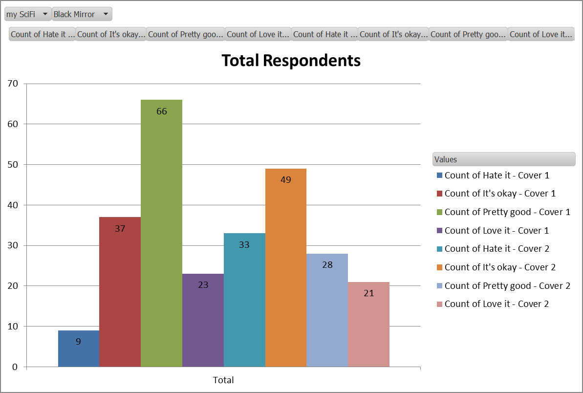
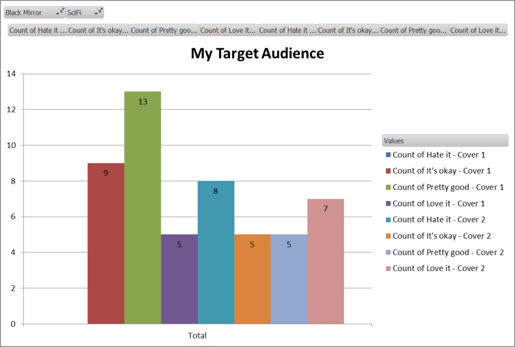
Cover 1 was the most popular overall, and once I’d filtered the responses down to my target audience, those that love near-future science fiction and Black Mirror, the balance shifted slightly but cover 1 was still the most popular.
But, I desperately wanted cover 2 and I decided the difference wasn’t sufficiently large enough for me to change my mind. Especially as the image for cover 2 was of an eye looking out from a shattered piece of glass and the first story in the collection is about a man who feels so trapped by a mirror that monitors his health that he smashes it.
Knowing my weakness though, I made myself check the comments; that’s where the real gold dust lies.
On the whole the comments were positive and contained lots of phrases I’d hoped to hear. However, cautionary themes for each cover emerged from my target audience of 89. The negative comments for cover 1 (5%) were half as many as cover 2 (10%), despite my belief before counting that the warning signs for cover 1 were higher. There’s my bias showing through nice and strong again.
It was enough to make me stop and think.
In the end I went for cover 1 with a slight amendment and this is what it looks like.
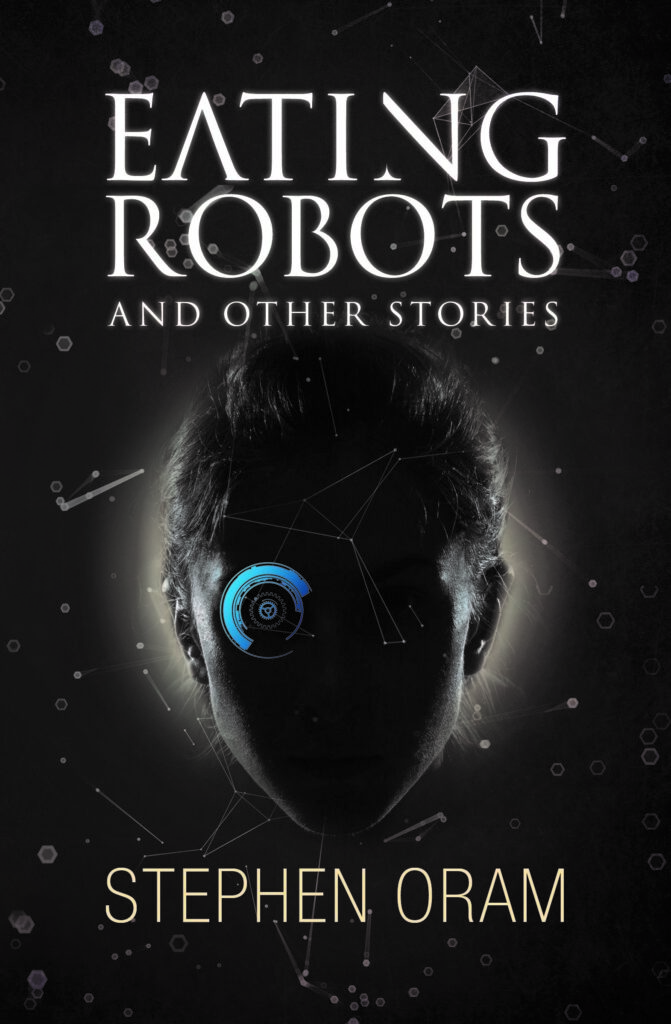
A collection of 30 sci-fi shorts that take technology and humanity, mix them up a bit and play with their futures. Sometimes dark, sometimes light, but nearly always with a word of warning.
What I Learned from my Book Cover Survey
I knew I was biased but hadn’t realised how much until I tried to justify my choice against the data and the comments.
Please do join the pre-release mailing list if Eating Robots takes your fancy (via my website).
OVER TO YOU Do you think this approach undermines creativity or provides a solid base for an objective choice? If you've tried a similar approach, how did it work out for you? We'd love to know!
#Authors - can't decide on your book cover? Check out @OramStephen's system Share on XOTHER GREAT POSTS ABOUT BOOK COVER DESIGN



[…] Pentru scriitori: Câteva idei de a alege cea mai bună copertă. […]
[…] be forgotten, overshadowed by its more pressing rivals, the edit, the marketing campaign, and the cover design. But ignore the blurb at your own peril—it is the bridge between the mildly interested potential […]
[…] What you like may be an indicator of what the public will like, but it may not. So getting opinions is always a good idea. Here is the story of one author who used a survey to help with the decision. […]
:-)Was amused to find this article when I’ve just done the cheap version: putting up possible designs on the ALLi and other FB sites where I can ask people to comment! Not got answers in the hundreds, but I think effective and useful if one isn’t into the survey league …
It is certainly worthwhile to ask around, as covers do sell books … and the ones I am going with now are the result of lessons learned first time around …
[…] Stephen Oram Can’t decide which cover to use for your next self-published book? Read this case study of […]
Great article. I started using surveys a few weeks ago, with two covers, and changed both of them completely. Sales have already started to pick up.
Thanks. I’d love to know a bit more about that… did the survey contradict what you thought or confirm. Or is that too much of a simplication?