


This week’s Alliance of Independent Authors (ALLi) blog brings together design tips for a great book cover from partner members 1106 Design and Miblart. From image selection to typography and layout, this book cover guidance will help you create a great book cover yourself or work successfully in collaboration with a designer to make it happen.
What's in a cover?

Michele DeFilippo
Michele DeFilippo has 50 years of experience in the book publishing industry. Her company, 1106 Design, offers a full range of editorial, design, and marketing services with the quality of traditional publishing.
Potential readers will often first judge your book by the front cover, whether you display it online, on your website and socials, or in bookstore displays. The more eye-catching it is, the more likely people are to want to learn more about it and possibly buy it.
Of course, you probably already know this. You may be attempting to design your own cover or create a rough concept for a designer to follow. Or you may even have invested money in a designer, and now you’re wondering how to quality-check their work or provide meaningful input to guide their revisions.
If either of these apply to you, you likely have a ton of questions, such as “What makes a great front cover?” and “What elements go into a front cover, anyway?” In this article, we’ll take a look at the common components of a front cover and how you can use each to grab a reader’s attention.

Photo by Milad Fakurian on Unsplash
Selecting an effective book cover image or background
Cover trends vary from decade to decade. For example, back in the ‘80s, it was popular for adult fantasy books to have detailed, dynamic covers depicting fantastical creatures, beautiful landscapes, or heroes slaying monsters. These days, adult fantasy covers are less complex and more abstract, in general.
There are exceptions, of course, but covers now often focus more on conveying specific moods or themes, rather than depicting a single scene or character from the book. You can look at the latest bestsellers in your genre or topic to get a feel for what is attracting readers in the present.
Tips for selecting the right cover image:
- Image, pattern, or color? Your cover image can be a photo, graphic, pattern, or even a simple solid color behind your text. But it must suit your book’s themes, topic, or genre. Photos, graphics, and patterns will typically be more striking and unique than solid colors. So, if you do use a solid color, choose one that will stand out on the shelf.
- Non-Fiction trends: Specifically for non-fiction, it's more important than ever that a potential reader knows from the words and images exactly what they will get from your book. What is the information, takeaway, lesson, or solution they are buying in to? Current trends include simple graphics on a clean, plain background that depicts the main takeaway instantly for the reader, alongside a large direct title, with a smaller subtitle expanding on the topic.
- Fiction – main characters: Depending on your genre, outright depicting the main characters on the cover is generally frowned upon today because it can impact a reader's ability to identify with them. When readers are allowed to imagine the protagonist's physical characteristics, or the book's theme is symbolically represented on the cover instead, a stronger connection to the reader can be created. For instance, on thriller and mystery covers, the protagonist is often depicted in deep shadow or facing away from the reader.
- Fiction – creating intrigue: A cover should intrigue a potential reader to pick up your book. For instance, if your book is Lovecraftian horror, showing just part of a monster creeping out of a lake can be more mysterious and gripping than showing the full monster attacking someone. So consider selecting an image that leaves something to the imagination, rather than an image that gives away the heart of the book.
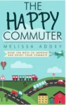
Example non-fiction cover
Typography on a book front cover
Almost anything goes in cover design, but for a cover to look credible a few typographic principles should always be followed:
- The main title should be readable when the cover is reduced to the size it will be displayed on Amazon, so always test a design at different sizes to check.
- Serif or sans-serif fonts can be used, informed by the genre and the design styles currently in vogue. For example, you wouldn’t use a frilly serif or script font for a murder mystery or a blocky, condensed sans-serif font for romantic poetry.
- It’s OK to use both serif and sans-serif fonts together on a cover for contrast, as long as they don’t clash with each other. It usually doesn’t work to combine two serif fonts or two sans-serif fonts.
- The main background color on the cover should contrast with the typography color, so the text pops.
Quick Glossary
Serif: A typeface with decorative marks at the end of the strokes of a letter. Often used to emote a traditional, formal, or heritage tone. Popular examples include Times New Roman, Garamond, and Georgia.
Sans-Serif: A typeface without decorative marks at the end of the strokes of a letter. Often used to emote a modern or minimalist look and considered more accessible on screen. Popular examples include Arial, Helvetica, and Franklin Gothic.
Text hierarchy on a book front cover
Don’t overlook the importance of text hierarchy. Usually, the title comes first, followed by the subtitle and then the author’s name.
The book title itself should be the largest because it’s the most important. We recommend making the author’s name smaller than the title, except when the author is already well-known, in which case the author’s name will be more instrumental in selling the book. In these cases, the author’s name might not just be larger, but may also appear above the book title.

Example fantasy cover
Layout on a book front cover
First and foremost, don’t cram the cover with a lot of information. The front cover should only share the title, the subtitle, and the author’s name. If there’s enough space, it’s alright to add a short endorsement or a brief quote from the book, but that should be it. Too much information on the cover will look cramped and hard to read, and it can disrupt the background image.
All the elements should work together to create a cohesive, balanced design, and special attention needs to be paid to placement of text to make sure none of the title or author name is mistakenly cut off during printing.
Extra book cover design tips:
- Before you get going on design, make sure your title and subtitle suit your book’s subject matter. You may find other books with the same title, but don’t panic. This is actually quite common because there aren’t enough words in the English language to give every book that has been published a unique title.
- I've mentioned it before, but it is important enough to repeat – when creating an ebook, make sure your front cover is appealing even at smaller sizes. For instance, when displayed as thumbnails on Amazon, you don’t want your cover to look vague or unreadable.
- When writing fiction, your readers should be able to tell your book’s genre by your cover, so understanding what others in your niche are producing is important. That said, your cover should still be unique while fitting in with the general style, so make sure you aren’t directly copying a competitor's look and layout.
- Before sending your cover to the printer, be sure you view the cover in print and digital formats to make sure you’re happy with the color scheme for both. CMYK only works for print, and RGB only works for digital. In general, CMYK will be duller than RGB. Authors who aren’t aware of this are often unpleasantly surprised upon viewing their printed cover for the first time because the colors are usually more muted.
- If your book is part of a series, plan ahead for that while designing the cover. Books within the same series should all have a similar design scheme. Readers should be able to look at them and tell that they’re all part of a series. Good examples to reference are the Mortal Instruments series by Cassandra Clare, the Odd Thomas series by Dean Koontz, and The Dresden Files by Jim Butcher.
Quick Glossary
CMYK: “Cyan, magenta, yellow, and black”. Commonly used when physically printing. Print work starts out on a white sheet of paper, necessitating different base colors to build the final color image.
RGB: “Red, green, and blue”. Commonly used for digital design. Most digital canvases use black as a starting point and add varying levels of red, blue, and green to create the most accurate shades.
What if you can’t decide?
If you’ve received a selection of front cover designs and you’re not sure which to choose, try running a cover poll on social media. Cover polls are a good way to raise engagement on your social media before you launch your book and can make your book more visible before publication.
Ask participants which cover they would most likely buy rather than which cover they like. The latter encourages subjective preferences and suggestions for design changes. However, balance your feedback with your own or your designer's views; your friends and followers may not always choose the best cover for sales.
DIY or book a designer?
If you’re attempting to create your own front cover, it isn’t impossible, and many bestsellers do so. But, unless you have the knowledge, experience, and skills necessary, you run the risk of publishing your book with a subpar cover. You probably spent years fine-tuning your manuscript. Why settle for anything less than a cover that’s worthy of the time and effort you put into your work?
Keep in mind that an experienced designer will have an eye for detail, knowledge of design theory, and familiarity with the proper computer programs, among other skills. All of these skills are necessary to create a professional cover that will hook readers and help drive sales.
But be sure to vet your designer before making a decision. You should be able to view samples of their work, read endorsements and reviews, and fully understand all their fees and exactly what services they include for the price.
ALLi tip: Make sure you have a contract up front, signed by both of you, before you get going. This will make sure you know exactly what you are paying for, when it will be delivered, and how and when you will pay. Ensure it includes details of how many rounds of ‘amends’ you will be able to make if you need to tweak elements of the design before you are happy. If things go wrong, this is what you can go back to for evidence of what was agreed.
In conclusion
If you are designing your own covers, hopefully you now have a good basis for making decisions on the cover, by considering the imagery, layout, and typography for your work.
And, if you’re working or want to work with a designer, you should now have the knowledge and confidence to communicate what you want and provide helpful feedback on revisions to ensure you receive a cover you love.

Photo by Cytonn Photography on Unsplash
How to write a successful book cover design brief
Following Michele's great tips for designing your book cover, we thought it was worth revisiting guidance on how to produce a design brief before you get going. This top checklist has been adapted from one provided by ALLi partner member MiblArt — a book cover design company for self-published authors.
A good brief aims to communicate all the key information about the needs you have for your cover. If you are working with a designer, getting this information right from the start can avoid misunderstandings which in turn saves time, money, and energy on both sides.
And if you are designing covers yourself, producing a brief that can inform the decisions you make from the outset should help to ensure you have considered your needs from all angles before you get going.
- Book title & Author name (of course!)
- Tagline (if applicable). It's a short, catchy sentence you might want to use to pique the readers' interest. The tagline will help a designer catch the soul and spirit of your book.
- Ebook/paperback/hardback or dust jacket. It doesn't affect the front cover much, but this information is vital for the overall book cover design.
- Book size & number of pages (if you will have a print version). Depending on the contract, sometimes you don't have to worry about the final number of pages, book size, spine length, and blurb text. The designer can add this information later without extra charge. However, keep this information in mind.
- Platform or publishing house (if you have an ebook version). Different platforms have different technical requirements. The professional designer knows how to adjust, let's say, your image pixel dimensions so that it'll not get rejected.
- Genre or topic. You absolutely must mention the book genre or your topic if you are writing non-fiction, so that a designer will conduct their creative research. Frankly speaking, representing the genre or topic well is one of the primary responsibilities of a great book cover. If you are writing in a not so common (niche) genre, please include a description of the main characteristics. If this particular book is a combination of a few genres, explain what's going on.
- Audience. Try to describe your target audience in a description of just a few sentences to pinpoint just the most important factors that might directly influence the book cover design. This aims to make sure your cover appeals to your target audience.
- Description of your book. To make your life simpler, you can insert your blurb here. Toss in the author commentary to better explain the plot, setting, historical timeframe, and characters (appearance, outfit, gender, behaviour patterns). But you don’t need to give it all away. A good book cover should intrigue potential readers, so it's best if the designer also doesn't know how the story ends.
- What would you like to see on the cover? you have any ideas about your book cover design, spell them out. And if you rely entirely on a designer's creative mind, you can still help them out by providing some extra details.
- Back cover information. We're talking about the tagline, blurb, author bio, and testimonials.
- Author brand details. Working on establishing your author brand? Great. You might want a designer to include an author logo, let's say on the spine or back flaps of your dust jacket. If you are using a color palette or a specific graphic element that links your books together, don't forget to mention it.
Find out more
![]() Worried about plagiarism when you are producing your front cover? Catch up on this ALLi Member Q&A podcast which discusses just that: Plagiarism podcast
Worried about plagiarism when you are producing your front cover? Catch up on this ALLi Member Q&A podcast which discusses just that: Plagiarism podcast
Looking for a designer or other supplier? ALLi prides itself on its approved partner directory and services vetted by our Watchdog Desk, if you want to search for trusted cover designers, start there. Members can download a handy print edition to keep on your desk. You can find out about this and the many other member benefits here.


Thanks, Michele. There is some great cover design advice there for new and even experienced authors. While most of us authors would like to believe that regardless of our cover design, our books will stand on their own merit, many consumers shop with their eyes first, and a great cover is the first step down the pathway toward a purchase.