


If you’ve managed to build and launch a basic website to support your indie author business, congratulations! Your website is the cornerstone of your author brand and book marketing efforts. However, there’s a strong possibility it could work harder for you. That's what we're discussing in today's post. The Alliance of Independent Authors welcomes partner member and website designer, Pauline Wiles.

Pauline Wiles, indie author and website designer
Pauline Wiles is an indie author with 6 books published. For her day job, she specializes in helping authors create professional, attractive websites. She noticed others are often overwhelmed by this task, and loves to dispel the myths around how difficult a web project should be. Her professional resume includes teaching computing to adults on both sides of the Atlantic, as well as desktop support, entrepreneurship education, and marketing analysis. Find out more about Pauline on her website and Facebook and download your free author website starter kit here.
Easy Author Website Mistakes to Fix
As a writer, you don’t necessarily have the design and technical skills to maximize your site’s potential for selling books. Especially if you built your website yourself, you’re probably making a few mistakes which are easy to fix.
Read on for actionable tips from a professional website designer, so you can move beyond a beginner website to a powerful business tool.
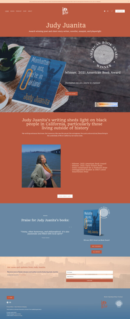
Example of website designed by Pauline demonstrating reader needs.
Focus on Your Readers’ Needs, Not Yourself
The best way to create a website that gets results is to focus on your readers and their experience when visiting. Spend some time thinking about why they might come to your site, what information they’re looking for, and what the result of their visit should be.
Clarify your Call to Action (CTA)
Studies have shown that when we give people too much choice, they tend to feel overwhelmed and do nothing at all.
You need to get clear on what the ideal next action is that you’d like a visitor to take, after they’ve viewed your website. Instead of giving them myriad choices for what to do next, read next, buy next, or where to follow you, decide on your priority.
For the majority of authors this is either:
- Buy a book
- Join your email list
If you haven’t published yet, you might instead want to build community, or invite them to explore your articles or blog.
Which action is more important? Most authors I talk to focus too much on trying to sell a book, and not enough on persuading the visitor to join their email list. If you’re taking a long term view of your indie publishing career, an engaged list of people who are keen to hear from you is at least as valuable as a single book sale.
Depending on your overall marketing plan, you might also want your website to show you as a credible speaker for author appearances and book club visits. Remember to create a clear and appropriate Call to Action on every page.
Research reveals that website visitors are more likely to take an action when it’s displayed as a button instead of a text link. Not only is a button larger, but it’s much easier to tap on a mobile device. Use the most eye-catching of your author brand colors for your action buttons.
See also: The Ultimate Guide to Selling Books on your Author Website
For extra points: most professional web designers will set external links to open in a new tab or new window. Having done the hard work of getting someone to your website, you don’t want to lose them when they click a link and forget to come back. Consider this option for any link that leads away from your website.
The Value Your Email List
An email list is a key marketing tool, but don’t fall into the trap of simply inviting your website visitor to “sign up for my newsletter”. Nobody wants more inbox clutter without good reason!
It’s your job to show that they will receive value from being on your email list. Ideally, you’ll offer a free book or other resource that appeals to your ideal reader. If you’re not yet at the stage where you can give a free sample of your work, you can still promise news, special offers, exclusive content, and event notifications. Don’t simply imply that you’ll fill their inbox with snooze-worthy rambles.
Include Social Proof
Your book won’t be right for everyone, and that’s fine. Help a website visitor know if your work is perfect for them by including reviews and praise from other readers. When your existing fans use words like gritty versus cozy, or sizzling versus sweet, this is valuable information to set you up for success with a new reader.
Aim to include short extracts of praise on your home page, as well as individual book pages. And of course if you’ve won or been shortlisted for any awards, these should be prominent too.
See also: What’s the point of an author website?
Brevity is Queen
Attention spans these days are short! Savvy website owners are using much less text and writing in “soundbites”, not long paragraphs. Font sizes have increased as well. Not only are many of your visitors are on a phone, but bigger text will remind you to write shorter copy.
- Use headlines
- Keep sentences short
- Use bullet points where possible
Your reader will decide at lightning speed whether to browse further, or leave. You want them to stay long enough to take your desired action.
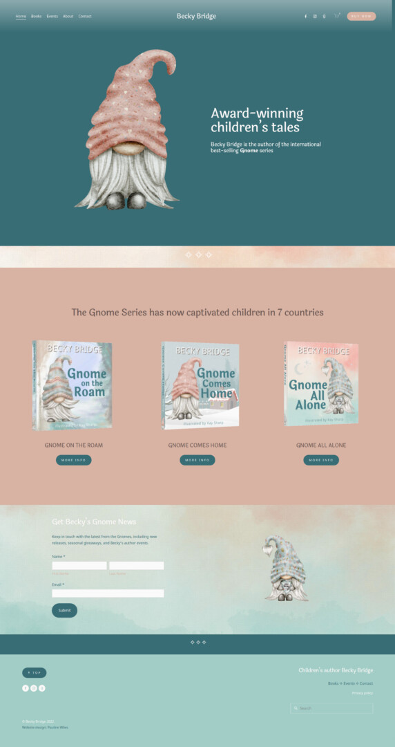
Example of website designed by Pauline demonstrating an up to date design.
Bring Your Design up to Date
When I view your home page, it takes me about two seconds to guess roughly how old your website is. If you want to come across as a professional who publishes high quality books, your website needs to look contemporary and well designed too.
“Be a professional, and look like one. Your Author site should be an indicator of quality, even if all you’ve published so far is one short story.” – Karen Myers
Ditch Your Side Bar
Many of us got started with blog-based websites that feature a sidebar on every page. Today, almost all modern websites have moved away from that, with the exception (maybe) of your blog pages and online store. If I visit your home page and see a sidebar, you’re telling me immediately that you’re way behind the times. Switching to a full-width page is one of the fastest ways of propelling your website into 2022.
Elevate Your Images
Hopefully your book cover looks great at thumbnail size for online retailers, but that doesn’t mean it should be tiny and apologetic on your website.
Assuming you love your book cover (and I hope you do, or you’ve got bigger problems!), give it a starring role on your site. After all, it’s the primary visual representation of your author brand.
Technical note: that doesn’t mean you should use a large file size for the cover: big files slow down your site when it loads, which is annoying for your user and harms your ranking with Google. But do give your book cover plenty of real estate on the page.
If your work is available as a physical book, I’m a big fan of mockups that turn your flat cover image into something that looks like a real book. My favorite free tool for this purpose is this one from DIY Book Covers.
Don’t forget to link every book cover image to a useful destination page. Especially on a phone, if a visitor is interested, they’re likely to tap the image. I recommend you link to somewhere they can buy the book.
One final professional design detail: did you remember to change the default browser icon to represent your brand? A favicon is the tiny image that appears in the browser tab, and you should make your own instead of accepting the generic icon that comes with the website platform you used.
Purge the Clutter!
Especially if your website is more than a couple of years old, you’ve probably accumulated a horrendous amount of clutter. Remember, your site should primarily contain the essential information your reader needs, and if you must have extra material, move it to subsidiary pages.
Your website is not the Wikipedia of your writing career, so please do your visitor a favor and don’t make them wade through everything you’ve ever typed.
“A lot of author websites are absolutely coming down with junk. There's way too much stuff and people don't know where to go. They don't know what to do. They might even want to buy a book and not be able to find their way.” – Orna Ross
Clutter lurks most often in sidebars (hence ditching that bar altogether gives you an immediate advantage) but also shows up in your footer, widgets, and even menus. If you like to create new website pages but never remove any, I’m talking to you!
Are you linking to social media accounts from your website? Make sure you only feature those that you’re still actively using, and where the content supports your author business. I still come across authors linking to Google Plus, which has been dead for 3 years. And if you’re using an account primarily for personal posts, it doesn’t merit a link from your author site.
Be sure to update any page that has date-sensitive material. You don’t help yourself with a headline that says “new book coming in September 2020” when it’s now years later. Check your bio, in case you’ve used any phrases like “two years ago” or “seven-year-old dog”. And if you have listings of author events, take a look at whether past happenings need to be labeled as such. Best practice is to include the year for all events, so that your website visitor sees instantly if they can still attend.
Finally on the topic of clutter, it’s a dead giveaway that you built your website yourself if you still have “powered by WordPress” or “made with Squarespace” in your footer. You’ll look more professional if you remove this free advertising.
Do a Technical Check up
Test Your SEO Basics
Whether or not organic search is a key part of your book marketing plan, do take the time to make sure your Search Engine Optimization (SEO) essentials are in place.
Your technical foundations for better search rankings include:
- Is your website mobile responsive, so that it looks great on a phone or smaller screen? Check that here.
- Do your pages load reasonably fast? If they don’t, it’s frustrating for your visitor and Google will punish you. Test your site here.
- Do you have an SSL certificate in place? Many website browsers will now block your site if you don’t. A padlock, plus https in the browser address line are great guides, but you can also check SSL here.
- Does every page have a URL that makes sense? For example, myauthorname.com/science-fiction-novels is way better than myauthorname.com/page6785. Not only does this look more professional, but the URL tells Google what that page is about.
- Do you have alternative text (“Alt” tags) specified for all your images and photos? This is a necessity for a visually impaired visitor who will navigate your website a screen reader. And Google’s robots need help reading images too. Use a short, descriptive phrase to explain all your images. The imaginatively named Screaming Frog SEO Spider can help you check that you have the right tags in place.
See also: The Ultimate Guide to SEO and Findability for Indie Authors
Make Sure Everything (Still) Works
Don’t make the beginner mistake of losing readers or book sales because a piece of your site is broken. As your writing career develops and your website changes, make sure you’re checking that the basic features still work, especially if it’s been a while since you set things up.
“Your writing career doesn’t stay static – and if it does, you’re probably doing it wrong! Websites will naturally evolve alongside your writing career, if you let them.” – Debbie Young
I recommend you set a calendar reminder for two or three times a year and test:
- Your contact form.
- The email list signup process, including any automated welcome messages and delivery of your lead magnet.
- Your shopping cart, if you sell directly from your website.
You’d be surprised how often I come across broken contact forms. Who knows what opportunities you’re missing, if a message never reaches you?
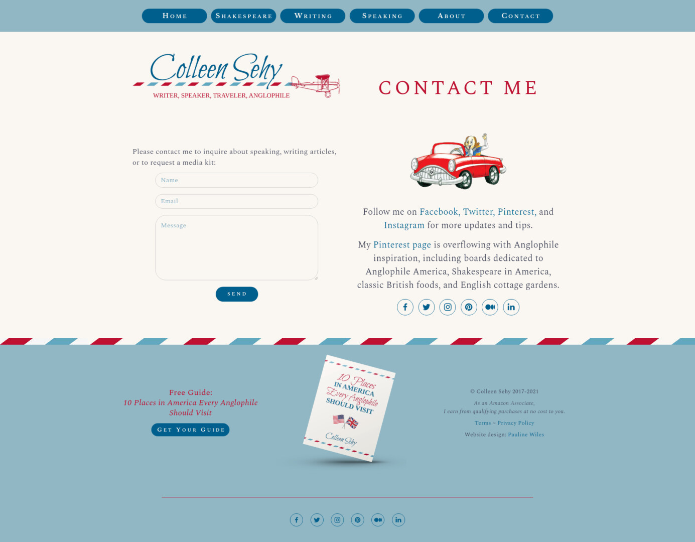
Example of website designed by Pauline demonstrating a technical check up.
Comply with the Law
As a professional indie author, you should of course aim to comply with international laws. Courtesy to your website visitor is important, too. These aspects quickly reveal whether you’re competent and trustworthy.
Generally, you’ll place each of these items (or a link to them) in your website footer:
- If you’re gathering any kind of visitor information, including an email address when someone joins your list, you need a Privacy policy. This ALLi article on GDPR contains both a legal guide to email lists and a sample privacy & cookie policy. Your Privacy policy should be visible from every page, hence it makes sense to put a link in your footer.
- If you earn affiliate income from Amazon or other third party sites, you must disclose this to your audience. You can see the Amazon Associate requirements here.
- Copyright year: realistically, placing a copyright notice on your website doesn’t magically protect your content. However, it’s the easiest way to show a visitor that your website is still active and cared for. Either update it to this year, or use a date range to show the longevity of your site.
Example of website designed by Pauline demonstrating legal compliance.
Summary
The best indie author websites:
- Put your readers’ needs first.
- Look fresh, modern, and professional.
- Are structured and designed for the visitor to take action.
- Serve as mission control for your author brand and all your marketing efforts.
- Are a living business tool that you update regularly.
Kevin, SEO is a multi-layered and complex topic. There is no “best method”, as the Google algorithm takes over 200 factors into account when showing search results.
The first thing I recommend when the topic of SEO comes up is: talk to your readers and be sure they are using search engines to “discover” books like yours. For fiction, they may not be (a Penguin Random House study a few years ago found that Goodreads led the way for discovery, and organic search didn’t even make the chart). If this applies to your readers, getting in front of other people’s audiences may be a better use of your time than trying to impress Google. On the other hand, for nonfiction, especially how-to advice, organic search is likely to be very important.
If you’re hoping to attract search traffic, your key focus must be on delivering a useful, pleasant and informative user experience. Google rewards sites that are easy to use, answer the questions people searched for, and where people then spend time on your website. In a nutshell, this means:
a) You’ve taken care of technical basics, including mobile responsiveness, page load speed, SSL certificate, image alt tags, and no broken links. Among web tools, WordPress and Squarespace both offer excellent SEO potential… other choices, not so much.
b) You consistently post useful, up to date, informative material that answers questions people are searching for. Realistically, this means you target keywords that are fairly niche (lower search volumes) instead of trying to rank for very popular, but very competitive, search terms. Folks who post quality info consistently report that SEO can still take several months to bring them traffic, depending on their starting point and niche.
SEO truly is a marathon, not a sprint. Sadly it’s a myth that we can spend 30 minutes on a few magic things, and then Google will sell books for us while we sleep.
And I can’t emphasize enough: knowing how your ideal reader likes to discover something new to read is a *much* better question for long term success than jumping immediately into SEO.
Great article — thanks!
I’m glad you found it useful, Karen.
Great post, Pauline! 🙂
I have one question about the side bar. I do still have it on my homepage, but not on all the other pages on my site. The reason i still have it on my homepage is that it has lists of the different blogposts and categories that I have. Should I ditch the side bar there as well?
Thanks, Maria
Hi Maria, yes, if in doubt, get rid of it. In general, you can make better use of space on your home page and look much more contemporary if you highlight the most important things the reader is looking for about you and your writing instead. If your blog is a super-important part that makes you money, then you could do a homepage showcase of your best posts or key topics and link from there.