Today American screenwriter Tom Rogers shares his experience of developing an appropriate cover for his children's novel, Eleven, which is based on the response to the 9/11 disaster of a young boy living in Manhattan, and who happens to turn eleven years that day.
Churchill (or Shaw, or Wilde, depending on whom you ask) famously described England and America as “Two nations separated by a common language.” The same can often be said of writers and artists – united in our love of storytelling but frequently unable to communicate across the pond that separates the verbal and the visual.
I’ve been a screenwriter of animated movies for nearly twenty years and work with storyboard artists on a daily basis. (If you’ve never seen a storyboard, it’s essentially a comic-book panel that tells a small moment of the story.) We don’t always see eye to eye. (Want to drive a storyboard artist crazy? Write, “An epic battle ensues.”) They fall in love with their cool visuals the same way we fall in love with our scintillating dialogue.
But when it works, it’s thrilling: I can spend a paragraph trying to describe how a character projects an aura of power; an artist can draw him looming over us and say it all in one shot.
That’s the kind of visceral punch you want from your book cover.
How to Talk to Cover Designers
When it came time to create a cover for my novel, I felt like I had a leg up in knowing how to speak the language of these exotic creatures.
It all boils down to three key concepts: give them room to explore, be specific and upbeat with feedback, and remain open to surprise.
Give them room to explore
Before you launch, talk about feeling and mood and tone and theme. Mention a few key images from the book. Then turn them loose and trust their unique skills. This is their first draft; and just like you wouldn’t like an editor jumping in to dictate what you should write, artists don’t want you holding the pencil for them.
Be specific, but always be positive
When you respond to that first batch of ideas, start out by telling them what you like. Not only does it get you focused on fruitful directions to pursue, it sets a collaborative tone that will keep them on your side. When you give negative feedback, be gentle: phrases like “I see what you were going for, but I think I’d rather try another approach” are much easier to swallow than “I hate this.” This may sound touchy-feely and obvious, but you’d be surprised how many writers forget that feeling of artistic vulnerability when they’re the ones giving the notes.
If you feel like the drawings aren’t landing, be as specific as possible about why: for example, I didn’t want images of direct horror (flames, smoke), because they felt too sensationalistic. Even if you can’t explain exactly why you don’t like something, try to be specific about how it makes you feel; the artist may know why some element in the artwork is eliciting that response and can work to avoid it on the next round. (And keep in mind that figuring out what you hate can help point you to what you love.)
Finally, if there’s something you just don’t understand, ask them what they were trying to achieve; you may find a good idea hiding behind a bad drawing.
Remain open to surprise
All great art somehow catches you by surprise. (If it only told us what we already know, what would be the point?) I got a great reminder of this while working on my own cover, as you’ll see below.
To illustrate this, here is a selection of images from throughout my process, from my first amateur sketches to finished product delivered by my incredible designer, Tim Kordik of Tim Kordik Graphic Design.
So I’ll pipe down now and let the pictures (mostly) tell the story.
Why I Needed to Hire a Professional
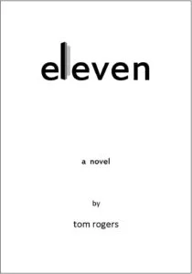
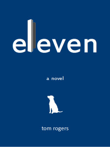
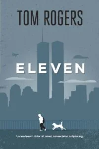
Above are my own clumsy efforts in Photoshop. Amateurish but still helpful: I liked the Twin Towers as a nod toward the subject matter; the dog helps make the book more approachable and kid-friendly.
I only did this as an exercise for myself; I never shared it with Tim, because I didn't want to put thoughts in his head that might limit what he'd come up with on his own. We talked a lot about the book’s theme and tone – about emphasizing the kindness of strangers, the balance of despair and hope, and the growth of a boy into a young man. Then I backed away to let him work.
“Blue-Sky” Sketches from Tim
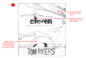
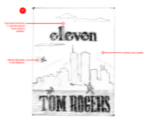
GROUP 1: THE CONTENDERS
(Click to see Tim’s comments in red.)
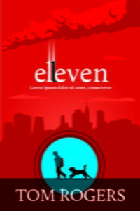
Tim surprised me by including the main characters, Alex and Radar – the boy with the backpack and the stray dog he just rescued. I loved this from the start. I liked the towers looming behind, pushed back into shadow. I also liked the skyline silhouette from the one on the right (design #7), as well as trying to incorporate the Twin Towers in the typography of the title. Tim felt strongly about including images of the disaster: the towers on fire, smoke and ash in the sky, the jetliner screaming in. But this made me queasy. Rather than shut him down, we agreed to explore versions with and without such imagery.
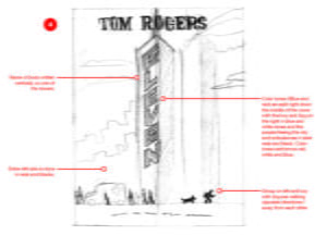
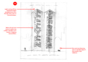
GROUP 2: THE MAYBES
Tim had a clever visual idea about how to incorporate the title and author into the design; but the idea of using the symbols of a national tragedy to billboard my name didn’t sit well. Also, his composition on the left (#4) had the boy and dog heading in opposite directions from the ambulance and victims. This didn’t fit with a major theme of the book, which is about how strangers came together that day through extraordinary acts of heroism and kindness. This was a case where seeing the opposite of what you intend helps you hone in on what you’re really trying to say.
GROUP 3: THE ALSO-RANS
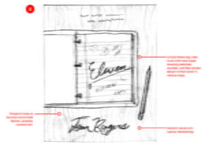
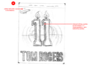
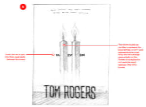
The image on the left was refreshingly different from all the others, and I liked how it put the viewer in the point-of-view of an eleven-year-old kid at school; but it felt like it didn’t relate to the main thrust of the story. The other two related a bit too literally. In Tim’s defense, the candle imagery comes from a moment in the book which most of my readers have found evocative. But what works on the page and in the imagination comes off here like a strained visual joke. Still, I let Tim know that I appreciated how he was trying out new ideas, playing with the layout of type and background in interesting ways.
SECOND BATCH:
In the second round of designs, Tim tightened up the graphics and began experimenting with color, while continuing to narrow down the layout options. Now it was time for me to be specific and make some definite choices.
But it was also important to be respectful of the work being rejected. In the case of the design on the left, I let him know he’d delivered exactly what we’d discussed; but seeing it so well rendered made it clear I couldn’t have my name creeping up the side of the towers like a Vegas marquee. I also felt that having the boy and the dog so far apart made them feel disconnected.
In the middle one, I missed having the towers in the background; but I really liked that pop of blue, so reminiscent of the clear blue skies over New York on 9/11. In all of them, I had a strong aversion to the blood-red color and felt the grayish blue was too somber. I pushed Tim to aim for more of a sky blue to lift some of the heaviness.
We focused then on fine-tuning the blue-gray one on the right. Here, we got really detailed: the boy seemed too dejected (since the towers behind him were still standing), while his dog was too frisky; the dog needed to be more alert to the boy’s mood, to make them feel connected. I asked Tim to emphasize the Hudson River separating the foreground action (in New Jersey) from the Manhattan background; but where I’d perceived a river, he hadn’t intended anything at all. We both rolled with the happy accident and made the change. Finally, I begged him to take out the airplane careening towards the building; he felt just as adamant that the plane should be there. We agreed to stick a pin in it for now and move forward.
THIRD BATCH:
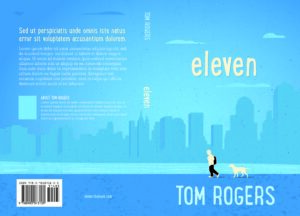
Now it was really starting to come together. Tim took out the fence railing and layered in the river; he raised the boy’s gaze just slightly and somehow matched the dog’s mood to the boy’s. (He even gave me a choice of dog silhouettes.) And while he lightened the hue, he added a faintly speckled overlay that just hinted at something like ash. To my complete surprise, I loved it. It gave added depth – both visual and thematic – to the image.
At this point, all that remained was for me to make a few final decisions: choosing the font and placement of title and author name; including the towers or not; and deciding whether or not the dog’s tail should be bobbed. (Seriously.)
FINAL COVER DESIGN:
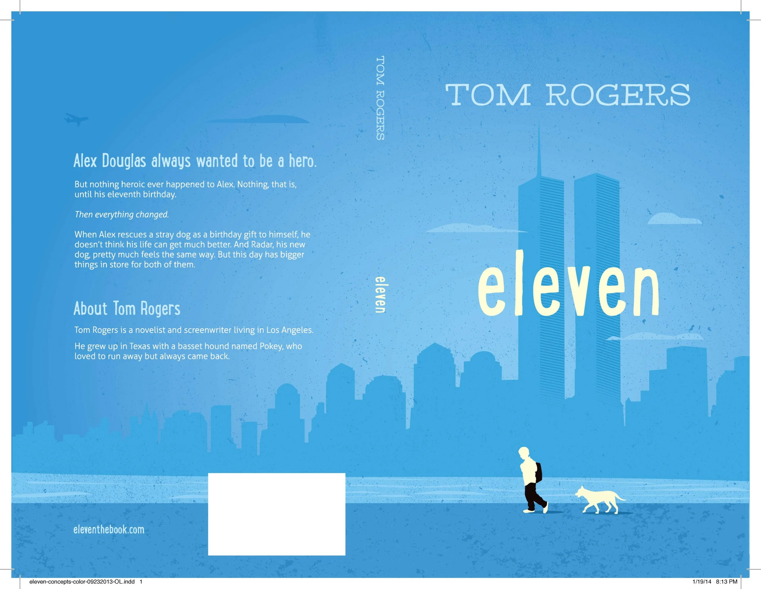
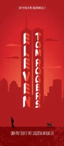
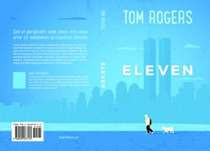
So there it is, and I couldn’t be happier. The towers, the river, the boy and his dog and his dog’s tail: all there. Even the uneasy mood, captured in the contrast between the cheery blue and the towers looming in shadow. (Tim alerted me that blues tend to come out much duller in print than they appear on-screen, so he brightened the hue even further.)
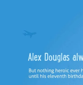
Tim had one final surprise in store, too. Remember that plane I wanted to get rid of? Most readers don’t spot it. But it’s there:




[…] An Animated Approach to Cover Design […]
[…] An Animated Approach to Cover Design […]
Oh dear. Still learning. My name is Nicoletti , not Nicooletti, though come to think of it, it does describe me somewhat.
Thanks, Jo! (And your name is still cool however you choose to spell it.)
Learned so much from this article. Filed for near future reference.
If you need to reach your young readers – just put a dog in to do the job
Thanks, Patricia! I was lucky to have designer Tim Kordik as a collaborator.
What a touching and respectful story. Determining a way to treat such a sensitive topic in the manner it deserves and then integrating innovative design ideas is a fascinating read. Your final cover is exceptional. Thanks for sharing this story with us.
Thank you, Stephanie and Pauline. Really gratifying to hear.
I just wanted to chime in and say that I think your cover artist did a wonderful job with your cover. You mentioned not wanting it to be sensationalized, and this doesn’t feel like that at all. I think that’s why I like this cover, even when I tend not to like images focusing on the disaster itself. I also agree that the plane in the distance on the back cover is a nice touch. It hints at the looming events without (again) feeling sensationalized or heavy handed.
Thanks for sharing your cover art process, and good luck with your book. 🙂
A lovely story. I particularly love your respect toward our national tragedy. I like the final result very much. Thank you for sharing it.
Hi Jane — thanks for the kind words about the post! Obviously, I agree with you about the blue. In fact, I’d always been drawn to that for the very reason you cite: that it’s evocative of the weird disjunction between that stunningly perfect day and the events to follow. I’m glad you responded well (if that’s the right term) to the plane; when it appeared on the back cover, I had the same reaction and knew Tim had hit on the right solution.
To your questions: I wrote the book as a way to help teach kids who weren’t even born on 9/11 what happened that day and also how people responded to this tragedy by coming together in amazing ways. I always figured the book would find its natural home in schools (which is proving to be the case), and the primary buyers would be parents and teachers looking for a way to answer their kids’ questions about 9/11. So I definitely wanted an image that would instantly convey the subject matter to adults but also suggest a kid-friendly, age-appropriate tone. As for bookstores — since few of them carry independently published books, that’s just never been a major concern. And the instances where I’ve been able to get the book into a few libraries have come through the advocacy of children’s librarians.
Thanks Tom – that was pretty much my assumption. I don’t write children’s books so I don’t know much about how they are bought, but I do remember that when my kids were young (up to about 10) I made many of the purchasing decisions. And then it all went sideways…
What an interesting post. I love the use of blue–I think many of us who remember that day remember the perfect weather (in the Midwest as well as what we were seeing on our TV screens). And the plane on the back cover gives me chils.
But the intro says this is a children’s novel, and while the adults who will probably select this book for their child will key into the visual reminders of that day, for the children who read it 9/11 is history. Did you aim the cover at those purchasing adults? What do you think will make a child pick this up from a bookstore or library shelf?